Sunday, August 24, 2014

Why Is Macro So Hard? Brandolini’s Law

This comes to us from computer science:

Ordre Spontane has some similar quotes.

Anyway, think about a handful of macro issues:

  • Trade restrictions are good.
  • The minimum wage is a good way to help the poor and unskilled.
  • Predatory pricing is a successful management practice.
  • Americans don’t save enough.
  • Government needs to subsidize firms before they can thrive.

These are all BS. And yet macroeconomists spend a lot of effort, year in year out, trying to expunge these from informed public discourse.

Via Café Hayek.

The Minimum Wage Doesn’t Really Help the People We Think It Does

Raising the minimum wage nationally has been a hot political subject for a few years now, and many jurisdictions around the country have already raised it locally.

On the pro side, 1) if we take cumulative inflation seriously, then yes it’s probably time to adjust it, and 2) the “common sense” that it reduces employment doesn’t appear to be persuasively supported by the data.

But, here’s an idea familiar to economists that the public just doesn’t talk about much: a plurality of people who earn the minimum wage already live in high income households.

You see, when the minimum wage was first instituted a few generations back, most people who worked at the wage lived in low income households. So a minimum wage certainly helped them make ends meet.

That’s a good thing. I don’t know if the effect was strong enough to counterbalance the theoretical loss of jobs, but it’s close enough that reasonable people fall on both sides.

And that’s the urban myth that continues to be most people’s argument for supporting the minimum wage today.

Except it’s an urban myth because it really isn’t true any more.

These days the typical minimum wage worker is a teenager from a high income household: one with access to job openings, transportation to jobs, and immersed in a culture of employment. This is not your typical poor person in America: without ready access to job openings, often living where transportation to jobs is spotty, and distinctly not immersed in a culture of employment.

[Calculated estimates indicate that] if we were to raise the minimum wage to $10.10 per hour nationally, 18% of the benefits of the higher wages (holding employment fixed) would go to poor families, and 29% would go to families with incomes three times the poverty level or higher.

What about minimum wages as high as $15 an hour? Applying the same calculation as above for a $15 per hour minimum, the share of benefits going to poor families would decline to 12%, and the share to families more than three times the poverty line would increase to 36%. [emphasis via a quote posted at Carpe Diem].

Let me put some perspective on that. A household with income 3 times the poverty level corresponds roughly to that of a married SUU professor, with a spouse who doesn’t work, and two kids … one with a job at McDonald’s.

This is not necessarily a reason to be against a minimum wage increase, because there is still a positive effect on the poor. But, it is an argument that if your motivation for raising the minimum wage is to help the poor, then there are probably other methods you should think about first.

You can read the original here, from David Neumark, a macroeconomist at UC-Irvine.

Saturday, August 23, 2014

Putting Absolute Poverty In Perspective

One of the problems in understanding macroeconomic policy in developed countries is the distinction between absolute poverty (someone lacks something) and relative poverty (someone has less of some things than their neighbors).

And in developed countries, activists tend to prefer to talk about relative poverty … because there simply isn’t much absolute poverty.

A further concern, and one that’s a little bit deeper and thus less discussed, is what is the radius used to determine the comparison set when discussing relative poverty. Most activists want to limit that to a few miles. But if we talk about a radius of thousands of miles … there isn’t even any relative poverty in developed countries at all: it’s all in developing countries.

None of this matters though, if we focus primarily on absolute poverty. And really, even if you’re concerned about relative poverty, most would agree that it is a secondary. And, if you’re still concerned about relative poverty, then ask “relative to what?”

All of which brings me to agricultural subsidies in developed countries. You see, there’s a standard metric for the poorest of the absolute poor: those who live on $2/day or less. That covers over a billion people on the globe.

And in places like the EU, they pay cows more than that. Of course, the cows don’t get the cash themselves, to blow on smokes and forties. Instead, the farmers collect the income that (at least conceptually) is paid to the cows.

So, here’s an idea. The next time someone you know starts to grouse about poverty, suggest that we remove the agricultural supports for American farmers, and instead pay that money out to someone in absolute poverty in a developing country.

Friday, August 22, 2014

More than Corporate Arm Candy?

All the big, famous, firms have to have one these days: a chief economist.

That’s the dream of the new tech company chief economist: Become indispensable, by using your employer’s data to create something the market didn’t know it needed.

Wednesday, August 20, 2014

Purchasing Power

Here’s a chloropleth from the Tax Foundation showing how much $100 buys:

The data here is something like the inverse of a price index (which takes low values where prices are lower).

N.B. Normally, you might see something like this with “heat map” shading. The problem with that is that the color blind have difficulty with that choice of colors. The use of blue-to-yellow here may not seem that comfortable, but it has the virtue that even the color blind can readily see the differences.

Anyway, blues are bad: stuff is expensive there and $100 doesn’t go as far. Yellows are better: your $100 will buy more there. The biggest difference, going from Mississippi to D.C., is 37%. So at the store, you’d walk out with a third more loot.

Sunday, August 17, 2014

Is Tax Complexity Discriminating Against Dumber People?

New research out of Harvard that is very disturbing (although probably not surprising).

  • To control for the weirdness of the real world, they did this as a lab experiment. In these experiments, subjects enter for free and play for real money that is proportional to their performance.
  • They simulated taxes. Subjects got to keep the after-tax money they earned.
  • They did this with the same people in two environments: one in which taxes were simpler (had less rules to follow) and one in which they were more complex (had more rules to follow). The subjects’ outcomes would be the same across the two environments if they were able to follow all the rules.
  • They found that subjects behavior was closer to optimal when the tax system was simpler. Basically, subjects left money on the table when the tax system was too complex.
  • It gets worse. Then they added an identical rule to each tax system — making each setup a little more complex — and had the subjects play again. Now, put on your thinking caps: in the simpler system, the marginal increase in complexity from an identical change will plausibly be larger. What they did was actually go from 2 to 3 tax rules, and from 22 to 23 tax rules, so this seems like a plausible conclusion. What they found was that performance went down under both systems, which isn’t very surprising. What is surprising is that they found that 1) performance got “more worse” (I know that sounds kludgy) with the complex system, 2) poorer performance was concentrated in the people who performed worse before the change, and 3) the measured decision-making time of those people didn’t change much.

The authors conclude from this that they were able to isolate subjects who found the complex system to be beyond their cognitive ability, and that when confronted with a rule change that made that problem worse, these people shut down and ignored the change.

This is a strong case that a complex tax system discriminates against people on the lower end of the intelligence spectrum.

That’s a bombshell: politicians, in collusion with bureaucrats, accountants and lawyers, may have set up systems that discriminate against people who aren’t as smart as they are.

Keep this research in mind the next time someone tells you that a flat tax system is bad, or that a progressive tax system is better.

BTW: In perusing the reference list, I conclude that the strain of literature these authors are targeting is liberal rather than conservative: it falls in the Elizabeth Warren, Cass Sunstein orbit of the Democratic party.

Friday, August 15, 2014

The Future You

Macroeconomics can be mind-bending.

I turned 50 the day I wrote this post. One of the things you need to take away from an advanced macroeconomics class is some sense of how things might be different 50 years out into the future, when you’re 70 or 75, and your grandchildren or great-grandchildren are taking a class like this.

I bring up that I turned 50 to make a point. When I took my first advanced macro class (Spring 1982), we didn’t think enough about the future. Let me give you an example. At that time no one imagined that (recorded) music, not just any music but the music you wanted to hear at the moment, would be free. The thing is, it was free to the tech savvy within 17 years (I should know, I downloaded a lot of it).

Going further though, let me tell you about 1998. At that time, very few understood that (recorded) music was going to be free. I saw the handwriting on the wall around 1990, and got myself pretty tech-savvy. When I found out about downloadable MP3s in October 1998, no one I knew could believe it when I showed it to them. And yet, by late 1999 many people started using Napster. That name probably sounds ancient to you. The recorded music supply chain industry should’ve seen that coming, but they had no clue. Thus all the lawsuits of the early oughties; those too are ancient history.

Alright, enough about me. My point is that whole categories of industry and employment disappear very quickly, without anyone seeing it coming, over the course of a couple of decades. So how will employment look when you’re old? Take a look at this video:

This sounds very disheartening about anyone’s specific career choices. On the other hand, it sounds very good generally: everyone will have more stuff and more time to enjoy it.

What I worry about is the choices of policymakers. They have no clue. They think people like to work (note their unemployment rate fetish). They think people’s consumption choices are the problem (not Obamacare’s focus on limiting consumers of healthcare, rather than producers of it). I could go on.

Instead let me focus on what you need to think about. For example, how are you going to convert the leisure you consume in your driverless car into productivity that gets you more or better stuff? Or will you just lay there like a slug? Try thinking about that, while also thinking about the video’s focus on people in transportation losing their jobs. Oops. Maybe the video got a big picture, but missed the bigger picture.

Now I need to go on one step about policymakers. How are they going to react when the “old school” GDP numbers suggest things are getting worse (because of all the drivers pushed out of those jobs), when they don’t have “new school” numbers to tell them that the rest of us just got all their income transferred to us in the form of consumer surplus?

One way to think about this is that Obama may be the biggest dead wood, dinosaur, who just doesn’t get it, President we’ve ever had. Until the next one.

This may be a good time to go back and look at two older posts on this blog.

First, there’s this one from Spring 2014 on what’s wrong with America. Pay particular attention to the Thanksgiving dinner analogy in the middle. What’s wrong may very well be that we have a fetish for our jobs.

Second, there’s this one that I first discussed in Spring 2011 on what the world is going to look like if growth accelerates (not the growth the government can measure, but the stuff that you and I actually enjoy).

Back to me being 50. When I was born in 1964, people imagined many things about the future. But their view of daily life was a bit skewed. No one envisioned the amount of time spent on Facebook. How about drones? How about drones that deliver stuff from Amazon on the day you order it? How about computers that grade papers (used by me, in class, this past summer)? Did they imagine that income inequality would matter to some people even when so many things are free? Or that most of our debates about healthcare would be about how to get someone else to pay for the portion we consume?

I hope you think back on your advanced macro class at SUU in 50 years. You may have heard it here first.

Sunday, August 10, 2014

An Obvious Point that Isn’t Repeated Enough

Economists talk about traded and non-traded goods. By this they mean traded across borders.

So cars are traded, and haircuts are not. Typically, goods are very easy to trade, and services are harder to trade.

Now, add a second thought: trade (at least the voluntary kind) is beneficial to both parties. In particular, for the argument I’m making, trade benefits buyers by reducing prices.

Now the third thought. Who spends a greater portion of their income on traded goods? The answer is probably the poor.

That might not be immediately obvious. But, if you think about it, there’s a lot more inequality in spending on goods and services than there is in spending on goods alone. The reason is that for many goods, your utility diminishes very quickly. For example, there’s only so many Chilean grapes you can eat. But, services on the other hand, include things like personal shoppers, concierge services, legal and accounting services, and live entertainment. As people get richer, the consumption of all of those continues to rise long after our consumption of goods plateaus.

Which brings me to a quick quote posted at Marginal Revolution. As an economist, it made immediate sense to me, but to my readers … I felt the explanation might be necessary:

…trade typically favors the poor, who concentrate spending in more traded sectors.

This is from an NBER working paper by Pablo D. Fajgelbaum and Amit K. Khandelwal.

Saturday, August 2, 2014

Why Government Can’t Do Much

It’s a continuing problem with students: they either believe the government can do a lot more than it does, or they believe that it does too many things.

Neither is true … and those beliefs are shockingly “old school” for college students who pride themselves on bringing a breath of fresh air to stodgy adults.

In the U.S., and generally in developed countries, governments have evolved (mostly over the last 50 years) from institutions that have free cash flow to spend on desirable projects (or alternatively, to return to taxpayers), into institutions in which spending and spending increases are on “autopilot”, and consequently no longer under the control of legislative bodies.

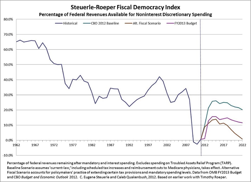
Don’t believe me? Here’s a chart of the Fiscal Democracy Index:

This shows the percentage of federal government spending which is discretionary: that members of Congress can actually control with their votes.

Most interestingly for students in conservative Utah, this is a metric developed at The Urban Institute. That’s a think tank that’s generally regarded as left of the center of the Democratic party. And they have developed a metric of how strictly the hands are tied of people who might actually approve progressive spending ideas.

And this is going to get worse. The real problem is Medicare (the one that pays for the care of seniors), and not Social Security (or disability), Medicaid (the poor), unemployment benefits, corporate welfare, defense spending, or foreign aid. The problem with Medicare is that it’s an open-ended promise to pay for medical care. But, because medical care extends life, it also extends payments.

Friday, August 1, 2014

(Physical) Capital Is Basically Working at Capacity

There’s an unemployment rate for labor. Round it to 6%. That implies there’s also an employment rate for labor that must be 94%.

We measure the same thing for physical capital. But here, the primary measure is called “capacity utilization”, and it’s roughly comparable to the employment rate. Except for one thing: machines don’t starve if they’re not used, so typically the economy gets away with a much lower capacity utilization rate than employment rate.

And right now, capacity utilization is certainly about where it should be in mid-expansion, and approaching the level that we only see near a business cycle peak:

14-07-21, New York Times, Capture of Capacity Utilization Chart

This is from The New York Times. The columnist takes a pro-Democratic position that this suggests that it’s time for firms to start investing in more capital because we’re using everything we’ve got. I can’t disagree with that, although I will note that Democrats in D.C. have been crowing for years about firms needing to invest more, without addressing the question of whether or not they just don’t want to invest because they don’t trust the Democrats to not screw things up. At least that’s what owners and managers say, and I don’t see any reason to disrespect them on this.

Whatever. The chart does show that this expansion is pretty much as good as it gets, and we should stop complaining about it.

Are We At Full Employment?

Republicans would never admit to this.

Democrats would like to believe it’s true.

I’ve made the case repeatedly in this blog that a lot of what we’re seeing right now is that the baby boomers are now in late middle age or the early years of retirement.

Here’s a workup from Idiosyncratic Whisk about what would happen if you adjusted JOLTS data for how demographics have changed since the turn of the millennium due to the aging of the baby boomers.

JOLTS data is a more detailed look at the data than is provided by the commonly trumpeted unemployment rates, labor force participation rates, and raw numbers of the disabled and otherwise out of work. It tracks separate series on the rates of things like quits, layoffs, openings, hires, and separations (a collective measure of people leaving jobs for any reason).

You don’t have to think too deeply to figure out what would happen as people age: quits goes down. Without quits, there aren’t as many openings. Without openings, there aren’t that many hires, and so on.

The point Idiosyncratic Whisk is making is that the economy of 2015 will be one in which the median baby boomer is 60, while the economy of the last great boom we had (in the late 90’s) was one in which the oldest baby boomers were in their early 50’s (and the youngest, like me, didn’t even have kids yet).

What’s the conclusion?

So, the measures, demographically adjusted to compare to the previous recession, give us a picture where Openings and Quits suggest that Unemployment should be nearly 1% lower than it is.  I have separately estimated that about 1.2% of the labor force remain drawn into unemployment because of the unprecedented generosity of Emergency Unemployment Insurance (EUI).

The net result may be that we have a labor market that, for the most part, is operating at full employment.

In sum, the vast majority of the working age population is operating in a full employment economy. But, we add in a small minority that have been offered long-term benefits for being unemployed, and that boosts the rate.

So, for students, if you feel like there aren’t any jobs, it isn’t because the economy sucks. It’s because it’s operating at full capacity.