Thursday, March 27, 2014

Does Income Inequality Matter for the Economy?

The answer seems to be … not much.

… Jencks, a renowned professor of social policy at Harvard, abandoned his 10-year-old project of writing a book about the consequences of inequality on the nation’s health and opportunity, on its politics and crime. Why?

“I came to see a book with six or seven chapters that all said the same thing: It’s hard to tell,” he told me.

What does he conclude from this?

“The most common moral arguments for and against inequality rest on claims about its consequences,” Professor Jencks wrote more than a decade ago. “If these claims cannot be supported with evidence, skeptics will find the moral arguments unconvincing. If the claims about consequences are actually wrong, the moral arguments are also wrong.”

Mr. Jencks describes the state of the debate between friends and foes of inequality in these terms: “Can I prove that anything is terrible because of rising inequality? Not by the kind of standards I would require. But can they prove I shouldn’t worry? They can’t do that either.”

In short, don’t dismiss income inequality as a potential problem, but forget about assuming that it is a problem.

Evaluating Income Inequality and Decoupling

Given the two earlier posts (here and here), we know (roughly) why people get the amounts that they do from employment: that marginal income can’t vary too far from marginal productivity over the long haul.

But the trendy new idea being floated is decoupling. This is the idea that income and productivity no longer seem to be coupled together, with productivity rising at a consistently faster pace than income. Usually this is asserted to be a problem of the last 30 years.

But, we need to do two things to the data before we can talk fruitfully about inequality. First, we need to count all forms of compensation that are paid to labor. Second, we need to deflate that amount appropriately.

This is another situation in which people who want to advocate for a certain position are self-serving in their choice of solution to both problems. Currently, it is activists on the left of the political spectrum who are staking out positions with overly aggressive assumptions about how to address those two problems.

First up is compensation. Employees get paid in a lot of ways: wages, salaries, bonuses, piecework, commission, tips, price breaks on merchandise, and benefits. Benefits is the bugbear here. Most people in America get compensated with a lot of expensive healthcare, and most of them would choose to take some cash instead if given the opportunity. But they aren’t given that opportunity.

Here’s a chart I produced from Table 1.12 from the BEA. Some items are netted out of GDP to arrive at National Income. Compensation, and wages and salaries, are two components of national income.

I apologize for the lack of dates along the horizontal axis: Excel was not being cooperative. This is based on annual data running from 1929 to 2012.

image

The proportion of compensation rose steadily until around 1990, and it has dropped somewhat since then. This is related to the big tax reform passed in 1986: this made it easier for people to be paid with things like stocks and options. That’s something just about everyone wanted: it helps address the principal-agent problem between managers and employees. The thing is, that isn’t counted as compensation. Compensation is fairly regular payments for labor, while financial assets are counted as a form of ownership.

But the proportion paid out as wages and salaries peaked almost 50 years ago. That wedge you see opening up between compensation and wages and salaries is mostly healthcare benefits.

People who want to take the position that income inequality has gotten worse focus on the red line.

The second problem is how to deflate the nominal income data. Progressive advocates tend to argue that we should deflate with the CPI. The pro is that this tracks consumer purchases the best. The con is that it’s constructed with the Laspeyres’ method, which means it always overstates inflation.

That leads to a further problem. If the CPI overstates inflation every period, then the total overstatement gets larger with the passage of time. Thus income, deflated by the CPI, is likely to look most problematic in the most recent years. That’s good if you feel that progressives should be making hay while the sun shines.

I want to state clearly that using the CPI is morally worthy. We should focus sometimes on what consumers can buy with their income. And, while the Laspeyres issue is a big one, recall that the alternatives aren’t perfect. But, using the CPI also requires moral blinkering* about the technical aspects of measuring productivity (discussed in the earlier posts). Since the right income is related to productivity, and productivity is derived as a residual from GDP, the proper thing to deflate income by for this comparison is the same thing that GDP is deflated by, not the CPI. This is further buttressed by our theory of how compensation works: if the compensation decision made by an employer starts with a worker’s marginal revenue product, then what’s called for is a price index that matches up with that revenue, rather than how a worker spends the money derived from that. In short, the moral worth of using the CPI indicates that it should be used for some argument, but not for the one at hand.

Put this together, and advocates for a political addressing of income inequality use wages and salaries deflated by the CPI. The trendy word to describe this is decoupling: the idea that productivity is still growing but that wages and salaries deflated by the CPI are not keeping up.

What you don’t hear about much is what if you used compensation, and deflated with a chained price index. Don Boudreaux and Liya Palagashvili discussed this in a piece in the March 6 issue of The Wall Street Journal  entitled “The Myth of the Great Wages 'Decoupling'”. When you make those two choices, you find no evidence of decoupling.

This is a form of the problem dubbed by Reenan and Pessao as net decoupling. Will Sham, writing at All Different Things defined that as “… the difference between GDP growth per hour and average compensation, with GDP deflator taken into account for both …”, in contrast with gross decoupling: “… the relationship between GDP growth per hour and median worker wages”. Reenan and Passao found that for the UK and the US, like Boudreaux and Palagashvili, that net decoupling is non-existent. But Reenan and Passao also found that gross decoupling does exist.

It’s easy to find people like Sham who are more concerned about gross decoupling (I know nothing of Sham, but I like his presentation of the progressive position on this issue). I think they’re right to focus on the median worker, but I emphasize that this is exactly the sort of comparison we shouldn’t be making with the data we actually have. The reason is that we don’t get median productivity data. By comparing average productivity data to median income data we will always find a problem. By all means we should encourage the creation of better data sets, but without that, I think it’s unethical to answer a question with the wrong data set.

All of these issues, and some additional ones, are covered in The Heritage Foundation publication entitled “Productivity and Compensation: Growing Together” by James Sherk. Do keep in mind that this source is not regarded as politically neutral.

Having said that, I don’t know many macroeconomists that disagree with my central points: 1) use a broad and inclusive definition of income from labor, 2) use a price index relevant to how employers think about all their cost decisions (including labor), and 3) don’t compare medians to averages. By that metric, the overreach of progressives is larger on this issue than most.

* Blinkering is a word I use often when talking about subjective positions in macroeconomics (I learned it long ago from other macroeconomists, and it’s the perfect word for me sometimes). Here’s a picture of blinkers:

The blinkers are the leather patches that limit a racehorses field of vision so that it thinks about only the dimension in front of it. When I talk about people taking positions because they’re blinkered, I mean that they (or someone else) is intentionally restricting their view to encourage that they think along one dimension.

Tuesday, March 18, 2014

A Little Rhetoric

I learned about kairos from colleague Julia Combs a few weeks back.

From Wikipedia:

In rhetoric kairos is "a passing instant when an opening appears which must be driven through with force if success is to be achieved."[2]

Kairos was central to the Sophists, who stressed the rhetor's ability to adapt to and take advantage of changing, contingent circumstances. In Panathenaicus, Isocrates writes that educated people are those “who manage well the circumstances which they encounter day by day, and who possess a judgment which is accurate in meeting occasions as they arise and rarely misses the expedient course of action". [emphasis added]

I write this because I recognize that this is an essential part of teaching macroeconomics. My feeling is that what makes a successful macroeconomist is the ability to recognize a current event as either something we’ve seen before, or something new … and relating that to students.

Friday, March 14, 2014

Why Do We Care About Productivity?

When a manager is trying to figure out how much to pay an employee, the upper bound has to be the employee’s marginal revenue product: how much extra revenue that one employee adds from their production. Basically, the employee's marginal costs can't exceed their marginal revenue product.
But an employee has a lower bound on what they’ll accept for their time. Sometimes this is zero, but typically it’s quite a bit higher than that (we call that a reservation wage). And sometimes a statutory minimum wage is part of the lower bound.
When you combine those two together, for people who are employed, the intersection is a narrow band of possible levels of compensation that both parties will agree to.
To this, we add several other considerations.
First off, employees have a lot more control over their marginal product (how much they produce) than they do over their marginal revenue product (how much what they produce is sold for). Both sides know this, and there’s a (tacit) implicit contract just about everywhere that you get compensated for the typical value of what you produce, and the owner’s handle any risk (upside and downside) involving the revenue.
Secondly, owner’s and employees generally arrange compensation so that you’re the total marginal compensation over a long period of time matches up with marginal revenue product over a long period of time. Then that’s paid out over shorter increments. For example, getting $10/hour doesn’t mean your production in each specific hour is worth $10; rather it means that if we add up your marginal production over many hours, and then divide by the number of hours, that the result is $10.
Tie all this together, and perhaps your marginal revenue product, averaged over many hours, is $20/hour. And perhaps your reservation wage is $15/hour. How much do you end up getting? To the extent that you think that employers can take advantage of employees, you think you’d end up near $15/hour. Alternatively, if you think that employees have a great deal of ability to leave jobs in which the division of gains is unfair (recall the ultimatum game), then you’d think you’d end up near $20/hour.
Assessing this relationship is a key to understanding how political opponents view the labor market.
But, there’s two problems. First, the theory says we need marginal product for individuals, but what we have is total factor productivity — a form of average product for a country. It’s easy to find an average wage for a country. But this brings up the second problem: both marginal and average product are real, while wages are nominal. So we have to filter those nominal wages with a price index to get to real wages. The first problem means that our comparison is less than perfect, and the second one means that it can be manipulated to satisfy non-economic ends.

How Do We Measure Productivity (and Technology)?

Productivity of people is hugely important to human society, and a major focus in macroeconomics.
But it can’t be measured directly.
When we measure it indirectly it’s called total factor productivity. It gets this name because it’s from all factors of productivity totaled together: we can’t really break down which factors are getting more productive.
We measure total factor productivity as a residual. This means that we net out other stuff that we understand, and what’s left over must be productivity (or something close to it).
So, we start with real GDP. Then we subtract out the effect of labor. We can measure people working really well, and the hours they work pretty well. Measuring the differences between individuals is really hard.
**************
DIGRESSION: What’s critical for a follow-up post is that we’re dealing with aggregates. This means that we can get totals, and from those we can get per capitas. That’s a form of average productivity. But we can’t get the marginal productivity that we really need to know to apply our theories properly. And we can’t get productivity on an individual basis to assess how accurate the average productivity is as a summary of what individual people do.
**************
Then we subtract out capital, which is a little harder. Counting physical capital is pretty easy, and assessing the utilization rate of it is a bit harder. Again, we run into the problem of measuring differences in productivity between different models, makes, and vintages of machinery. We run into the same problem with human capital, like education and learning-by-doing. And it gets worse with social capital, like legal and regulatory enforcement.
When we’re all done with that, what we’re left with is a residual called total factor productivity. Roughly, this is a measure of technology, or at least the effects and usage of technology.
Do note that we can’t separate out types and vintages of technology either. So this is a mix of high tech, like iPhones, and low tech, like freedom of association.

Thursday, March 13, 2014

Tips 4 Economists

I’ve had a lot of students ask me about graduate school this year. This site is for you: Tips 4 Economists.

Larry Summers on Why Austerity Might be a Bad Idea

“Austerity”, as currently used, is the meme that the problem with developed economies is that governments spend too much. It’s essentially anti-Keynesianism: government spending and GDP go in opposite directions.

To the public, particularly conservatives, this is a trending idea. Macroeconomists aren’t necessarily against it, but you have to make an awfully convoluted theoretical argument to justify the position (i.e., it fails Occam’s razor).

Here’s Summers again … so this is coming from the moderate Democratic viewpoint. It’s a long piece, but should be digestible for undergraduates:

… It has now been nearly five years since the trough of the recession in the early summer of 2009. …

The record of growth for the last five years is disturbing, but I think that is not the whole of what should concern us. It is true that prior to the downturn in 2007, through the period from, say, 2002 until 2007, the economy grew at a satisfactory rate. …

Did it do so in a sustainable way? …

It is fair to say that critiques of macroeconomic policy during this period … suggest that … fiscal policy was excessively expansive, and that monetary policy was excessively loose.

As a reminder, prior to this period, the economy suffered the relatively small, but somewhat prolonged, downturn of 2001. Before that, there was very strong economic performance that in retrospect we now know was associated with the substantial stock market bubble of the late 1990s. The question arises, then, in the last 15 years, can we identify any sustained stretch during which the economy grew satisfactorily with conditions that were financially sustainable?

Part of me agrees with this. And part of me thinks we need to be very careful about how we select our samples: no one was saying any of this looked bad in 2007.

Then Summers does a thought experiment: what sort of underlying problem would cause this sort of behavior:

… I would suggest that in understanding this phenomenon, it is useful at the outset to consider the possibility that changes in the structure of the economy have led to a significant shift in the natural balance between savings and investment, causing a decline in the equilibrium or normal real rate of interest that is associated with full employment.

Let us imagine, as a hypothesis, that this has taken place. What would one expect to see? One would expect increasing difficulty, particularly in the down phase of the cycle, in achieving full employment and strong growth, because of the constraints associated with the zero lower bound on interest rates. One would expect that, as a normal matter, real interest rates would be lower. With very low real interest rates and with low inflation, this also means very low nominal interest rates, so one would expect increasing risk-seeking by investors. As such, one would expect greater reliance on Ponzi finance and increased financial instability.

I’m not sure I agree with the logic laid out here, but I’d be the first to argue that we have a lot of wealth around, and that the middle of the investing market has disappeared: everyone wants both low-risk for part of their portfolio, and absurdly high returns for the rest. To get the latter, why not just invest in Peru? There’s a lot of places like Peru that could use the investment, but not enough people are doing that. This is … weird … the world has more money to blow than it’s ever had, and people are unwilling to take a flyer on investing in physical capital projects in places that need them the most.

Recall that real interest rates — what lenders expect to get in real terms at the time they make the load — are not observable. So why does Summers think they’ve dropped? He gives 6 reasons:

  1. We don’t need as much debt finance, due to over leverage, tightened regulations, and the proliferation of new ventures (like WhatsApp) that require very little capital.
  2. It’s an old macro result, but it’s well accepted that real interest rates can’t stray far from population growth rates … which are in decline everywhere.
  3. Worsening income inequality and economic growth mean we have a lot more savings combined with a lot less need to earn high returns on those savings.
  4. We don’t need to borrow as much because all forms of physical capital have gotten a lot cheaper.
  5. We pay taxes on nominal interest rates, but get real rates by subtracting expected inflation from nominal rates. With low nominal rates, this means that real rates can hit zero for even very low expected inflation rates.
  6. Everyone wants “safe” assets, rather than even low-return assets: but all those T-bills are funding borrowing that probably isn’t very productive.

From Summers’ moderate Democratic perspective, he recommends three things:

… The first is patience. These things happen. Policy has limited impact. …

I would suggest that this is the strategy that Japan pursued for many years, and it has been the strategy that the U.S. fiscal authorities have been pursuing for the last three or four years. …

A second response as a matter of logic is, if the natural real rate of interest has declined, then it is appropriate to reduce the actual real rate of interest, so as to permit adequate economic growth. This is one interpretation of the Federal Reserve’s policy in the last three to four years. …

This is surely, in my judgment, better than no response. It does, however, raise a number of questions. Just how much extra economic activity can be stimulated by further actions once the federal funds rate is zero? What are the risks when interest rates are at zero, promised to remain at zero for a substantial interval …

… There’s also the concern pointed out by Japanese observers that in a period of zero interest rates or very low interest rates, it is very easy to roll over loans, and therefore there is very little pressure to restructure inefficient or even zombie enterprises. …

The preferable strategy, I would argue, is to raise the level of demand …

Anything that stimulates demand will operate in a positive direction from this perspective. Austerity, from this perspective, is counterproductive unless it generates so much confidence that it is a net increaser of demand.

His conclusion is that we need more Keyensian expansionary fiscal policy. Interestingly, he supports this view with an “old school” econometric model, rather than the DSGE models (discussed back in January) that would be better suited to this task.

Wednesday, March 12, 2014

Potential Output Revised Downwards

Potential output is a useful thing to know. But, of course, it can’t be known … only estimated (we don’t go in to how you might do this in this class).

Not everyone produces a potential output number, but the Congressional Budget Office (CBO) does.

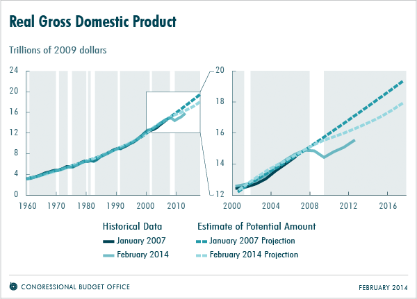
Real Gross Domestic Product

And, they’ve revised growth in potential output downward. What this reflects is their considered opinion that part (perhaps most) of what the U.S. economy has experienced over the last 7 years is permanent rather than transitory.

Perhaps surprisingly though, about 65% of the reduction is actually an adjustment reflecting overestimates of growth trends in earlier forecasts. Basically, they assumed that weakness they’d been seeing in growth rates for factors of production for a few years before 2007 weren’t temporary blips at all.

And, about 40% of their downward revision is attributable to one factor: declining participation in the labor force. I’ve argued before that we’re in a descent for that variable that predates the Great Recession (heck: it even predates the recession before the last one), and which we expect to continue for another 10 years or so.

============================================

It’s useful to think a little bit about how dynamics (of any process) have to work.

If potential output is the target, it’s a moving target. As you approach a target, you need to slow down. This also implies that you’ll go faster when you’re further away. This means that your path as you approach the target is curved: heading right towards it when you’re far away, and drawing parallel when you’re close.

DIGRESSION: note that I’m just going through the math. I’m not sure the economy has a target at all. If it doesn’t, then this is all moot. But if it does, then we need to think about how the math will work.

Part of our understanding of recovery in the wake of the Great Recession is conditioned by this. If potential GDP is a target that the economy approaches, and if it’s stationary, then we should have grown faster right after the trough. You know … approach fast, and then slow down when you get close. And if we had a big recessionary gap, we should’ve grown really fast.

But, we didn’t. This is part of the basis that a lot of people have for thinking the economy isn’t recovering well: it should be getting back to the target more quickly than it is.

Unless the target got closer to us. If the target got closer, we’d need to slow down earlier.

When you look at the panel on the right above, you don’t see that curvature of approach to the darker dashed line. Now, it’s really easy to say there’s something wrong with the economy when you see that. But what most people fail to recognize is that it also means something is goofy about the math. Think about that: a lot of people say the economy is all Obama’s fault, but no one is saying “And, oh yeah, Obama’s so omnipotent that he can also goof up the mathematics of approach to a moving target.” They don’t say that because it’s ridiculous. But, perhaps that means the whole “It’s Obama’s fault” position is ridiculous.

ANOTHER DIGRESSION: I’m not saying it isn’t Obama’s fault. What I’m saying is that there’s a set of 3 ideas that go together: 1) the economy’s approaching a moving target, 2) Obama is holding us back, and 3) he’s not only screwing up the economy but he can change how the math works too. It’s that combination of 3 things that’s ridiculous. But if one of them is wrong, then we’re OK (even if we don’t have a firm answer yet).

Now look again at the lighter dashed line in the panel on the right. The perspective is upside down, but relative to that dashed line, the economy is on an approach path consistent with the math. So, in some sense, the revision to potential GDP makes the experience of the last 5 years more consistent with how the math needs to work.

And this changes the question we need to ask as macroeconomists. It’s not how and to what extent recent policies have affected current GDP and growth, it’s why recent policies have caused potential output to change. That’s not the biggest component in the table in the source article, but it’s still the second biggest one. Plus, perhaps there are some policies that have reduced the second column too, above and beyond the demographics.

Sex, Drugs, and Guns

It’s from The Urban Institute, so it’s not an official government number, but there’s now limited data on the scope of the 3 major underground industries for a selection of U.S. cities.

The data shows that these are under 0.2% of GMP for the cities.

Fiscal Condition of the States

You can go to this site for the 4 sub-charts, and one overall summary chart, of the fiscal conditions of the 50 states.

Utah does OK: two rankings of 5th, an 11th, and a 20th, for an overall ranking of 11th.

What are the worst states? New York, California, Massachusetts, Illinois, Connecticut, and New Jersey.

Do keep in mind that this was produced by the Mercatus Center. This is an offshoot of the economics department at George Mason University. This department is known for being libertarian/conservative.

In doing rankings like this, it’s possible to show that the numbers, by themselves, are meaningless. It’s a degrees of freedom problem: there aren’t enough observations to actually estimate the summaries produced. So, instead, the authors have to input their own weights (they may try to be unbiased). Critics may say that their biases are showing, and they have a reasonable position (although their biases may be showing too).

I tend to agree with stuff put out by the Mercatus Center, but you don’t have to.

Tuesday, March 11, 2014

Do People with Jobs Think the Labor Market Is Tight?

I’m not sure about tight, but people with jobs definitely think the labor market is behaving normally.

Evan Soltas looked into this.

There’s a common argument that the labor market is a lot looser than the unemployment rate would suggest: loose in the sense that there’s unemployed people all around that are a good fit for a job.

The current unemployment rate of around 6.5% isn’t great, but it isn’t that bad either … especially considering that we’re riding down a demographic wave* in which our population is, on average, less likely to be working.

If the labor market was loose — so that people were really worried about losing their jobs because the slack would be taken up by someone else — then they’d be less likely to quit. Here’s Soltas’ chart:

The market would be loose if the red dot was below the blue cloud of points. It isn’t. This suggests that the labor market is behaving normally … and is not loose, as many would have you believe.

Now, we don’t know the “right” level of unemployment: it’s been lower than this quite a bit over the 2001-13 sample shown here, but that was when we were higher on the labor participation wave than we are now. But, if we move to the left, we should also move up. Perhaps I’ll come back and reexamine this data with next year’s class.

Via EconLog.

* I found out something interesting reading a novel this past winter. The word I want here isn’t wave at all, it’s scend. The wave is the water. The scend is what something on the water does when the wave passes. That’s where ascend and descend come from: the ship’s deck ascends and then descends as the wave passes by (note that we don’t “awave” and “dewave”). Anyway, I still used wave here because clearly that’s the word we use in 2014.

Monday, March 10, 2014

Status

Income inequality is quantitative. But what if you just asked people about their perceptions of their own status?

The General Social Survey has been asking people for decades whether they feel they are in the lower class, working class, middle class, or upper class.

Bryan Caplan, writing at EconLog, reports that there is a downward trend in how people view their status (this is in spite of the huge absolute gains in per capita real income over this period).

He doesn’t provide (enough) details on his estimates (for me). But, he summarizes his results this way:

The last equation implies that from 1972-2012, achievement-corrected status fell by .14.  That's larger than the status gain people get when their income doubles.

Translated: people feel their status is lower in 2012 than in 1972, and you’d have to double the income of everyone to make them feel better about themselves.

Professionally, I’m not sure what to make of that result.

Personally, I think this solidifies the case that Americans increasingly have … ridiculous expectations.

Sunday, March 9, 2014

A Scorecard for Monetary Policy

People worry too much about the details of Fed policy, and not the results.

James Hamilton, writing at Econbrowser, discusses a monetary policy conference that all the bigwigs went to.

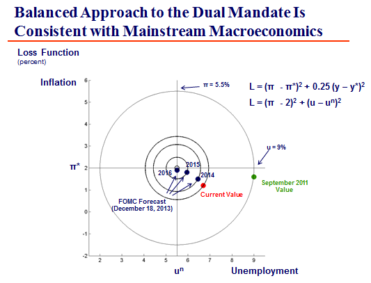
At it, Charles Evans (president of the FRB of Chicago) produced the chart below. Charles Plosser (president of the FRB of Philadelphia) concurred, but argued that the bullseye is a lot fatter than a single point. I don’t know what he meant, but I’d be comfortable with the second smallest ring.

Source: Evans (2014).

N.B. I’ve told you before that Hamilton is a big name in time series macroeconomics. Plosser is also huge, but mostly as a theoretician. Evans is also a name guy, but not quite as well-known as the other two.

Was the Great Recession an AD or AS Shock?

I’ve tooted Casey Mulligan’s horn quite a bit this semester. Mulligan is a new classical macroeconomist: everything is about supply rather than demand.

Here’s an alternative viewpoint from Menzie Chinn, writing at Econbrowser.

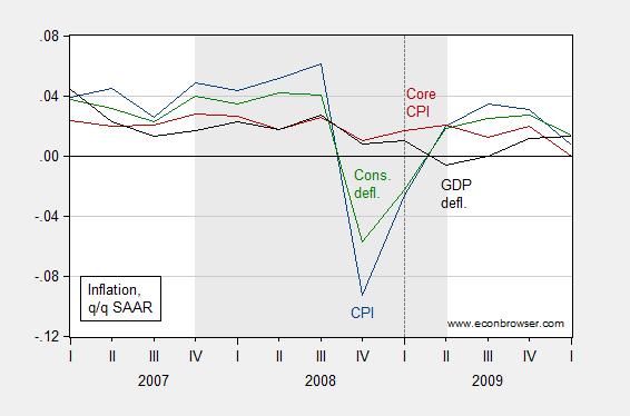
Chinn’s position is pretty simple. If AS shifted left, real GDP would go down, but prices would go up. If AD shifted left, both would go down.

Y’all should be familiar with how real GDP has behaved, so here’s Chinn’s chart of prices:

greatrecession2

I think Chinn is right: what happened in late 2008 and early 2009 was a shift of AD to the left. An appropriate response to that is expansionary fiscal and monetary policy: like the Bush or Obama stimulus packages, or the various monetary policy programs that have been pursued.

But, I also think Chinn has oversold his case. We have had weak real GDP growth for throughout an expansion that is approaching its fifth birthday. This has not been accompanied by falling prices. To me, this means that Chinn may be right about 2008-9, but that Mulligan may be right about 2009-2014.

Are the White House Growth Forecasts to Optimistic?

Maybe a little bit, but not by enough to be concerned.

This is discussed by Menzie Chinn, writing at Econbrowser. This is a good post for a macroeconomics student starting to do time series.

Chinn is a much better macroeconometrician that I am; but my approach would be the same: estimate an ARIMA regression and compare the White House forecasts to it.

We’re not going to go as far as an ARIMA model in class. ARIMA’s have 3 components: autoregressive (the AR), integrated (the I), and moving average (the MA). We will start doing AR regressions with Case 2 in the text. Then we do an I regression with Case 4, and an ARI regression with Case 5. Each of those is followed by a number that roughly indicates the complexity of the model. We do an AR(1), then an I(1), then an ARI(1,1). Chinn does an ARIMA(1,1,1). So his results are one regression past what you’ll be doing on homework towards the end of March.* Chinn, or me, or any Ph.D. doing time series could come up with a more complex regression, but the message you need to take away is that at the top levels we find ARIMA regressions to be quite satisfactory … and producing them is a good skill for you to carry away from this class.

What the White House (and CBO) does is announce point estimates of growth rates. They probably could produce interval estimates, but they don’t announce these. A TV weatherperson thinks the public is smart enough to consume interval estimates, but D.C. does not.

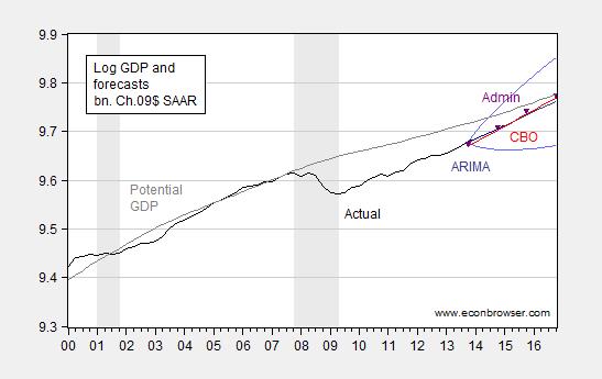
Anyway, Chinn uses his ARIMA(1,1,1) to produce a point estimate too. But he also know that the probability of that point estimate getting an exact hit is essentially zero, so he doesn’t bother showing it. Instead, he uses it to produce a 95% confidence interval (we’ll just do point estimates in class). Here’s his chart:

comparefinal1

It’s a bit hard to make out his colors and symbols. His 95% confidence interval is the two curves on the top and the bottom at the right that produce a widening range. That’s what his regression says is likely over the next couple of years. The point estimates from the White House are the black triangles, and the CBO point estimate is the (slightly different) red line.

Basically, the White House (and CBO) point estimates are pitched right down the middle of what’s likely. The White House estimate is a tiny bit higher … but still right down the middle. From this, it’s reasonable to conclude that the White House is not being overly optimistic.

Now, one thing Chinn doesn’t discuss is his potential GDP estimate. Note that he’s got the gap between actual and potential GDP closing.  Further, his potential GDP arcs downward a little, rather than growing at a constant rate. So, Chinn is definitely assuming that there has been some sort of structural slowdown in the U.S. economy, and that relative to that, we’re doing a good job of closing off the gap. That’s a decidedly pro-Democratic view: his potential GDP starts curving around 2003, so he’s definitely saying something went wrong 10 years ago (when Bush was in charge), and that it isn’t fixed yet. Perhaps he’s right … but he is assuming that position, rather than defending it. I don’t think you should judge him harshly on that (I’m not sure he isn’t right) … but I do think I’m supposed to train you to spot that sort of thing.

* FWIW: You really can’t do an MA in Excel, so if I were to take you that additional step, we’d need to use some more serious stats package like R or gretl. That’s not a huge hurdle, but big enough to push it beyond the scope of this class.

Tuesday, March 4, 2014

Kudos for Kyle Bishop and SUU

My co-author, Kyle Bishop, got featured on the front page of The Wall Street Journal today.

Kyle Bishop figured it was risky when he applied to a University of Arizona Ph.D. program in English eight years ago by proposing a dissertation on zombie movies.

He was dead wrong.

The program approved Mr. Bishop's proposal, and he is now chairman of Southern Utah University's English department. …

Later, the article discusses other academics working on the undead, including:

Other collections due this year include "Economics of the Undead," which co-editor Glen Whitman, a Cal State Northridge economics professor, says "raises issues of the use of resources" in an apocalyptic event. The work is academic, he says, but might draw readers "with a casual interest in economics."

Kyle, my wife Mary Jo, and I authored Chapter 6 in that book (entitled “What Happens Next? Endgames of a Zombie Apocalypse”). It comes out in a couple of months.

Read the whole thing entitled "Zombie Studies Gain Ground on College Campuses" in today’s issue of The Wall Street Journal

Sunday, March 2, 2014

One More Bit About Obamacare Being Forecast to Cause a Drop In Employment

It took me a while to digest these ideas too. There’s a very big picture here, so bear with me.

Scott Sumner, writing at EconLog, asks why expansions feel good and contractions don’t?

Your first instinct, and mine, is to say “Duh”.

Like I said, it took me a while to digest.

First off, Keynesians argue that both expansions and contractions are less than optimal. Why is that so? In both, we have a tradeoff of labor for leisure. In expansions, we use too much labor and consume too little leisure. The end result, if left unchecked, is inflation. In contractions we use too little labor, and consume too much leisure. The end result, if left unchecked, is persistent and involuntary unemployment. Keynesians, in arguing for demand management policies, target just the right amount of employment, typically known as the natural rate.

Fair enough. Then why do expansions feel better? One explanation might be that we get more utility out of the consumption we buy with our labor, than the leisure we might consume instead. Decisions in most peoples’ personal lives tend to confirm this. Turning this around, it means that booms make us happier because most of the time we can’t work as much as we’d like to. I know that sounds weird, but when was the last time you stopped to smell the flowers?

Why might that be so? Now we switch over to micro, to think about the distortions from taxes. One of the important points of micro is that a tax on either suppliers or demanders will lead to a deadweight loss. One way to theoretically justify the empirical observation that expansions feel better is to argue that we have deadweight losses everywhere, and expansions go some way towards replacing the stuff we might have gotten otherwise.*

Next up, note that a tax that falls on someone else will create a deadweight loss in their market, but to you in your market this will feel like a negative externality. Can that negative externality affect your decision-making? Yes, of course. And can you respond optimally to that externally? Again, yes, of course.

But, do you have some inalienable right as a human to not be inconvenienced by externalities? Again, I think the answer is yes. I’m not claiming that you can realistically avoid those externalities, or that you shouldn’t behave optimally in response to them, but it’s the role of society to make sure they’re minimized.

I said it’s a long way round to the big picture, and here it is. Liberals/Progressives/Democrats are claiming that the forecast job losses from Obamacare are an optimal response to changing circumstances. That is a microeconomic argument that you’ll respond optimally to an externality. It ignores the macroeconomic argument that society has a responsibility towards the individual to reduce externalities.

Instead, the Liberal/Progressive/Democratic argument that the forecast job losses are OK ignores the macroeconomic distortions that lead to the microeconomics externalities. This is nonsense.

I’m still willing to countenance the argument I made in an earlier post that Obamacare is shifting us from one distorted labor market to another. But I think Sumner has made the strongest argument I’ve seen yet: it is incumbent upon Liberals/Progressives/Democrats to prove that the forecast job losses result from distortions in the earlier healthcare system that led to too much work being done … say, something like at least half of the forecast lost jobs.

And quite simply, I don’t think anyone can make the argument that the earlier healthcare system was creating deadweight gains leading to something on the scale of like 1.5 million or more extra jobs. My heck ;) even the Republicans never made a claim that outlandish.

Folks, it was the ninth inning of the seventh game of the World Series, the bases were loaded with two outs, and Sumner just threw a strike. And Liberals/Progressives/Democrats are arguing that it doesn’t count because they didn’t swing at the pitch.

* Do note that we could also say that subsidies lead to deadweight gains. But this can’t be a big effect: no one is really worried that subsidies outweigh taxes.