Friday, January 27, 2017

Real GDP Growth for 2016 IV

The advance (first draft) news release comes out the last Friday of the month following the end of the quarter, around 6:30 Eastern time: so, early this morning.

The growth rate for that quarter was 1.9%. Positive, but not good.

Considering the population growth rate in the U.S., I typically assert that we have to exceed 2% to feel good about the economy. So we missed that.

But, this is just a quarter, and we also can’t really feel these things until we string a couple of quarters together.

That’s exactly what we’ve been doing, and that’s why we feel that the economy is underperforming. We did not reach 2% for 2016 as a whole, and we’ve missed that mark a few times over the last decade.

It used to be that real GDP growth for the U.S. averaged about 3.3% per year. But we have not hit that rate since the middle of the second term of Bush II.

In other posts from past years I argued that about half of the shortfall appears to be demographic in nature. The baby boomers are starting to retire in big numbers, and you’ve got to account for subtracting those people out of the labor force. This is because overall real GDP growth comes from the sum of growth of labor, growth of capital, and growth of technology. If the first one is lower, the whole sum will be lower.

The other half is more troublesome though. We seem to not be getting the growth from capital and technology that we should be. Is that because we’re not doing enough with what we’ve got, or is it because there’s something wrong with the capital and technology we have? No one is quite sure.

Now, something like half the country thinks we should blame Obama for this. Fair enough. Everyone is entitled to their opinions, but if we’re being serious about macroeconomics we have to support those opinions. So, an acceptable theory for a macroeconomist that leads to the conclusion that “it’s Obama’s fault” has got to include one or more of the following:

  • We have enough capital but something is discouraging us from using it.
  • We have better technology but something is making us stick with the older and less productive technology.
  • We’re investing in capital, but it isn’t the right capital.
  • We’re creating new technology, but it isn’t that useful.

Justifying any of those positions is tougher.
Wednesday, January 25, 2017

One Opinion About Why Politics and Economics Seems All Goofed Up, Both In America, and In Other Developed Countries

I am mostly posting about this article for the graphs (that I’ve pasted below). The source article itself is not required, but it may interest some of you.†

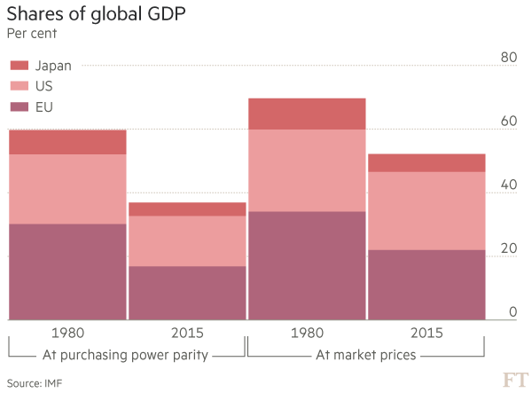
This is a useful chart (although it’s not really saying too much):

https://www.ft.com/__origami/service/image/v2/images/raw/http%3A%2F%2Fcom.ft.imagepublish.prod-us.s3.amazonaws.com%2F5095fbe2-d348-11e6-9341-7393bb2e1b51?source=next&fit=scale-down&width=600

In the U.S., where we think we’re the center of the world, we sense that the rest of the world is catching up to us … and because we think we’re the center of the world we tend to infer that means we’ve done something wrong or someone else has cheated. This chart shows that, if anything, the U.S. has maintained its share of the world economy over the last 35 years. It’s the EU and Japan that have faltered. Obviously, that’s not what Trump would say. But interestingly, it’s not what Obama would have said either (recall that he readily admitted that he wanted the U.S. to be more like Europe).

This chart is not that useful:

https://www.ft.com/__origami/service/image/v2/images/raw/http%3A%2F%2Fcom.ft.imagepublish.prod-us.s3.amazonaws.com%2F53927fb4-d348-11e6-9341-7393bb2e1b51?source=next&fit=scale-down&width=600

This is an example of a bad chart because the scale is not logged. GDP per capita is one of those series that grows through compounding, so if it’s not logged … beware. The reader will have problems with any comparison made from this chart, but I’ll focus on the U.S. versus Japan. Towards the right, it looks like Japan is close to the U.S., but not that close. So then there’s a tendency to follow the lines to the left and think … oh … Japan is just as far behind as they ever were. But that’s not the case if you think of it terms of multiples: on the left the U.S. GDP per capita is perhaps 5 times Japan’s, but on the right it’s more like 1.3 times as big. That means Japan has improved a ton over the 65 years shown.

It’s worse if you’re focused on China. How accurate is your estimate of how much bigger America’s GDP per capita is than China’s on the left of the graph: that could be 10 to 1, or even 20 to 1. Who knows, right? That innaccuracy arises because this data isn’t logged.

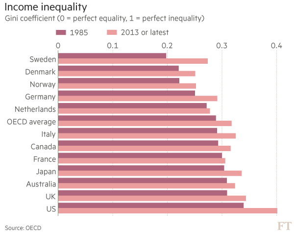
It’s also very trendy to focus on income inequality. In the U.S., we think about this through the filter of Democrats and Republicans, and just having had 8 years of Obama, and a recession and financial crisis that has been largely blamed on “the rich”. Fair enough. But at this level, we need to go look at data, and here’s a chart of the primary measure of income inequality:

https://www.ft.com/__origami/service/image/v2/images/raw/http%3A%2F%2Fcom.ft.imagepublish.prod-us.s3.amazonaws.com%2F5496348c-d348-11e6-9341-7393bb2e1b51?source=next&fit=scale-down&width=600

The most striking feature of this is that inequality has gone up in every single one of the developed countries shown here. So any explanation of that must focus on something global rather than national. This means that this Democratic/Republican thing that we have going on in this country — that mean Republicans are taking all the money — just can’t be right. One might argue that this is due to increasing political conservatism around the globe. I’m not going to go into the details, but I’ll warn you not to go there: the data doesn’t support that either.

More broadly, in social sciences, we call explanations like that political one “just-so stories” after the Kipling children’s book. They’re too easy to explain, and not thoughtful enough. Macroeconomists have to deal with a lot of those.

So, for income inequality, we need a story that works in all the richer countries without referencing which party is in power at a particular time. Macroeconomists don’t have great answers for this question yet, but we’re looking at whether the sort of technological advances we’ve seen over the last few decades lead to uneven gains in income. For example, if having Facebook is a good thing, we might have to put up with Mark Zuckerberg getting rich from it.

Stretching further, another possibility that I’ll consider in more posts later in the semester, is that increasing inequality in richer countries is related to decreasing inequality across all countries. One of the weird things about these debates is that while we’re all concered about local inequality within our country, globally, the inequality between countries is much larger. But now we run into a moral issue: global inequality is a bigger problem but it’s improved drastically, yet we’re focused on local inequality (which has gotten worse) even though it’s a smaller problem. That’s twisted. An explanation that ties the economics together is that perhaps the trade that’s making the poor richer globally is more tightly linked to the rich rather than the poor in developed countries. There’s some evidence to support that; but this bugs people because it means that policies to beat up the rich in developed countries to help the local poor are hurting the more numerous and worse off global poor.

These are drawn from an article from Financial Times entitled “Martin Wolf: The long and painful journey to world disorder”. Martin Wolf writes a regular column about economics; his stuff is generally well-informed, so if you see his name outside of class consider paying more attention.

† The source article is from Financial Times, a British newspaper similar to The Wall Street Journal. Typically, Financial Times requires a registration to view articles. I recommend that you go ahead and do that. Of all the publications I read/view, the Financial Times is the one that seems to have never, ever, done something I don’t like with my personal information, or sent me spam.

OPTIONAL: Tyler Cowen Thinks We Should Wake Up to the Misdirection

Is Trump playing liberals for fools?
Maybe.
Trump specializes in lower-status lies … The lie needs to be understood as more than just the lie.
… Long-term credibility does not need to be maintained. Once we get past blaming Trump for various misdeeds, it’s worth taking a moment to admit we should be scared he might be right about that.
… The Trump administration trusts neither its own appointees nor its own supporters, and is creating a situation where that lack of trust is reciprocal. That is of all things a strategy for getting things done …
Yikes.
This is just Tyler’s opinion, but he thinks on way more levels than I do.

******************************

OOPS! You do not have to read this post.

I use one software (OpenLiveWriter) to write blog posts for multiple blogs. Above the line is a post I wrote for, and did post to, my non-academic blog voluntaryXchange. But I also clicked the button to post it here too. Unfortunately, it's 2017, and with social media, once something gets posted, it's hard to undo, and easier to just apologize. So ... sorry about this.

You're welcome to go read that blog if you like, but it isn't required. If I really want you to read something it's here on the class blog.

Please note that this post is paired with the one that immediately precedes it on that blog. So, if you do read this, go read this other one too. I'm not pro-Trump, but I'm trying to figure out how this is all going to pan out. I'm warming to the viewpoint that if he's crazy, he's "crazy like a fox"

Monday, January 23, 2017

Economic Complexity

Jonah brought up something after class on Friday: he’d read that Japan had the most “economically complex” economy. And he wanted to know what that meant. I only knew a little, but I read up on it over the weekend.

*****************************************************

Digression

You may have noticed that elected governments aren’t always very good at doing their jobs. There are many reasons for this.

One dimension of this is that they’re not always very good with their macroeconomic data. Like most organizations, they’re better at counting what they think they’re supposed to, rather than trying to figure out what they should count.

Take GDP for example. It was designed to measure an economy in an era when we made things that could be counted or maybe weighed: steel, cars, cattle, and so on. It doesn’t do very well with valuing many newer things we take for granted: reruns of TV shows, increasing leisure opportunities, tweeting, etc.

This is a particular problem when macroeconomists start to think that maybe the data is too tightly tied to a particular theory. If we decide the theory isn’t quite right, what do we do with all the data we gathered and spent money on? In macroeconomics, we wonder whether GDP is too closely tied to the Keynesian model (they were both developed from the 1920’s to the 1940’s). But now we mostly do growth models (developed from the late 1950’s onwards) that tell us we ought to measure things differently. But it would be prohibitively expensive to start over again.

*****************************************************

So economists at big name schools do research and get funded grants to create newer and better data sets. We saw a little bit of this in the Barro text: he includes “unofficial” real GDP numbers that macroeconomists are comfortable with, but which government data sources (like the BEA) don’t even acknowledge exist.

One of these is “economic complexity”, which was developed about 10 years ago. The idea is that richer economies do two things that poorer ones don’t.

First, they produce more goods. Richer economies are more diversified.

Second, some of the goods richer countries produce aren’t made anywhere else yet. The word they use for this is ubiquity. Basically, you can’t get very rich if you make something that’s ubiquitous.

There are rankings of economic complexity available. Not surprisingly, countries with big GDP’s rank near the top, but it’s mostly a matter of GDP per capita. So this is how rich residents are rather than how big the country is. Japan ranks the highest, while the U.S. is fifth. Large but poor countries, like China, are not near the top of the list: the stuff they make is too ubiquitous. Anyone can make that stuff.

This map and graph is one image that I copied from Wikipedia.

One cool thing about economic complexity is that it ranks countries that do a lot of resource extraction fairly low. Those economies do well when resource prices are high, but they crash when resource prices are low. These are in the lower right of the chart, and include most of your oil producing countries, but also places like Canada, Australia, New Zealand, and Norway.

One thing I don’t like about economic complexity is that it is built on this fetish we have with transactions that cross international borders. This works to the disadvantage of large countries with few neighbors, like the U.S. Products that we make that are not ubiquitous, and which may be traded across thousands of miles within the country … will not get counted at all by this measure if they aren’t traded outside the country. For example, Nielson’s Custard might be unique, but if it only gets “exported” a 200 miles down the road in Idaho, it doesn’t get counted in economic complexity. But if, say, a small Belgian brewery makes a lambic (a regional specialty) that gets sold 20 miles down the road in France, it does count as economic complexity. I don’t have a solution for this problem, so this is just a caveat.

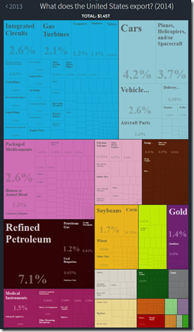
Having said that, we can see in these graphics from the Observatory of Economic Complexity that the U.S. exports a lot more variety than China does (both more colors and smaller blocks):

US Economic Complexity Capture China Economic Complexity Capture

Wednesday, January 18, 2017

The Corporate Cash Fantasy

U.S. corporations are “sitting on a lot of cash”. This has been a common refrain for a couple of years now.

What is meant by this is that the balance sheets of corporations are composed of assets and liabilities, and that currently the proportion of those assets held as cash is relatively large.

People view this as a problem because cash isn’t much of an investment. Economic growth comes mostly from productivity improvements, those come from investments, and we’re not investing as much as we could or should. Or so the story goes.

The fantasy is in two parts.

Democrats assert that corporations are holding out until Republicans are voted into power at the national level. Basically, that Republicans are mean.

Republicans assert that corporations are holding cash because they dislike the actual policies of the Democrats, and are holding out until Republicans are voted into power at the national level. Basically, that Democrats are stupid (or more diplomatically, that they should know better than to make poor policy choices and then blame others).

When thinking about policy, you should learn that it's a red flag when opposing parties think their problems can be solved in different ways, but are unified in both blaming the same third party.

*****************************************

Digression:

Do note that this is related to, but not quite the same as, concerns that American firms are holding a large proportions of their recent profits outside the country, and that these can be, will be, or should be, repatriated back into the U.S.

The reasons for that have a lot to do with tax systems requiring periodic reform, and the American tax system not having been updated as recently as many other countries. This has left us with both relatively higher corporate tax rates, and a bizarre system in which profits left overseas are taxed once, but taxed twice if they're brought back home.

But again, views on that commonly devolve to "Republicans are mean" and "Democrats are stupid".

*****************************************

These positions run into 2 problems when we look at the data.

The first problem is that the run up in corporate cash mostly occurred in 2000-4. Check it out:

CampelloSummary


(I could not position this chart properly. Not sure why).

Anyway, it's pretty clear from the blue line that corporate cash was lower in the 90's, went up by 2005, and then stayed there. We're not quite sure what the reasons for that are. What should be clear is that it isn't about Democrats and Republicans, or the performance of the economy over the last 8-10 years. The reasons have to do with corporate finance, and it's not required but if you want to learn more I drew this chart from Campello's "Corporate Liquidity Management" article.

There's an additional minor side point now that you've seen the graph. Both parties are attributing current weakness, in part, to corporate cash holdings. But then neither one can explain why things didn't start getting bad in 2000-4 when they were accumulating all that cash.

The second problem was noted by Summers in that article I quoted last week:

He also dismissed the idea that tax policy aimed at encouraging US companies to repatriate cash held overseas would provide a big boost to the economy. Trump had repeatedly championed this idea along the campaign trail.

"The vast majority of the companies who have large overseas cash also have substantial amounts of domestic cash," Summers said. "The reality is that cash that's brought home will be used to pay dividends, to pay back shareholders, to buy back shares, to engage in mergers and acquisitions, to rearrange the financial chessboard, not to invest in large amounts of new capital. It is a chimera to suppose that there will be large increases in capital investment as a consequence of that repatriation."†
Basically, firms could spend this cash on a lot of stuff, but what they're choosing to do is spend it on their own savings accounts. Can you imagine if both Democrats and Republicans went around saying that the problem with America was that people like you and I saved too much for a rainy day? We'd recognize that quickly as nonsense. But they point fingers at firms doing the same thing, and many people suspend any sense of reasonable suspicion.

The upshot of all this is that both Democrats and Republicans are likely to be disappointed with any plans that rely on changes in corporate cash holding. And, of course, politicians will probably blame the firms for this.

† You folks are bright, but relatively new to work at this level. How many of you know what chimera means in this context? How many of you looked it up as soon as you saw it? The internet is an incredible resource for making you smarter. Take advantage of it. I'll help you out this time around: chimera has multiple meanings, but in this context it's the fourth one down on this page.

Saturday, January 14, 2017

The Flow of International Trade

Excellent visualization of the scale of exports and imports around the world.

If you ever wondered why Latin America, sub-Saharan Africa, and south Asia are poor, now you know.

Via Cafe Hayek.

Friday, January 6, 2017

The Wide Macroeconomic Latitude for Success

The phrase “wide latitude” comes from the age of sail. It means that you are taking a passage between two land masses that’s wide enough that you can safely get through with low visibility. It’s the Drake Passage instead of the Straits of Magellan.

One lesson of macroeconomics is that there is a wide latitude of outcomes for a variety of policy inputs. This means there are a lot of situations in which good policies can turn out poorly, and bad policies can turn out well.

**********************************************************

Just to be clear, I don’t like Trump. I liked Clinton less. And I wasn’t very fond of Obama and hmmm … McCain, Kerry, Gore, and so on. In retrospect, I wish I’d been more tolerant of Romney. Bush II struggled to be OK in my book. With BIll Clinton, well, it’s hard to argue with success, but I do think having a foil helped.

**********************************************************

Peter Navarro is Trump’s top economic advisor. He is a not-so-famous business school professor, who’s pushed a variety of macroeconomically odd populist ideas over the last 25 years.

WIlbur Ross is Trump’s nominee for Secretary of Commerce. He’s an investor in the Gordon Gecko mold: he buys distressed assets, gambling that some of their poor performance is due to poor management, and therefore fixable. He is not an economist.

Larry Summers is a macroeconomist (and a medium-lister for a Nobel Prize in the future). He’s also a former cabinet secretary, and got chased out of the leadership at Harvard for being too conservative (even though he worked in both the Obama and Clinton White House’s). I have some personal reasons for not liking Summers much, but I am warming up to him in his position as a Democratic eminence grise. It helps me that he was a strong internal critic of the Obama stimulus package.

**********************************************************

All of the above is a preamble.

Summers spoke out this week about Navarro and Ross’ view of the macroeconomy.

… The paper authored by Ross, the billionaire investor appointed as commerce secretary, and Navarro, the economist named as the head of Trump's newly formed White House National Trade Council, goes "beyond any set of doctrine that has been taken up by any administration in my lifetime."

… "The logic of it, the arguments made, are so far out of the mainstream of any kind of responsible economic thinking that they are the economic equivalent of creationism."

"So if this paper is to be a guide to US economic policy, and I'm not sure at all sure it will be ... but the kind of thinking that is implicit in that paper goes beyond any set of doctrine that has been taken up by any administration in my lifetime," he said.

I added the italic emphasis, and I think it’s important: a lot of people suspect that the Trump administration will not follow through on a lot of things they do to capture attention.

Even so, I think it’s clear this is a riduculously harsh opinion from someone with both expertise and experience.

**********************************************************

The problem for you as a student in thinking about policy and macroeconomics is that we can’t do experiments very well on this stuff.

Trump and his people could be right.

But policy is kind of like a roll of the dice. Trump has gotten the opportunity to roll. If he rolls well, does that mean he has some particular insight to rolling dice better than others?

He might. But the way to figure that out is to look, over and over, and different situations in which similar choices were made. Scientifically, we can’t have a good sense of whether Trump’s peoples’ ideas are good or not until 20 or 30 years down the road when we can look back at a whole bunch of similar situations.

Summers, speaking from experience, is noting implicitly that there isn’t much past evidence that positions like Trump’s have worked out well, on average.

Sunday, January 1, 2017

Utah the Rich State or Utah the Poor State?

Rich States, Poor States* is a popular economic analysis in Utah. In large part, this is because Utah ranks very high in their analysis (# 1 in economic outlook for most of the last 10 years).

It’s difficult to deny that Utah is on a pretty good run. Macroeconomically, the state has been thriving since the resource extraction downturn of the late 1980’s.

The position of Rich States, Poor States is that this is due to economic policies pursued by Utah’s politicians. They rank Utah # 1 in 3 of 15 policy choices: having a flat income tax, having little or no estate tax, and having a low minimum wage. These are politically conservative policies (no surprise there in Utah), and clearly the publication is cheerleading for more of those.

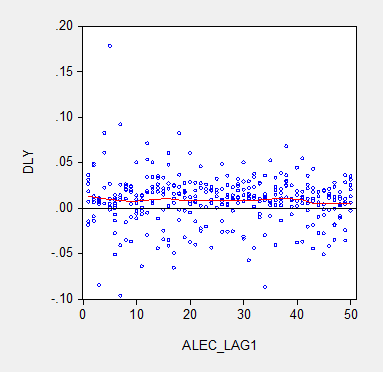
The thing is, a measure of economic outlook ought to have predictive power for GSP (the state level version of GDP). EconBrowser reports a bunch of regressions and charts that show … pretty much no relationship at all. Here’s an example:

info_ALEC1

This shows last year’s ALEC ranking (lower is better), versus the differenced logs (approximate growth rates) of this year’s GSP. If ALEC is on to something with their rankings of policies, the red curve should be downward sloping. It isn’t.

None of this says that Utah’s policy choices are bad. But it does say that they are no better or worse than other states.

* The full cite is Laffer, A.B., Moore, S., and Williams J., Rich States, Poor States, 2016, 9th ed., American Legislative Exchange Council: Arlington, VA.