Saturday, February 13, 2021

Relative Fiscal Stimulus

The Biden administration and Democrats in Congress are closing on passing a new fiscal stimulus package.

As always, an economist should be asking, compared to what? Greg Mankiw posted this chart drawn from Moody's Analytics:

Do note that this is scaled by GDP, so this is showing that the 2 stimulus packages passed so far are already more generous than those in every other large economy except Japan. Reasonable estimates of the size of our third package will blow right past Japan.

And, of course, as the largest economy in the world, the close to largest percentages of the largest economy indicate that our government has already gone bigger than everyone else.

N.B. While the cases and deaths in the U.S. are large, we are the third most populous country in the world. Relatively speaking, our pandemic is objectively not worse than most of the other countries on this list.

Wednesday, February 10, 2021

You Trade Most with People Who are Physically Closer, and Most Like You

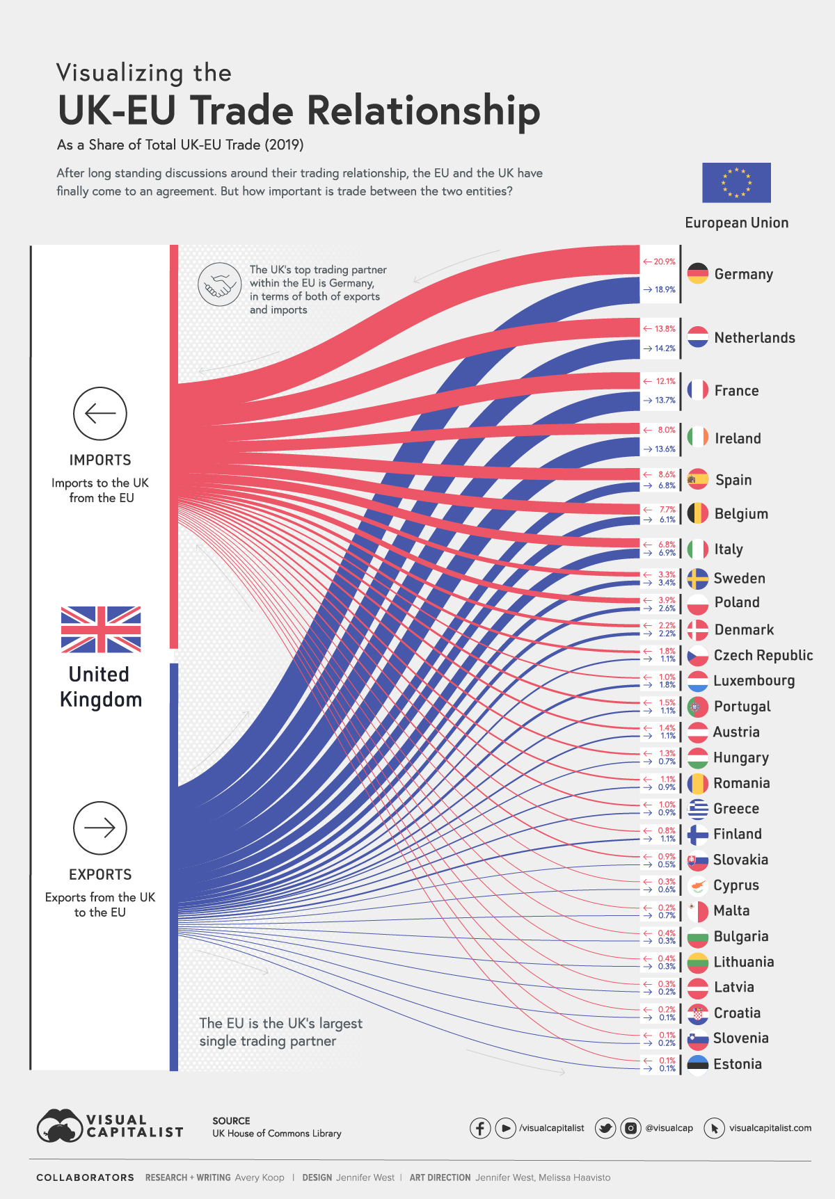
Visual Capitalist posted a chart of the UK's trade relationships with the EU members. A chart like this could be done for just about any country.

uk trade with eu  

Also, rather obviously, countries also trade most with whomever is economically biggest: bigger economy tends to mean more trade.

So, not surprisingly, the UK trades the most with Germany: it's big, it's fairly close, and it's culturally similar to the UK.

France and Italy are the next two biggest countries in the EU, and the UK trades less with them because they're smaller. They're also more culturally similar to each other, than they are to the UK, which will tend to decrease trade. Italy is further away than France, so it's lower on the list.

The UK, the Netherlands, and Germany share a more Germanic culture, language, and majority Protestant background. On the other hand, Belgium shares with France and Italy a Romance language and "latin" culture, and majority Catholic background. So, the Netherlands is a bigger trading partner than is Belgium, even though the countries are comparable and Belgium is closer.

The other big trading partner is Ireland. Different culture, different religious background, but a mostly shared language. AND, Ireland is the only country that shares a land border with the UK, and it's also the fairly close over water, so, lots of trade there.

Alternatively, if you look down towards the bottom of the list, you see mostly countries that have a Slavic rather than a Germanic language, most of which are further away, and smaller, with a religious background that is sometimes Catholic and something Eastern Orthodox. The UK doesn't trade much with those countries, but there are exceptions. Cyprus and Malta, are the two smallest countries in the EU. And yet they are not at the bottom of trade with the UK. Why is that so? Probably because both of them spent time as colonies of the UK!

FWIW: a model in which trade depends on distance is called a "gravity model". Paul Krugman (who now writes an opinion column for The New York Times) won a Nobel Prize for its development.

Tuesday, February 9, 2021

List of GDP Stats

In class I showed a bunch of these. There are more. I'm not concerned about you knowing all this stuff. It's just lists of facts after all. The bigger point is that you should know that these things exist and you can go find them if necessary.

Here's what I showed you in class:

  • List of U.S. states ranked by GDP (you should know the big four, and the areas of the country where the poorer states tend to be located).
  • List of U.S. metropolitan areas ranked by GDP (you should know the big three, and be able to name a bunch of the top 10 or 15.
  • List of U.S. counties ranked by GDP (you should know that this exists, that New York county, New York City, and New York state are not similar at all, and maybe the names of a few prominent counties around the country. For example Harris County was in the news about mail in voting quite a bit back in October, but it would be natural for someone to say "who the heck cares about some county down in Texas", but it would be missing why that county is important. It's also important because of the counties that are very big economically, but really don't have a major city in them, like Orange County, and Fairfax County).
  • List of world metropolitan areas by GDP (you should know the big ones, but also the surprises on the list: that Tokyo is huge, that Seoul is one of the biggest, or that Istanbul would be near the top of the list).
  • List of provinces in China by GDP (you should know the big ones, like Guangdong, Shandong, Jiangsu, because these things are as populous as big western European countries, and some are approaching their level of GDP. You should also know that the U.S. has one city that isn't in a state but is comparable in its own right — the Washington metropolitan area is our 6th biggest and sprawls past the limits of D.C., while China has designated three this way: Shanghai, Beijing, and Chongqing).
  • List of NUTS-1 regions in Europe by GDP. The EU is trying to get rid of the old subdivisions within member countries, which were of different sizes and often had more relevance historically than they do today, with a new system called by its acronym NUTS (there's maps here). NUTS-1 are the biggest ones, these are divided into NUTS-2 sub-regions, and those further divided into NUTS-3 sub-sub-divisions. By the time you retire, people may talk about something like Northwest Italy or East Sweden or South Spain as naturally as Americans talk about North and South Carolina. It's also plausible that some of the NUTS preserved historical features. For example, is the NUTS-1 containing Paris really the richest one in Europe, or did the French convince everyone else that their main one should include more territory than others, while the English didn't bother to add stuff on to Greater London? You should know the big ones around the continent: this is where the action is.

When I write that you should "know" this stuff, that does not mean I'm going to check if you have them memorized for an exam. It does mean you should know where to find this information, and be curious about the details. 

For example, you might note that Wuhan is on the list of biggest metropolitan areas, not far below Miami and Madrid and above Sydney: Wuhan was not a household word 13 months ago, but perhaps people would have paid more attention to COVID-19 if they knew how big Wuhan actually was on the world stage. Wuhan was really the first place in the world to ever be locked down (on January 23, 2020); can you imagine our reaction if Miami had been locked down? 

It was also a big thing when COVID-19 had its first sustained outbreak in Europe, in northern Italy in late February (a map towards the bottom of this post shows that it didn't land in a poor area, or slowly spread from the outside, but rather landed in one of the richest areas of Europe, and quickly clobbered it). Perhaps we would have paid more attention if people knew that the Northwest Italy NUTS that was hit initially has a GDP larger than the entire San Francisco Bay area.

Also, everything in this class coverage was about size of GDP. But we're also concerned about GDP per capita, and there's a wealth of lists of that too.

Our Strange Recession

The way we study things in generally experimental sciences is to make multiple observations of the same thing under controlled conditions.

The way we study things in generally non-experimental social sciences is to make multiple observations of things we presume might be the same, and then make sure we have all the other variables that might change that included in our analysis. 

The problem with doing this with recessions is ... they're often very different from the preceding one, and often from the whole set of about 40 recessions that we know of, going back in the U.S. to 1820.

Take the example of the current pandemic/lockdown recession. It's an even 100 years since we had a pandemic during a recessions. And, no country on Earth ever locked down anything before they all pretty much decided to just that late last winter.

Anyway, let's take a look at the labor market to get a sense of how different it is. The two graphs come from the Bureau of Labor Statistics website, which has nice tools for finding and charting data.

First up, here's the unemployment rate. This only goes back to 1948, so it missed the Great Depression, which would be not just off the chart, but probably 2 additional blocks up at 25%.

Even so, we can see how the ongoing recession is different: the peak rate is higher, while always steeper on the LHS this one is even steeper, and while it may not continue this way all the way down, it looks like the descent is faster than in earlier recessions. 

Even stranger is the labor force participation rate:


Generally, it's fairly hard to spot recessions in the labor force participation rate. 

Digression: this data is often interpreted incorrectly, and this is as good a time as any to explain. Notice that the hump is roughly symmetrical from about halfway up on the left (around 1980), to around 2015 on the right. Casual observers are inclined to say that the labor force participation rate went up, almost exclusively, because of women entering the workforce. That isn't the case: that was more of a smooth rise up until about 2000 — it does little to explain the hump. Instead the hump is likely from baby boomers being in the labor force during their prime years.

Anyway, it's fair to say from this chart that labor force participation has also behaved unusually in the pandemic/lockdown recession.

Looking at the raw numbers may help.


Year
and
month
Civilian
noninsti-
tutional
population
Civilian labor forceNot
in
labor
force
Number Percent
of
population
Employed Unemployed
Number Percent
of
population
Number Percent
of
labor
force

1986

180,587 117,834 65.3 109,597 60.7 8,237 7.0 62,752

1987

182,753 119,865 65.6 112,440 61.5 7,425 6.2 62,888

1988

184,613 121,669 65.9 114,968 62.3 6,701 5.5 62,944

1989

186,393 123,869 66.5 117,342 63.0 6,528 5.3 62,523

1990

189,164 125,840 66.5 118,793 62.8 7,047 5.6 63,324

1991

190,925 126,346 66.2 117,718 61.7 8,628 6.8 64,578

1992

192,805 128,105 66.4 118,492 61.5 9,613 7.5 64,700

1993

194,838 129,200 66.3 120,259 61.7 8,940 6.9 65,638

1994

196,814 131,056 66.6 123,060 62.5 7,996 6.1 65,758

1995

198,584 132,304 66.6 124,900 62.9 7,404 5.6 66,280

1996

200,591 133,943 66.8 126,708 63.2 7,236 5.4 66,647

1997

203,133 136,297 67.1 129,558 63.8 6,739 4.9 66,837

1998

205,220 137,673 67.1 131,463 64.1 6,210 4.5 67,547

1999

207,753 139,368 67.1 133,488 64.3 5,880 4.2 68,385

2000

212,577 142,583 67.1 136,891 64.4 5,692 4.0 69,994

2001

215,092 143,734 66.8 136,933 63.7 6,801 4.7 71,359

2002

217,570 144,863 66.6 136,485 62.7 8,378 5.8 72,707

2003

221,168 146,510 66.2 137,736 62.3 8,774 6.0 74,658

2004

223,357 147,401 66.0 139,252 62.3 8,149 5.5 75,956

2005

226,082 149,320 66.0 141,730 62.7 7,591 5.1 76,762

2006

228,815 151,428 66.2 144,427 63.1 7,001 4.6 77,387

2007

231,867 153,124 66.0 146,047 63.0 7,078 4.6 78,743

2008

233,788 154,287 66.0 145,362 62.2 8,924 5.8 79,501

2009

235,801 154,142 65.4 139,877 59.3 14,265 9.3 81,659

2010

237,830 153,889 64.7 139,064 58.5 14,825 9.6 83,941

2011

239,618 153,617 64.1 139,869 58.4 13,747 8.9 86,001

2012

243,284 154,975 63.7 142,469 58.6 12,506 8.1 88,310

2013

245,679 155,389 63.2 143,929 58.6 11,460 7.4 90,290

2014

247,947 155,922 62.9 146,305 59.0 9,617 6.2 92,025

2015

250,801 157,130 62.7 148,834 59.3 8,296 5.3 93,671

2016

253,538 159,187 62.8 151,436 59.7 7,751 4.9 94,351

2017

255,079 160,320 62.9 153,337 60.1 6,982 4.4 94,759

2018

257,791 162,075 62.9 155,761 60.4 6,314 3.9 95,716

2019

259,175 163,539 63.1 157,538 60.8 6,001 3.7 95,636

2020

260,329 160,742 61.7 147,795 56.8 12,947 8.1 99,587

Monthly data, seasonally adjusted(1)


2020


January

259,502 164,455 63.4 158,659 61.1 5,796 3.5 95,047

February

259,628 164,448 63.3 158,732 61.1 5,717 3.5 95,180

March

259,758 162,721 62.6 155,536 59.9 7,185 4.4 97,037

April

259,896 156,478 60.2 133,370 51.3 23,109 14.8 103,418

May

260,047 158,200 60.8 137,224 52.8 20,975 13.3 101,847

June

260,204 159,797 61.4 142,100 54.6 17,697 11.1 100,407

July

260,373 160,085 61.5 143,777 55.2 16,308 10.2 100,288

August

260,558 160,818 61.7 147,276 56.5 13,542 8.4 99,740

September

260,742 160,078 61.4 147,543 56.6 12,535 7.8 100,664

October

260,925 160,718 61.6 149,669 57.4 11,049 6.9 100,207

November

261,085 160,536 61.5 149,809 57.4 10,728 6.7 100,548

December

261,230 160,567 61.5 149,830 57.4 10,736 6.7 100,663

2021


January

260,851 160,161 61.4 150,031 57.5 10,130 6.3 100,690

Footnotes
(1) The population figures are not adjusted for seasonal variation.

NOTE: Revisions to population controls and other changes can affect the comparability of labor force levels over time. In recent years, updated population controls have been introduced annually with the release of January data. Additional information is online at https://www.bls.gov/cps/documentation.htm#pop.

I think it's fair to assume that we were at full employment in January 2019. Using that as a baseline, it's fair to say that unemployment is up by about 4.3 million people.

Given the scale of the numbers, population growth contributes a little to that, but can probably be safely ignored. For example, if population grows by about 0.5%/year (as shown in the leftmost column), each column in the table should go up by about that rate, and for unemployment that might contribute 0.1 (rounded up) to the 4.3 million increase.

For the employed, we are off about 8.6 million. But, from above, only half of those are unemployed. Where did the rest go? They are picked up in the decline in the labor force by 4.3 million. 

Note that for the employed and the labor force that the population increase of 1.3 million will make more of a difference. Doing a rough distribution, I'd say that 1.2 million should have gone into employment (meaning the announced number is down more than it looks), 0.1 into unemployment, and 1.3 into the labor force. So, adjusting a little gets the labor force down by 5.6M, employment down by 9.8M, and unemployment up by 4.2M.

Recall how people can be outside the labor force, but still in the civilian non-institutional population: they do not have a job and they are not looking. Further, if they all were looking, unemployment would be up to about 15.7M or a rate of 9.5%. That should put things in perspective that we are in pretty bad shape: it's comparable to the two highest peaks in the unemployment rate in the top chart.

From my longer perspective, I'll tell you that this is something the Democrats have always worried about in recessions, but which never really showed up in the data very seriously: people not interested in being employed. Now we have that, so it's important not to judge this recession by just its unemployment rate. 

It also means that as far as policy goes, we also shouldn't be excessively focused on the unemployed. Yes, we have a lot of them, and many deserve help from policy. But, since past recessions had far fewer people dropping out of the labor force, it's not clear that existing policies or off-the-shelf proposals are going to be focused on the right people.

Thursday, February 4, 2021

Historical Real GDP (for the U.S)

The extended data set shown in the beginning of the Barro text comes from the Maddison Project. Angus Maddison was an economist whose life work was the creation of very long historical GDP series. The project is now part of the Groningen Growth and Development Centre at the University of Groningen in The Netherlands.Their data is free to download.

As of this semester, the data for the U.S. is annual, and has been extended back to 1820. These charts come from a spreadsheet saved to the class's shared Google Drive folder.


I am not certain, but I'm really sure that Barro got his data from the Maddison Project (there really aren't any competitors), and that probably at the time he downloaded it, it only went back to 1869.

Wednesday, February 3, 2021

U.S. Costs of COVID-19

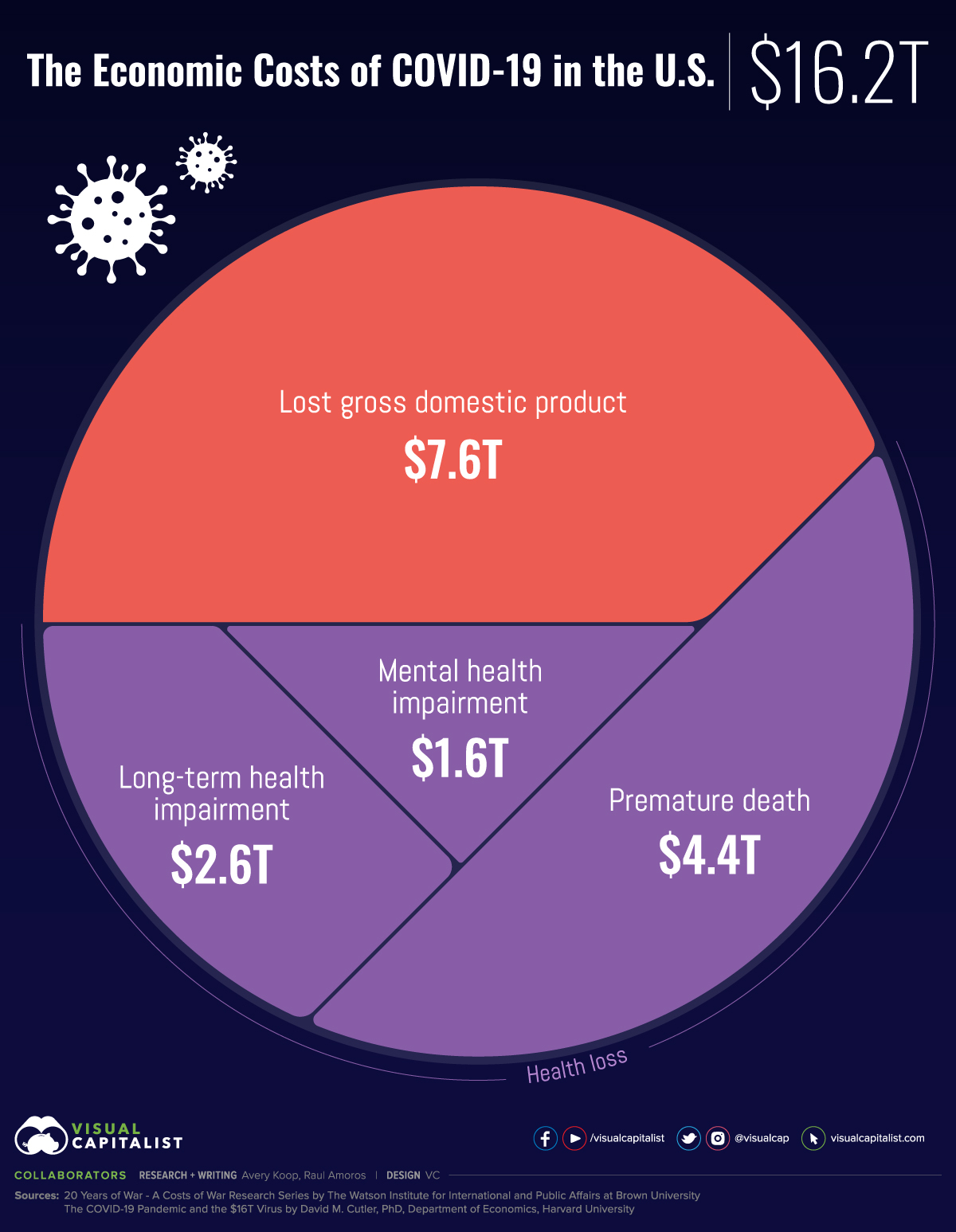
Here's an infographic from Visual Capitalist:

Cost of COVID-19

These are drawn from "The COVID-19 Pandemic and the $16 Trillion Virus," by Cutler and Summers.

Since you're all undergraduates, I do try to clue you in to authors and sources you should pay attention to. 

  • Visual Capitalist didn't do the research, just the image. 
  • The article was published in the Journal of the American Medical Association, the best or second best journal in the field.  But, it was published in their opinion section, rather than under basic research.
  • David Cutler is a professor of economics at Harvard (and a former department chair and college dean). He is one of the top researchers in health economics. Here's Cutler's Google Scholar page (70K cites and an h-index of 107 is crazy), Cutler's biographical page at Harvard, and his Cutler's Wikipedia page. He also served in the Clinton and Obama White Houses. In my view, Cutler might be moving up from the medium to the short list for a future Nobel Prize.
  • And Lawrence Summers is even bigger. He's a professor of economics and former president of Harvard, He is one of the top researchers in macroeconomics, and was already huge when I was in graduate school 30 years ago. Here's Summer's Google Scholar page (157K cites, and an h-index of 178), and Summers' Wikipedia page. He served in the Clinton White House, topping out at Secretary of the Treasury. He was also Chief Economist at the World Bank. Here's Summers' press biography. And, both his parents were economics professors at the University of Pennsylvania, and ... get this ... each of his parents had a brother who was an economist who won a Nobel Prize. I think Summers is probably a lock on a Nobel Prize in the next decade.

The bottom line is that they will have a huge audience.

The biggest piece of the pie is reduced economic activity. Cutler and Summers draw on the Congressional Budget Office for that number, which is a sum over the next decade. Personally, it seems high, but not outrageous to me.

For regulatory purposes, economists have estimated the value of a human life. Non-economists find this controversial, mostly because we do it at all, but it serves a need. Their figure of $4.4T for premature death uses an estimate of ultimately 625K deaths valued at $7M each (that's a conservative value, I usually use $10M). I find the deaths number plausible, but not the overall total. This is because the $7M figure is for a whole life. While I don't generally agree with the common viewpoint that a COVID-19 diagnosis affects the old, I do think the total number should be cut down by quite a lot ... probably over half.

I am less well-versed in the costs of long-term health impairment. Having said that, I think everyone underestimates this. Since Cutler and Summers can back up their numbers, I'll accept them. The same goes for the mental health costs.

Now let's put this in perspective. It would be incorrect to naively compare this number to GDP. The value above is a stock variable, while GDP is a flow variable. (The authors do this anyway, because it's popular, but I don't encourage my students to do this). A better comparison might be to financial wealth of the United States, which is about $100T. So COVID-19 is going to knock off about a sixth of that. 

That's like a college student with a car worth $12K, and a huge insurance deductible of $2K, getting into a collision: it would hurt, big time.

**********************************

BTW: At this time last year, I was ballparking that the costs to China (a smaller and poorer economy) would be in the range of several hundred billion dollars. But, there are researchers in Australia who made the definitive estimates of the costs of SARS-COV-1. And 11 months ago they estimated the costs to the U.S. of COVID-19 would be $1.7T. Cutler and Summer's guesstimate is 10 times as high. Of course, when they published that estimate, the U.S. had a handful of cases in the Seattle area, and it was still a week before Rudy Gobert and the shutdown of the NBA, and everything else after that.


Monday, February 1, 2021

Visualizing Income Support Due to COVID-19

Income support means, roughly, that a government provides some replacement income to people during a time of crisis. In the case of COVID-19 this support is often large, but combines temporary and permanent measures.

All of this is being tracked through this site at Oxford. And all their data is available for free download. Ain't the internet great?

Visual Capitalist has put together an interactive graphic showing countries shaded by their level of support with the passage of time. Click through to play with it. Do press play at the bottom left to show changes through time.