A Voronai diagram of the global economy":
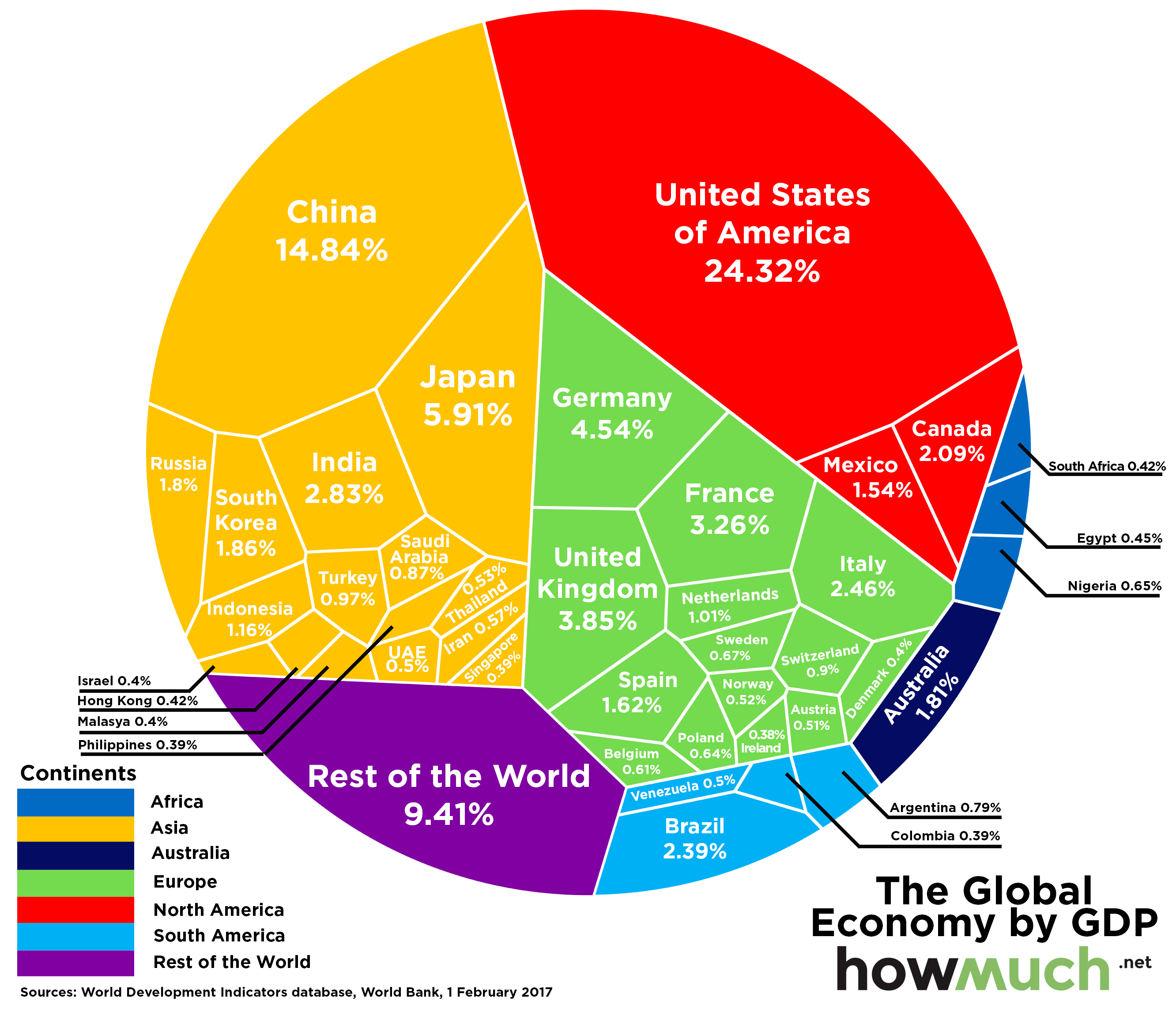
This is based on World Bank data, which is adjusted across countries using PPP. PPP isn’t bad or wrong, but it is more of an upper bound that shows poorer countries being bigger than they probably are.
Via howmuch.net, Business Insider, and Newmark’s Door.
No comments:
Post a Comment