This is based on an interactive graphic. You should go there and play with it. All I show below is screen captures.
The Congressional Budget Office provides non-partisan economic advice for Congress. They’ve put together a cool page on income inequality.
There’s an urban myth that’s been going around that incomes have stagnated over the last 2 generations. There’s a lot of things that suggest this is not the case (vastly improved healthcare, provided as a benefit for 85% of the population), and a lot to suggest that it is the case (wages haven’t moved as much as other forms of compensation).
Their analysis is based on quintiles, and averages. Quintiles are divisions of the population into fifths by income: the top 20%, and so on. Averages of households within quintiles are OK, except when it comes to the top one. In the bottom 4 quintiles, there’s a top and a bottom to the possible values. The average isn’t a great way to summarize the data within a quintile (because it still won’t be symmetric), but it’s OK. It’s a bit worse for the top quintile, because there’s no upper boundary. The real problem is not comparing the top quintile to itself but to the lower quintiles: that comparison can be distorted by Bill Gates.
Anyway, on average, the top quintile earns the most, as shown in this chart.
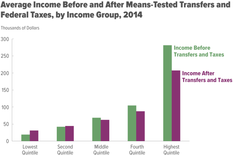
The distortion is that I wouldn’t use this to say that the typical member of the highest quintile earns 3 times as much as those in the 4th quintile. More is OK, 3 times more is probably too high.
What’s interesting here is that it can be tough to find sources that net out both taxes paid (which reduce your income) but also transfers received (which increase your income). So the purple-ish bars indicate that people actually have. There’s still a lot of inequality, but on net the top 60% help the bottom 40%.
Most of this is done through the progressive tax system, not through the welfare system:

The first chart is not interactive, but this one is. You may want to go play with it on the site. If you’re the type to be concerned about transfer payments going to the poor, this should help you realize that maybe they’re not that big.
It’s kind of drilled into us that the rich have benefitted the most over the last 50 years. This chart confirms that:

However, keep in mind that any analysis done this way with the highest quintile will be distorted (the super rich only have to benefit a little to make the average go way up). The rich as a group may have benefitted greatly, we just can’t tell that a typical rich person has benefitted greatly.
Where we can make a more reasonable comparison is between the lowest and middle quintiles. And here we see that the poor are not doing worse.
The story is different if we net out taxes and transfers:

This paints a rosier picture of what we do for the poor. But it also tends to confirm the complaints of the middle class that everyone is improving faster than they are.
No comments:
Post a Comment