Monday, April 30, 2018

Drones (Not Required for This Year’s Final Exams)

In class on Wednesday, in response to Aaron’s question about whether technology will force people out of jobs, I talked a little about macroeconomic speculation.

Outside of macro, people worry about capital displacing labor from their jobs. This is “old school” thinking.

Inside macro, the “new school” thinking is about how labor will compete for capital and technology when we have alternative forms of labor, like drones.

As an example, I briefly mentioned that there are quadcopters now that can do stuff like push elevator buttons.

There are also global addressing systems like What3Words. Last October I was hiking a bit and was thirsty: how long until I can have a water bottle delivered by drone to crush.blast.puff (https://map.what3words.com/crush.blast.puff)?

Anyway, check out this excerpt of an interview with Balaji Srinivasan, and in particular the last section about drones.

The macroeconomic future is not one where we have to worry about capital replacing labor, but rather one in which capital is no longer capital at all, but rather an extended form of labor.

(Sneaking any of this post into your answers for this year’s exams won’t help your score).

Tuesday, April 17, 2018

Test Post 2 (Optional)

Something isn’t right with my software. Need to make 2 test posts.

Tax Complexity Interview

For the day income taxes are due, The Washington Post ran an interview with two tax scholars about why the U.S. personal income tax system is so complex. Check it out: you may be surprised at their two main answers.

Read the whole thing, entitled “Why the U.S. tax system is so complicated — but Americans are proud to pay taxes anyway” in the April 12th edition of John Sides Monkey Cage column.

Infographic of Logical Fallacies

Last year, a few students commented towards the end of the semester that leaning about logical fallacies had helped them a lot as economists. I agree: these things are all over public discussion of macroeconomic issues.

Logical fallacies are everywhere, and it’s useful to list out the possibilities and consider ones you haven’t thought of before.

You need to click through to get the whole thing (with interactivity), but here’s a screen capture:

Capture of Logical Fallacy Infographic 2

In the original, these are more readable, and sortable.

Barriers to Entry and Income Inequality

There’s new research showing across the cross-section of countries, that higher barriers to starting new businesses is associated with higher levels of income inequality.

A problem with this sort of research is that it’s not clear if barriers cause inequality, or if inequality causes barriers. Causality is hard to establish in non-experimental settings.

However, economists are better than most social sciences at purging their results of the feedback between two possible causes, and this research does a good job of that.

The data on barriers comes from the World Bank, which publishes a cross-sectional data set on the number of consecutive steps an entrepreneur must complete prior to opening for business. These range from as few as one out into the twenties, and might include things like educational and training requirements, land or equipment ownership, licensing, testing, or health and environmental conditions.

The results show that between otherwise identical and typical countries, that the one with one more step involved in starting a business has a higher income share for the rich (roughly 31% vs. 29%), and a larger Gini coefficient (a limited and basic but very common measure of overall income inequality).

Income inequality is, of course, a macroeconomic concern. However, the microeconomic mechanism at work here is well known: more barriers means less entry in response to positive profit signals, and less competitors leads to bigger markups and profits.

The real world is no doubt a mix of these, but these results are consistent with these polar stories: 1) well-meaning governments erect barriers to protect consumers and those make the rich richer (presumably because they have the resources to overcome the barriers), or 2) the rich influence government to erect barriers to keep competitors out and this helps them get richer.

The research by Chambers, McLaughlin and Stanley appeared in Public Choice, and is entitled “Barriers to Prosperity: The Harmful Impact of Entry Regulations on Income Inequality”. The article is not available for download, but it can be viewed online for free.

******************************************************

Part of the problem of understanding the interactions of macroeconomics and policy is … the policy choices that get linked together under the banner of parties are often nonsensical.

Consider the U.S.: Democrats tend to be more interested in erecting barriers to business formation, but are also more worried about income inequality, even though this research indicates the two go together. Republicans grandstand with an opposing pair that’s just as conflicted.

Macroeconomists are too dull to come with crazy stuff like this on their own ;-D

Friday, April 13, 2018

Zuckerberg, Facebook, and Congress

Magicians will tell you that magic works because they get you to focus on the wrong thing.

And there’s a branch of the public choice subfield of economics named after Peltzman’s research on regulation.

The big news this week is Mark Zuckerberg, the founder and CEO of Facebook, testifying before Congress for two days about how information users divulged on Facebook might be used by others.

Alex Tabarrok has a piece on Marginal Revolution this week pointing out that these hearings are not what they seem to be. Think about magic. You’re probably focused on the wrong thing, and in this case the Peltzman model can tell you what you should focus on. It’s good enough to just quote in full:

If you want understand the Facebook hearings it’s useful to think not about privacy or  technology but about what politicians want. In the Peltzman model of regulation, politicians use regulation to tradeoff profits (wanted by firms) and lower prices (wanted by constituents) to maximize what politicians want, reelection. The key is that there are diminishing returns to politicians in both profits and lower prices. Consider a competitive industry. A competitive industry doesn’t do much for politicians so they might want to regulate the industry to raise prices and increase firm profits. The now-profitable firms will reward the hand that feeds them with campaign funds and by diverting some of the industry’s profits to subsidize a politician’s most important constituents. Consumers will be upset by the higher price but if the price isn’t raised too much above competitive levels the net gain to the politician will be positive.

Now consider an unregulated monopoly. A profit-maximized monopolist doesn’t do much for politicians. Politicians will regulate the monopolist to lower prices and to encourage the monopolist to divert some of its profits to subsidize a politician’s most important constituents. Monopolists will be upset by the lower price but if the price isn’t lowered too much below monopoly levels the net gain to the politician will be positive. (Moreover, a monopolist won’t object too much to reducing prices a little since they can do that without a big loss–the top of the profit hill is flat).

With that as background, the Facebook hearings are easily understood. Facebook is a very profitable monopoly that doesn’t benefit politicians very much. Although consumers aren’t upset by high prices (since Facebook is free), they can be made to be upset about loss of privacy or other such scandal. That’s enough to threaten regulation. The regulatory outcome will be that Facebook diverts some of its profits to campaign funds and to subsidize important political constituents.

Who will be subsidized? Be sure to watch the key players as there is plenty to go around and the money has only begun to flow but aside from campaign funds look for rules, especially in the political sphere, that will raise the costs of advertising to challengers relative to incumbents. Incumbents love incumbency advantage. Also watch out for a deal where the government limits profit regulation in return for greater government access to Facebook data including by the NSA, ICE, local and even foreign police. Keep in mind that politicians don’t really want privacy–remember that in 2016 Congress also held hearings on privacy and technology. Only those hearings were about how technology companies kept their user data too private.

Understanding macroeconomic policies can be problematic because elected officials are often not doing what they seem to be doing. In this case, that’s worrying about your privacy.

On the other hand, unelected officials are often more straightforward to understand. In this case, Facebook’s problem is not really with Congress (which wants a deal) but with Margrethe Vestager who wants more sweeping changes.

Or in the case of something like U.S. trade policy, worry less about Trump, and more about his advisors.

Thursday, April 12, 2018

Oversupply of Housing and the Financial Crisis

It’s become a factoid about the financial crisis of 2007-9 that construction companies were building too many homes that eventually were abandoned when owners could no longer make mortgage payments on them.

Maybe not.

Kevin Erdmann, an author and visiting scholar at the Mercatus Center† has written a fascinating paper about this (available here in full, and required). It is written at a level accessible to undergraduates.

What I like most about this is the careful stock to stock, and flow to flow, comparisons; and also median to median comparisons. From these he builds an argument that the structures themselves could not have been the problem.

  • First, his comparison of the (stock of) houses to the (stock of) population shows a steady or declining ratio from 30 years ago. No problem there.
  • Second, he shows that starts of new homes were in line with population growth. No problem there either.
  • His Figure 3 is more problematic: this sort of chart is difficult to read without distorting one’s view of the data. What seems clear is that there was a shift in the 2000’s out of manufactured homes and into traditional ones. I’m not sure what to make of that. Erdmann sees a decline in multi-family housing there, but I don’t.
  • His Figure 4 shows housing expenditures being steady as a share of income (or declining a bit) over the last 35 years. This result is the opposite of popular perception: people claim housing has gotten more expensive, and it hasn’t in proportional terms. No problem there either.
  • But, he does show in Figure 5 that while median rent and median income (a great comparison) are in line across the country. But what we do have is half-a-dozen cities where both incomes and rents are super high: people are getting paid more to afford housing there. Figure 6 shows that all of those cities do poorly on affordability of housing. No problem there either.
  • Those 6 cities are all well-known for tight housing markets with limited new construction. Figure 7 shows how emmigration from those 6 cities matches up well with immigration into nearby cities without limits on construction. In short, it was like spreading contagion: not enough construction in those 6 cities drove up prices there, so people moved nearby and drove up prices there too. And then people stopped moving as much in 2006. We don’t know why that happened.
  • The last two figures focus on Phoenix, and show that while there was huge immigration into Phoenix, it was matched by construction starts. Then both fell, and vacancies for rentals went up.

Here’s the conclusion: there was no oversupply of housing. There was a big drop in regional migration, but it was matched by reductions in new construction. I am sketchier on Erdmann’s other conclusion: that that there was an undersupply of buyers prior to the financial crisis, and this was transmitted into owners who were unable to sell putting their homes up for rent.

† The Mercatus Center is a libertarian think tank associated with George Mason University. I found Erdmann’s work to be largely free of libertarian positions until the last paragraph which gives an Austrian twist that I’m not sure is merited. The rest of it is solid.

FWIW: lots of us were watching the housing market in the 2000’s. I do remember hearing, more than once, that the age of the U.S. housing stock was older than it ever had been, and that this was motivation for new construction. That fact which was so common 15 years ago has seemingly been forgotten for the last ten.

Wednesday, April 11, 2018

Forecasting with Autoregressive Behavior

In class we estimate autoregressive models of ln(real GDP). Case 3 is an AR(1), Case 4 is an I(1), and Case 5 is an ARI(1,1).

The I indicates the special case where the coefficient on a lagged dependent variable (sometimes with a little algebra and the Engle-Granger Representation Theorem) is restricted to equal one. You don’t get a stochastic trend without that restriction. So Case 4 is a restriction on Case 3, and Case 5 could be thought of as an AR(2) with one of those restricted.

TS asked after class the other day if these sort of models are used for serious forecasting. My response was that, after removing a lot of details, all serious economic and financial forecasting models have AR(p) and ARI(p,1) processes at their core.

Using any of these is a craft, and one of the things you learn is that while they can do pretty good forecasts in the short-run, their long-run forecasts are sort of uninteresting. They’re not necessarily wrong, but they may not say much.

The reason for this is those lags. They contain all the information that makes the forecasts work. This works for forecasting one period ahead (t+1) because you have the data from time t to use in your model. But what if you want to forecast t+2? Where do you get the data from t+1 for the lags? One thing you can do is use your forecast of t+1 that you made at t as an input to make your forecast for t+2. This works OK. But the forecast made at t of t+1 is missing whatever shocks do happen at t+1 to make that period interesting, so the forecasts for t+2 tend to be a little plain and less volatile. The further you go into the future, the worse that problem gets.

The end result of this is that forecasts from AR(p) and ARI(p,1) models tend to converge to the average after a few periods.

Now combine that with the idea of the stochastic trend that you get from the I(1) part of those models. This is saying that there is no central tendency for the trend to return to. It’s always there, but it comes off the most recent data point you’re at. You can be above or below it in the short-run, but the best thing we can say is that in the long-run you’ll settle down to that particular stochastic trend. If there’s a shock next period, your stochastic trend will shift, but the new forecast is that you’ll still settle down to that new one.

So, check out these 10-year Treasury Bond rate forecasts:

Presentation1

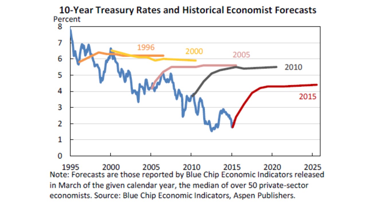
These are collected from Blue Chip, which surveys the most popular economic forecasters, who are (no doubt) using an ARI(p,1) model for these.†

What each colored curve is showing is the forecast from a particular point in time. They all wobble a bit in the short-run before converging to a flat line in the long-run. This is just an example. When you see this behavior in future publications, you know where it’s coming from.

You can check out the source post entitled “Losing Interest” at the Lawrence Economics Blog, but the whole thing is not required.

† Technically, the rates themselves are probably not an ARI(p,1). But rates are formed as a ratio of coupon payments and total amount borrowed, both of which do follow that sort of process.

Tuesday, April 10, 2018

Why Is Macro So Hard? Artificial Precision

I’m speculating here, and in a somewhat nasty way: I suspect that personality tests would show that governments are full of “control freaks”. Control issues are how therapists describe behavior in which people think things perform better because they specifically are the ones in charge.

A symptom of this is the artificial precision in many government statistics. In the U.S. we announce quarterly real GDP growth rates to an accuracy of one tenth of a percentage point. Due to annualization this is actually something a tad sharper than one fortieth of a point.

Yet, my personal opinion is that most people have trouble feeling a GDP growth rate difference of less than a percentage point. So the announcements are ten times sharper than they need to be.

Why do they do that? Most of us have experience with or as parents taking the temperature of a sick child. Doctors usually tell us not to worry (even a little) if the temperature is not above 100º F, and to not worry seriously unless the temperature exceeds 102º F. Yet many parents agonize over the tenths digit on their thermometers. At least parents have a reasonable excuse to be control freaks.

The government is doing this with GDP figures. And those are probably the most precisely measured macroeconomic statistic: others, like the deficit, are far less accurate.

We’re more mature than this. Announcers of weather forecasts get this:

RFD 18-01-11 Weather an an Approximation

They can make point estimates of forecasts that are very precise, but instead they provide us with interval estimates that are reasonably informative: like the high will be in the mid 60’s today.

Why don’t government officials behave the same way?

I think this encourages us to focus too much on unrealistic details. For example the Obama administration (and its critics) agonized over differences between 2.1 and 2.2%, when the real issue was that the economy was growing at 2% rather than 3%.

I work with U.S. real GDP data all the time. A reasonable autoregression shows that with annual data going back to 1929, the 95% confidence interval for growth is –5% to +11%.

Why worry about tenths when the range of what’s possible is so large?

Of course, you could make the argument that the annual data includes the unusual periods of the Great Depression and World War II. Fair enough. If you run the quarterly data from 1947 onwards you still get –1% to +7%.That’s a huge range of possibilities for controllers within the government to encourage people outside the government to fret over.

Monday, April 2, 2018

How Big a Problem Are Medical Bankruptcies?

Healthcare financing is a national macroeconomic problem. We see this through the lens of our last major reform: Obamacare.

Obamacare did a ton of different things, but it was heavily marketed based on emotional scare stories: people doing without care because of pre-existing conditions, and people declaring bankruptcy due to medical bills.

Unfortunately, one doesn’t need a license to practice economics. So there was a lot of economics done by non-economists. Sometimes that isn’t high quality work.

We’ve now got some harder evidence indicating that some of the earlier research was shoddy. Do award points for getting the issue on the radar screen (but back off the conclusion as needed).

The big one was published in The American Journal of Medicine. This sounds impressive, but obviously it’s not where I’d go looking for solid economics. And, unfortunately, it’s not that solid for medicine either: it’s ranked 118th in one list of medical journals. But, it said the right thing at the right time, and one of its authors is now in the Senate in part because of her research. And what it said was that a big chunk of bankruptcies were the result of medical bills.

Not so, but it took a while to do the research properly. The original paper looked at bankruptcy filings and counted up the proportion in which there were medical bills. They came up with roughly 50%. However, the authors were 2 doctors, a sociologist, and an attorney. This does not make their work wrong. But perhaps we should have been more incredulous about letting it strongly influence public policy.

The problem with this is that it does not take into account the order or motivation of the purchases. If you exhaust your savings on medical bills, that’s obviously a medical bankruptcy. But if you spend your savings on a luxury home, then have a health problem, and file bankruptcy because you can’t pay your bills … it really isn’t related strongly to your health problems. Especially if we have bankruptcy laws that allow you to keep a house that you’re not making payments on.

So now we have new research in the New England Journal of Medicine — the top medical journal with an absolutely top notch economist (Amy Finkelstein) as an author.And the new number they get is 4% of bankruptcies appear to be the result of medical bills.

Should medical bankruptcies be reduced to zero? Possibly. Is that the same thing as saying that medical bankruptcies are 12 times as common as they are? Hardly. And it’s distinctly possible that we’re spending a lot of money on what is not a primary problem with our healthcare system.

Income Growth, Before and After Taxes

This is based on an interactive graphic. You should go there and play with it. All I show below is screen captures.

The Congressional Budget Office provides non-partisan economic advice for Congress. They’ve put together a cool page on income inequality.

There’s an urban myth that’s been going around that incomes have stagnated over the last 2 generations. There’s a lot of things that suggest this is not the case (vastly improved healthcare, provided as a benefit for 85% of the population), and a lot to suggest that it is the case (wages haven’t moved as much as other forms of compensation).

Their analysis is based on quintiles, and averages. Quintiles are divisions of the population into fifths by income: the top 20%, and so on. Averages of households within quintiles are OK, except when it comes to the top one. In the bottom 4 quintiles, there’s a top and a bottom to the possible values. The average isn’t a great way to summarize the data within a quintile (because it still won’t be symmetric), but it’s OK. It’s a bit worse for the top quintile, because there’s no upper boundary. The real problem is not comparing the top quintile to itself but to the lower quintiles: that comparison can be distorted by Bill Gates.

Anyway, on average, the top quintile earns the most, as shown in this chart.

The distortion is that I wouldn’t use this to say that the typical member of the highest quintile earns 3 times as much as those in the 4th quintile. More is OK, 3 times more is probably too high.

What’s interesting here is that it can be tough to find sources that net out both taxes paid (which reduce your income) but also transfers received (which increase your income). So the purple-ish bars indicate that people actually have. There’s still a lot of inequality, but on net the top 60% help the bottom 40%.

Most of this is done through the progressive tax system, not through the welfare system:

CBO Capture of Income Inequality 1

The first chart is not interactive, but this one is. You may want to go play with it on the site. If you’re the type to be concerned about transfer payments going to the poor, this should help you realize that maybe they’re not that big.

It’s kind of drilled into us that the rich have benefitted the most over the last 50 years. This chart confirms that:

CBO Capture of Income Inequality 2

However, keep in mind that any analysis done this way with the highest quintile will be distorted (the super rich only have to benefit a little to make the average go way up). The rich as a group may have benefitted greatly, we just can’t tell that a typical rich person has benefitted greatly.

Where we can make a more reasonable comparison is between the lowest and middle quintiles. And here we see that the poor are not doing worse.

The story is different if we net out taxes and transfers:

image

This paints a rosier picture of what we do for the poor. But it also tends to confirm the complaints of the middle class that everyone is improving faster than they are.

What We Don’t Know About China (optional)

If interested, check out the article entitled “Nobody Knows Anything About China: Including the Chinese Government”.

It’s written by James Palmer, a longtime resident of Beijing, and the Asia Editor of Foreign Policy. This is a widely read, semi-scholarly magazine, with a pro-Democratic lean. And I think it’s fair to say that in contemporary America, the Democrats are more pro-China than the Republicans.

So the expert at a pro-China media outlet is providing excruciating detail that no one knows much for sure about what comes out of China. This is not a matter of prejudice: it’s simply not like other countries, and should not be interpreted as such.

The article is exactly what the title says: a litany of things about China that no one really knows for sure, including the Chinese. There are a huge number of links to deeper sources on many issues.

This is a problem for macroeconomics given the earlier post detailing how Westphalian sovereignty affects the interpretation of economic data.

Willingness to accept [is] … typical of the gullibility and compliance of many foreign NGOs … when dealing with China …

That’s a meaty quote from a magazine with an interest in keeping people informed.

N.B. One word in the article is kind of obscure: Potemkinism. The source of this word is an 18th century Russian official named Potemkin. Russia had conquered a lot from the Turks. In the old days, the point of conquest was to acquire a region that had value. Russia had conquered poor, backward areas, and the Empress wanted to see all the newly found riches. So Potemkin faked it. Today, his name is still used as a college-level word to indicate a nice façade covering up the bad news. Down in Texas they have a phrase I always liked for people who do this: “All hat and no cattle”. We all need to acknowledge that there’s a positive probability that China is all hat and no cattle.

BTW: Here’s a post from the 2009 class about Westphalian sovereignty is an underlying problem with international debt crises.