Wednesday, December 16, 2020

Why Is Macro So Hard: Government Playing Data Games

An early part of the core lecture entitled "Why Is Macro So Hard?" is that the government actually suppresses the collection of data they don't want anyone to know about (like, say, student loan delinquency rates by major or political affiliation).

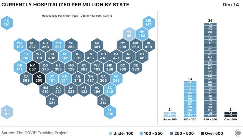
Governments also play games with the numbers. It's being reported that the state of Florida (which has been accused of playing games with COVID numbers for months) changed its reporting right before the election and changed back after the election. The result was systematically lower death numbers around election day.

Do note that there is an innocent problem here, but it appears the state used that to hide its policy.

The innocent problem is that in most places there are so many deaths that the bureaucracy in place to investigate those and keep track of them is overwhelmed and has a large backlog. This means that in most places the number of deaths reported today includes many deaths that occurred in the past and had not been reported yet. This has been a well-known problem since last spring, and everyone more or less puts up with it because there isn't much alternative. One approach to this, followed by Florida, is to allow the attending physician to make the official call instead of filing paperwork and then having the state do it. That has reduced the burden on the bureaucrats, but it introduced a new problem. Overworked doctors (rightly) don't  prioritize the paperwork, and often send in reports in bunches, weeks after the event.

OK. So I've made some excuses. Here's what's been reported as mixed in by the South Florida Morning Sentinel (the newspaper for Fort Lauderdale and Palm Beach), based on research done at the University of South Florida. The quote is long because it includes both sides of the story fairly equitably.

With minor exceptions, Florida quit including long-backlogged deaths in its daily counts on Oct. 24, 10 days before the Nov. 3 election, and resumed consistently including them on Nov. 17, two weeks after the election.

The result: The daily death numbers Floridians saw during that time were significantly lower than they otherwise would have been.

The South Florida Sun Sentinel last week began asking multiple state officials to discuss these surprising data patterns. None would answer questions. Jason Mahon, spokesman for the Florida Department of Health, did not respond to multiple requests for comment.

Thus the state’s intent in manipulating the data remains unclear. It’s possible the Florida Department of Health paused reporting of backlogged deaths as part of its new policy on reviewing them. Whatever the intent, the change led to more favorable death trends as the election approached.

The state’s reluctance to address questions about its COVID-19 data is not unusual. Throughout the coronavirus pandemic, DeSantis and his administration have engaged in a pattern of secrecy and spin, understating the spread of the pandemic in its earliest days and ordering public health staffers not to make public statements about COVID-19 as the election neared, a Sun Sentinel investigation found.

Analysts who track Florida’s numbers say they’re perplexed by the state’s pause in reporting months-old deaths. They said they, too, had asked the state for clarity but received no response.

“It’s hard to know if there was a limitation around election time or random other things were happening,” said Scott David Herr, a Florida computer scientist who tracks the daily COVID-19 data. “The Department of Health hasn’t explained why lags have been inconsistent. When they keep changing whatever is going on behind the scenes, when the lags keep changing, that is where it gets confusing.”

While public health experts say pandemic deaths are typically underreported, Republicans have complained that Florida’s death counts were exaggerated, with fatalities from other causes counted in the totals. DeSantis has speculated that the death statistics coming out of his own health department were inflated.

DeSantis’ administration has changed death reporting requirements through the pandemic, first as it grew concerned about the growing backlog and then as it began to question the validity of Florida’s mounting death toll:

Aug. 15: While county medical examiners were initially responsible for deciding whether deaths were caused by COVID-19, they became swamped with cases and fell behind. At their request, the state allowed the attending doctors to make those decisions and report them directly to the state.

Oct. 13: House Speaker José Oliva, a Miami Lakes Republican, attacked the COVID-19 death reports arriving at the health department as “often lacking in rigor” and undermining “the completeness and reliability of the death records.”

Oct. 21: Florida Surgeon General Dr. Scott Rivkees announces the state will impose another layer of review on deaths before releasing totals, saying many deaths took place more than a month before being reported or months after the person tested positive for COVID-19. “To ensure the accuracy of COVID-19 related deaths, the department will be performing additional reviews of all deaths. Timely and accurate data remains a top priority of the Department of Health.”

Within days, things changed. A key category vanished from the state’s daily tallies: deaths that occurred more than a month earlier. Such deaths have long formed a significant part of the daily totals in Florida and other states, because death reports from doctors don’t always arrive at the health department immediately, instead trickling in over days and weeks.
The impact of that change was huge. Consider: In the month that preceded the change, from Sept. 23 to Oct. 20, the state included in its daily tallies 1,128 deaths that occurred at least a month earlier — accounting for 44% of the deaths announced during that time. But in the week before the election, the health department included just one such death in its daily tallies.

Had Florida finally tackled its backlog? It had not: On Nov. 17, two weeks after the election, Florida’s daily death counts again began to consistently include deaths that had occurred more than a month before, and a large number of deaths that had occurred more than two months before, according to Salemi’s analysis.

A striking and mysterious resumption of backlogged death reporting came on Sunday, Nov. 8. On that day, the state logged the smallest number of reported new deaths in several months, just 15. And that day’s tally included the greatest percentage of backlogged deaths of any day yet — a staggering 74% of deaths reported that day were more than a month old. But because there were so few recent deaths recorded, the total tally for Nov. 8 appeared similar to the daily counts reported on the days before and after it.

The public didn’t see the actual dates of the deaths in that tally. What the public saw: a death count that declined in the days leading up to the election, and slowly climbed back up in the days after it.

The Florida Department of Health has refused to release COVID-19 death certificates to scientists or journalists to review. Until late summer, the records had been released to the public in summary form by the Florida Department of Law Enforcement, which collects death certificates from county medical examiner’s offices during states of emergency. But in August, when COVID-19 deaths stopped being funneled through county medical examiners, the information stopped being made public.

Do let me emphasize that while this appears to be an extreme case, governments around the world have been credibly accused of lying about case and death counts. 

Having said that, there have also been complaints about deaths attributed to COVID-19 that were primarily due to other causes (for example, in the U.S. doctors can list multiple causes for each person, but do not have to prioritize those conclusions).

And just about everywhere, public health officials have noted that their regular staff numbers are not sufficient to keep up with elevated numbers of cases and deaths to be kept track of.

P.S. If you don't already know this, the person in charge of reporting numbers for Florida was fired last May for repeatedly asserting publicly that the numbers were being managed for political reasons.

P.P.S. And if you don't know this already, for months she has been maintaining a separate set of numbers which she has been making publicly available. Shortly after the election, armed officers arrived at her home with a warrant and took all her computer equipment. Video of the raid is widely available online. Government officials did have reasons, but those have not yet been revealed in court.

Tuesday, December 15, 2020

Better than Other States

Somehow, Utah seems to have turned a bit of a corner. While DRMC is packed, hospitals on the Wasatch Front are doing better. Here's how Utah looks compared to other states:

This is COVID-19 hospitalizations per million people, a scaled number which you usually don't see (it's not quite as attractive as other pandemic-porn I guess):

Charts like this have been around, but I may not have posted them. Anyway, about 5 weeks back Utah was very close to the borderline between dark gray and black (I think that's 500). Anyway, we've dropped down into the second to lowest category, so we should be happy about that.


Thursday, December 10, 2020

Update to that Meme

You know the meme I posted just yesterday about top 8 days for deaths? It already needs to be updated.

Deaths also have a weekly seasonal. I don't think less people die on weekends, but I do think less deaths get reported on the day they happen.

Anyway, yesterday is the new # 3, pushing 9/11 down to number 4, and pushing Pearl Harbor off the bottom of the list.

The new list looks like this:

  1. 8,000    Galveston Hurricane (1900) (estimated)
  2. 3,600    Battle of Antietam (1862) (estimated)
  3. 3,043    This Wednesday 
  4. 2,977    9/11
  5. 2,662    Last Wednesday (revised a little)
  6. 2,647    Last Thursday (revised a little)
  7. 2,436    Last Friday (revised a little)
  8. 2,388    Last Tuesday (revised a little)

Tuesday, December 8, 2020

Friday, December 4, 2020

Believe It or Not, Utah Is Showing Some Improvement

It can be hard to spot in the data, but Utah's COVID situation has been improving (modestly) for over a week. It seems plausible that this is due to the state blasting out all those emergency warnings about a month ago.

Anyway, the thing to look at is not the daily case totals. This is an unlogged growing series. It will set records all the time. It will also tend to show larger and larger daily increments (those aren't good for our healthcare system, but the outbreak can be improving in an important sense even if the continue to get bigger).

You also can't look at daily changes. There are weekly seasonals in the numbers (seasonals is the name for any repetitive calendar pattern in data, no matter what the length).

So a good, easy to explain to non-specialists, method is to divide the total cases on a day, by the total cases one week before. This produces a weekly growth rate, but not in (net) percentage terms, but rather as a (gross) ratio. 

Today that ratio is at 1.098. That means we have about 10% more total cases today than we did last Friday (206,165 vs . 187,775). That is not good. Our current wave began when that ratio cranked up from around 1.05, where it had been steady through late summer, to about 1.10. It did this over a span of 10 days right after Labor Day. The local news has attributed this to university students returning to school, and it's been apparent for sometime that casualness was biggest at BYU and UVU.

It cranked up further in mid-October, steadily rising through mid-November. That's what got the Governor so freaked out. It has been declining steadily since November 13th, when it peaked at 1.160. That' the improvement.

But do keep in mind that it has only dropped back into the elevated range that it was in from mid-September to mid-October. You can see this here:

The most recent wave is on the right. The wave in early summer is on the left. 

In this sense, that earlier wave was "more out of control". Having said that, it was starting from a much smaller base of cases: in the worst parts of that wave we were adding 200 cases per day. In the current wave we are getting 10 times that number.

Nonetheless we can see from the hump on the right that there is some room for optimism. But we can also see that we've just returned to the plateau from earlier in the autumn.

But again, having said that, what we continue to be watching (and experiencing) is a slow motion train wreck. That train is still accelerating, just not quite as fast.

Friday, November 20, 2020

Friday's Are the Bomb

It's Friday, and today's initial number of total cases for the state (170,584) shows the second highest daily increase at 4,588.

The record? Last Friday with 5,352. 

That's good, right? You know, that we didn't set a new record? 

Gosh I hope so.

But, there's also stuff to darken your mood. 

As has been typical, we set another record for cases over the last 7 days (24,795). I remarked the other day that this is something we probably will have with us until the pandemic/wave really, really, eases up.

More disturbingly, the growth rate in total cases over the last 7 days is up to 17%. That is the highest since mid-July, when Utah was on the edge of the huge run-up in Arizona. 

Further, this percent has been inching up this fall (again, something I've talked about before). It was down around 5% around Labor Day. Then it rose rapidly to 10% before stabilizing. That held until Halloween. But it's been inching up consistently ever since.

Keep in mind that a percentage change is a statistic that is often quite stable even when the levels data is "growing exponentially". So the right phrase for what is going on in Utah should be something like "growing faster than exponentially". There isn't a great word for that, but sometimes people use hyperbolically: so visualize how a time series would rise more quickly as it approached an asymptote (there's no asymptote for this data, but the visualization still works).

****************************************

On a different note, I haven't been keeping tight track of the data, but the tweets from the Southwest Utah Rural Health Department indicate that active cases in Iron County have tripled since Halloween. 

Snark: well, at least we can be glad that while the outbreak has gotten worse as it's gotten colder, at least it won't be getting any colder than this. Geez.

Wednesday, November 18, 2020

More Records for 7 Day Totals

Utah seems to have gotten over its data glitches.

But, we again set records today and yesterday for cases over the last 7 days.

On the bright side, it's possible there's slowing in those numbers. For the last 6 days, the total for the preceding week has been less than 30% higher than the previous week. But if we go back to the 6th through the 10th, those weekly totals came it at as much as 48% higher than the previous week.

Those work out to multipliers like this. Today's total for the last 7 days (22,308) is 1.23 times the total for the preceding 7 days from a week ago (18,107). But we're going to keep setting records until that multiplier gets a lot closer to one.

Monday, November 16, 2020

Did Utah's Wave Just Crest?

Did we just crest, or is this another data glitch?

Positive cases were not high today, but it's Monday. They're always low on Monday's (reflecting that the data reported Monday is from tests done on Sunday). 

But importantly, it's lower than last Monday, and by quite a lot (2209 to 1971 in the preliminary data).

Also, we did not set a new 7 day high for cases today (we fell short on that by a bit, 20,742 vs. 20,980).

This bears watching. Viruses don't have waves. People do. Perhaps the Governor's state of emergency got peoples' attentions.

Sunday, November 15, 2020

Gonna' Need a Dummy Variable

Not really sure what the story is, but there's been a data glitch in the reporting of cases for Utah.

The data reported on Friday the 13th (go figure), for Thursday, November 12th, show far fewer cases than are reasonable to expect.

A data glitch produced artificially low coronavirus case numbers on Friday in Utah, with “only” 2,150 new diagnoses reported, state health officials said.

... 

For the past week, the state has averaged 2,616 new positive test results a day, but that figure also reflects the data glitch producing artificially low numbers of new cases; the true number is higher than that, UDOH reported. For the past week, 23.5% of all tests have come back positive — also potentially affected by the reporting error.

The glitch caused the string of 25 straight days setting a new record for cases over the last 7 days to an end.

Not surprisingly, the "catch up" data released on Saturday the 14th showed a new record in cases over the last 7 days. That's a total of 55 records since September 1st. 

Go Utah!

Sunday, November 1, 2020

Revisiting Forecasts and Making New Ones

Here's what I forecast about 10 days ago, taking us through October 29th (oops ... what I wrote below as Saturday was actually Friday, and the rest of the labels are one day late too):

  • Saturday: total cases at 102,627; new cases at 1,118
  • Sunday: total cases at 103,833; new cases at 1,207
  • Monday: total cases at 105,118; new cases at 1,285
  • Tuesday: total cases at 106,307; new cases at 1,189
  • Wednesday: total cases at 107,807; new cases at 1,499
  • Thursday: total cases at 109,504; new cases at 1,697
  • Friday: total cases at 111,660; new cases at 2,156

Here's what we got. Do note that my forecasts were based on the updated numbers from Wikipedia, so I compare to those updates too (the Utah Dashboard does not update old numbers).

  • Friday: actual total cases 103,192, I was too low by 565
  • Saturday: actual total cases 104,992, I was too low by 1,159
  • Sunday: actual total cases 106,171, I was too low by 1,053 (whoo-hoo, a little improvement)
  • Monday: actual total cases 107,289, I was too low by 982
  • Tuesday: actual total cases 108,863, I was too low by 1,056
  • Wednesday: actual total cases 110,687, I was too low by 1,183
  • Thursday: actual total cases 113026, I was too low by 1,366

Can you say biased? Let's fix that.

In my simple model, I assumed a 10% growth over 7 days previously. If I'd assumed 11% my forecasts would have been (at least to my eye) unbiased. What I could not have known 10 days ago was that the rate of growth would crank up from 10% to 11%. 

It's been hanging a tad on the high side of 11% this for about a week, so this time I'll assume 11.1% growth. And I'll be more careful about my labels. I'm writing this about 11:55 on Sunday night. The number I'm forecast first is the announcement that will be made on Monday afternoon for the total cases reported through the end of today. So, on the Utah dashboard it will be announced on 11/2, but on Wikipedia it will be labeled for 11/1. Here goes:

  • Monday: total cases at 117,956, for an increase of 1,446
  • Tuesday, total cases at 119,198, for an increase of 1,242
  • Wednesday, total cases at 120,947, for an increase of 1,749
  • Thursday, total cases at 122,973, for an increase of 2,026
  • Friday, total cases at 125,572, for an increase of 2,599
  • Saturday, total cases at 127,425, for an increase of 1,853
  • Sunday, total cases at 129,442, for an increase of 2,017

Of course the problem with this is that I'm forecasting levels by assuming growth rates will remain constant. And last week they didn't. This week they might, or they could go down, or up. 

Oh, and those pesky records for 7 day totals: we've set a new record each of the last 14 days.


Monday, October 26, 2020

Triage in Utah

As you know, I've been covering the worsening outbreak in Utah here on this blog since September 18th. 

If you did not see the news reported Sunday, late last week the Utah Hospital Association went to Governor Herbert and asked for approval of a triage policy.

If you still think COVID-19 is "just the flu", triage is unprecedented at Utah hospitals.

For those of you who do not know what triage is, it means that medical staff divide patients into 3 groups: those who can be helped, those who can be delayed, and (roughly for emphasis) those who should be cut loose so the first two groups can be served.

As a medical technique, triage is most closely associated with battlefield casualties on the Western Front in World War I.

However, while information is not public, it appears that it was practiced in many European hospitals last spring.

What the UHA asked the Governor for was an approved shift in policy from no triage ever, to triage if needed. Without that approval medical professionals could be criminally charged if they failed to provide adequate care to those in the third group.

I haven’t said, ‘It’s gonna happen’ — until [Thursday] night,” Bell said. “I told the governor, ‘It’s gonna happen." [Bell is the head of the UHA]

If you're curious, the ICU in Cedar City is handling only non-COVID-19 cases for the region. Anyone with COVID-19 in the region who needs ICU care is taken to DRMC in St. George. That's the hospital that had to convert a regular wing to an ICU wing last week because they were already full

And, yeah, if you're banking on the idea that it doesn't hit the young very hard (and who could blame you), a male between 15 and 24 in Utah died of COVID over the weekend.

BTW: The article also makes clear that the problem at this point really isn't beds or facilities, it's healthcare professionals to staff them: too many of them are out sick too. And, in case you hadn't noticed, that doesn't happen with other infectious diseases because they're either controlled with public health measures, or those professionals have some immunity from earlier exposures.

Saturday, October 24, 2020

Saturday's COVID-19 Numbers

This sums it up:

Saturday is supposed to be a much lighter day, not a somewhat lighter day.

Recall that the projections I made just yesterday were based on incorporating the recent worsening of the pandemic in Utah. I forecast 1,118 new cases, and we got 1,608. 

So I was low by almost 30%. Worried.


Friday, October 23, 2020

BTW Utah

Record breaking day today for new cases in Utah (at 1,960)

Of course, Thursday was a record breaking day too (at 1,543).

As was Wednesday (at 1,498).

*************************************

But, it's the end of the week, and records on those days can be sort of normal as labs catch up on backlogs before the weekend.

*************************************

So it's probably much better to look at the number of new cases over the last 7 days (to mitigate the effects of day of the week patterns). Like so:

  • Today was a record breaking day for cases over the last week (at 9,525).
  • Of course,  Thursday was a record breaking day too (at 9,055).
  • As was Wednesday (at 9,001).
  • And Tuesday (at 8,773).
  • And Monday (at 8,641).
  • So gosh it's a good thing last Sunday and Saturday did not set 7 day records! But last Friday did (at 8,594).
  • And the Wednesday before that.

*************************************

Now, I will be the first to tell you not to pay much attention to record numbers in trending time series. Records are part of what you should expect to see. 

But you shouldn't see a lot of them. And clustering of them is highly unusual. Further ... they should get rarer with the passage of time (just like, say, breaking home run records in baseball).

So let's set out a really simple forecast of what we should expect to see over the next week. Our 7 day growth rate has been a little on the high side of 10%, so I assumed 10% to be conservative. And I get:

  • Saturday: total cases at 102,627; new cases at 1,118
  • Sunday: total cases at 103,833; new cases at 1,207
  • Monday: total cases at 105,118; new cases at 1,285
  • Tuesday: total cases at 106,307; new cases at 1,189
  • Wednesday: total cases at 107,807; new cases at 1,499
  • Thursday: total cases at 109,504; new cases at 1,697
  • Friday: total cases at 111,660; new cases at 2,156

Due note that I'm not doing anything sophisticated here. Anyone with a spreadsheet and minimal knowledge could do this. 

What's unusual would be acting surprised at the numbers, as Governor Herbert seemed on Friday. There's a word for that: blinkered. And I kinda' like Gary Herbert, and have been very pleasantly surprised by his whole term in office.

*************************************

In local news ... Wednesday was the first time I've seen a line at our testing center by the soon to be abandoned "old movie theater". 

OK, yeah, I couldn't resist that little bit of snark.

*************************************

Back to the data: most people are also not aware that Utah updates it's updates, but quietly. They have a lovely dashboard, which only shows the new numbers on a daily basis. But in the background, they update the old numbers as lost, forgotten, misplaced, and whatever results come in. 

And they don't show you that very readily.

But Wikipedia does. Funny thing those updates there: they always shows that Utah Dashboard has underreported its numbers. In statistics, making errors that are usually in one direction is called bias. It's a bad thing. 

So yeah, the Utah Dashboard is biased towards underreporting the severity of the numbers. 

Having said that ... not by much ... don't panic. It's just that people who really care about getting the data right make a point of getting rid of bias. I'll be waiting.

Utahns On the Wrong End

I think Utahns are so used to being on the good end of any graph of state by state behavior that they don't look too carefully anymore. We should:


In my house, 1 out of 3 of us knows someone with symptoms right now, so Utah's position above seems spot on.

But here we run into another problem with Utahns: not paying too much attention to people in the rest of the country.

So, here's the thing. If a third of the people in your circle know someone currently exhibiting symptoms, this is not normal or typical for the rest of the country. This is a sign that we are on the bad end.

Wednesday, October 21, 2020

The Bump Up In Utah

Most of you are aware that COVID-19 cases increased greatly in Utah after the universities started up again.

Here's what they're not telling you (because it's complex) but which a macro student ought to be able to digest. 

Prior to September 10th, the daily measure of case growth over the previous week had hung around 5% for about a month. What's happened since then is not a level shift, but rather a growth shift.†

We are now over 30 days into a sustained shift of that daily measure of week-over-week growth to 10%. 

What does that mean? From March through August, what we saw was a slowly declining growth rate. Even in July, when there were a lot of cases statewide, the growth rate was high but still dropping. It seemed like it had been hit by a transitory shock.

No more.

What we have now is a full-fledged second wave.

Except ... shut up if you ever feel the need to say that out loud. Viruses don't have second waves. People do.

And Utah's second wave is not like its first.

The first wave was characterized by the portion of the population where the infection was thriving figuring out that it didn't like the way things look and slowly learning to avoid infection. 

It's still early, but it appears that our current second wave is in a portion of the population that isn't learning those things at all. Growth rates aren't getting worse. But they don't have to. At this rate we're doubling cases every 10 weeks, and by this time next year everyone in the state will have had it. 

Time to review the lily pad analogy.

† A sustained growth rate shift is exactly what we do not see in real GDP. There, shocks to growth rates are transitory, and fade out after a few quarters. Most of what we observe in real GDP is permanent level shifts caused by those transitory growth shocks. What we're seeing with COVID-19 in Utah is an increase in slope of the level.

Local News In Case You Missed It

Dixie Regional Medical Center exceeded their ICU capacity this past weekend. So, they put into action a plan to convert a wing of the hospital into a new ICU facility.

Uh Oh

FYI: I am like the most pro-vaccine person out there.

But, I also noted in COVID-19 coverage in class, and in the departmental seminar — both last February — that they've been working on a vaccine for the original SARS since 2003 and have not been successful. This is mostly due to side effects.

Which brings us to the third stage trial of the AstraZeneca vaccine against COVID-19 ... one of the best bets out there. It's trial was stopped about a month ago.

Why is that so?

Because in an 18,000 person trial there were two cases of transverse myelitis. Not to horrible a condition, but definitely worse than the typical side effects of "dry eyes, moist eyes, trouble sleeping, trouble staying awake, even numbers of arms, and so on." The thing is the incidence of that disease is 4 per million. †

This is a good example for students of how to get at probabilities of a certain sort. 

So, if 4 people out of a million get the disease, the probability of you not getting it is 0.999996. But what if you are just one of 18,000 people in a test? To get that, you'd need to raise that number to the 18,000th power. Good luck.

But there's an easier way. Take the figure 0.999996 and square it. That's the probability of having 2 people not get the disease. Square that to get the probability of 4 people not getting the disease, and so on. If you iterate that 14 times, you'll find that the odds of transverse myelitis not showing up in 16,384 (approximating 18K) people is 93.7%.

However, that doesn't get us the chance of getting two cases. Here's another trick: we can figure out the probability of getting exactly 1 case, and subtract both results from 1 to get the probability of getting two or more (figuring anything more than 2 probably has a probability really near zero). That's pretty easy to figure out. First, divide the 93.7% by the 0.999996 to get the probability of 16,383 people not getting it, multiply that by the (1-.999996) chance of getting it, and then by the 16,384 possible people you'd need to check, and you get 6.1%.

That leaves the probability of getting 2 or more in an 18K sample at roughly 0.2%. When I did that calculation and got that result, my first thought was: they're never going to re-open this trial. That doesn't mean there aren't other vaccine candidates out there, but it is the first sign that we're not going to get a vaccine on the optimistic timetables.

Why figure that out in a macro class? Because that's also the way that you figure out the bad effects of data mining when you subject your data to multiple tests. 

BTW: You could also approximate this with a Poisson distribution by estimating lambda as the expected number of cases, 4, times the sample as a fraction of a million (.018). Doing this gets you 0.24%.

† Of course, going on the basis of Wikipedia, perhaps the problem is that an effect of the side effect is "dysfunctional ... anal sphincter activities", and if they had to list that in a commercial's disclaimer I think they'd get some people's attention very quickly.

Sunday, October 11, 2020

Visualizing World GDP

 From HowMuch:

Do note that this appears to use nominal GDP (weighted by exchange rates). It will look somewhat different if PPP data is used.

Friday, October 9, 2020

Progress On Other Diseases

 Economic growth is about this:


Note that exactly none of these were taken care of before three centuries of economic growth, or by countries with governments known for either central planning or socialism.

Tuesday, September 29, 2020

Same Thing with BYU and Utah State

The same issue as the previous post appears with BYU and Utah State.

Is this a feature or a bug?

Unfortunately, I'm less intimately familiar with the neighborhoods around those schools, so I can't suggest alternative borders. 

Having said that, the area immediately south of the BYU campus is in a different region than the campus, and it has a much higher incidence rate.

Further, the region containing BYU is huge, extending up past Sundance (admittedly much of the region is uninhabited). But this goes some way towards explaining the very high rates at some of the high schools up there. Alpine is the district with the worst numbers, and last night they opened up a new and improved dashboard, but that's more northwest of BYU. The BYU region is more like Timpview High School, which so far is doing OK.

Why Did Utah Gerrymander the U Campus for Its COVID-19 Dashboard?

Utah is now making public finer data on COVID-19. That's good. 

But, if you tunnel down, the area reporting statistics for the U is split up. 

The campus itself, and a lot of off-campus housing falls in the region called "Salt Lake City (Downtown)". From the northwest corner where I-15 flies over W. Temple, this goes south along the interstate to 1300 S, then east to Liberty Park (but going north and east around the park) then east to include East High School, wiggling northwards to include those nice neighborhoods behind the cemeteries where people street park for football games, then east up 500 South to Wakara Way, then hooking around the entire campus to come back along South Temple. This completely excludes the Avenues, where many faculty, staff, and some students live. It also excludes the research park southeast of campus, and some neighborhoods with some students a bit further from campus on the other side.

It's pretty tough to see this map well, since the whole region is coded red due to high incidence over the last two weeks.

The U is included in the white bordered region in the middle (the dark lines appear to be train tracks).

The incidence in that area currently is 652 per 100K. That's roughly twice as high as the 4 regions bordering from the northwest to the south-southeast sides. And it's roughly comparable to the South Salt Lake and Glendale regions bordering to the southwest. 

Now ... listen up. The scale at the bottom right is roughly doubling at each step, until you get to the top. The upper bounds go 50, 100, 200, and then presumably should go to 400 and then 800. There needs to be at least one more color because those 3 bad regions would be in it, and possibly two because they'd be pushing the border of the next one. 

AND ... there's no decent way to figure out whether the U is doing worse or better. I'm not asking for much, but it seems to me it would make sense to have a cutoff somewhere between 900 East and 1100 East to isolate and get data on the U's stakeholders.

************************************

You can download a lot of data on this now (look for the link at the end of the first paragraph on this page). Even so, I am seeing in that overall case counts for these regions, and last 14 day case rates for counties, but I am not seeing last 14-day case rates for these finer regions. They clearly exist somewhere, but they aren't public yet.


Monday, September 21, 2020

Good News, Maybe

Monday's total, reflecting tests through Sunday, came in with 622 new positives. That's only 9 more than would be predicted if the virus was multiplying at a steady pace.

Keep in mind three things.

First, the multiple, if it's stabilizing, is stabilizing around a much higher value than just 2 weeks ago.

Second, we do not know what testing capacity is in Utah over weekend. That should be picked up by the straightforward method for projection that I've been using — unless there were a lot more tests this weekend (because a lot more people were feeling ill) and the capacity was met.

Third, simply counting tests has a problem. Lots of personnel have to be tested repeatedly, and presumably their samples go to the front of the line at the labs. Here's the thing: that could be a relatively more fixed amount (like some percentage of healthcare workers), with the balance made up by regular patients, and it's possible a greater fraction of reduced capacity is used up by required tests over the weekend.

*************************************************

Update:

Here's a little bit of evidence on that last point. Utah reported results of 6,799 tests today. But they only reported testing 3,886 people. Here's why the differences matter:

For the total number of people tested, one test per person is included by their earliest positive result. If there are no positive tests, their earliest negative result is used.

Parsing that, it means that if someone took their first test it was counted in both persons tested and tests run, and is also in the cases if it came up positive. But if they've been tested before, a positive counts only in cases and tests run, a negative only shows up in tests run, and no entry is made for persons tested since that person was counted upon their first test. 

What that means is that yesterday in Utah, 622 tested positive, 6,177 tested negative, but of those negatives 47% were repeat tests (probably by healthcare professionals). Compare that to the end of last week, where about 12.5K were done a couple of days in a row, and you get a sense that perhaps half the testing capacity was offline yesterday, and perhaps half of what they had (rather than maybe a quarter) was used for repeated tests of healthcare professionals.

Sunday, September 20, 2020

Sunday's Numbers

We got 920 new cases ... easily the worst increase Utah has gotten on a Sunday! Double what we got 3 weeks ago.

The stable outbreak threshold I posted yesterday was 700.

Smashed that. This is not getting better, it's still getting worse.

One week ago was a very light day. Unusual for a Monday. So my Monday-is-the-same-as-today forecast is down to 613 new cases. I expect to easily beat that, and we probably should not read too much into that.

Saturday, September 19, 2020

Holy ****!

Today's numbers are in, and they're a lot worse than expected.

The number I posted earlier, 634 new cases, was an if-Saturday-is-as-bad-as-Friday forecast.

It's a lot worse.

Total cases for today are at 62,852. That's 1,077 new cases, or just under a 1.1 multiple from last Saturday.

The new if-Sunday-is-as-bad-as-Saturday number is 700 new cases tomorrow. 

P.S. This is from a chat thread from a remote class at the U on Friday "Wash your hands. Getting COVID sucks."

How to Tell If Utah Is Having a Bad Day Today

It's Saturday, September 19th. It's a couple of hours before today's case numbers come out.

How do we know if the recent  uptick is continuing to get worse? Here's a number for you: 634 new cases.

That's a lot less than yesterday's 1,089 new cases.

How could a big decline from yesterday be a bad thing? 

*****************************************

Here's how. The case count data is seasonal. 

Seasonal is the word used in economics (and other fields) for data measurements that have a repetitive pattern in them. For example, employment is higher every December due to retail firms hiring more workers for holiday shopping season. Seasonality is a generic name: it doesn't always have to be related to seasons. What's important is that the pattern occurs regularly.

Case data in epidemiology is usually seasonal too. Importantly in this case, there are weekly seasonals in case data for most diseases. The reason is simple: the weekend. Doctor's offices are open less. Labs have fewer people working. Sick people who might have been out and around a bit and able to pop into a testing center on a weekday decide to hunker down at home for a couple of days, and so on. 

With positive test results, they're usually higher early in the week (as the labs catch up from the weekend), and lower on the weekend when only the most urgent tests are completed.

A particularly simple way to deal with this is to look at the growth rate between the same day each week.


This is really bad folks. That's a multiple that's plotted. When it's above one and level, we'll get more cases on a day than we got the same day last week. An outbreak, could even show up in something like this: if it bumped up to a new level, and then stayed horizontal (say, we'd been getting 5% more cases each week, and suddenly we start getting 6% more). 

But this multiple hasn't even leveled out yet!

Do the math. Yesterday's total of 61,775 cases was about 1.09 times larger than the previous Friday's 56,693 cases. So, if the outbreak is the same today and is was yesterday, we should have 1.09 times as many as last Saturday's 57,275. That's 62,409: an increase of 634 from yesterday.

Anything more and that upward sloping line has taken another step upwards.

Here's some speculation on where this outbreak came from (credit to MJ). The uptick starts a week ago Thursday. That's 3 days after Labor Day. The incubation period for COVID-19 is about 4-5 days. All of this is consistent with students away at college mixing with family back home over the holiday weekend. Given that the outbreak is mostly in the population center Salt Lake and Utah counties, and has skipped over some other counties with big student populations (Cache and Weber), I suspect the direction was from the colleges into the Salt Lake metropolitan area.


Friday, September 18, 2020

SUU's Case Count

SUU has a case count page.

But it's only updated weekly.

And it only include positives that were self-reported.

There are no testing facilities on campus. There is no information about turnaround times for off-campus tests. And there are no incentive mechanisms to encourage reporting.

Gosh the numbers are low, and haven't gone up much.

HELLO!!!

 Uh ... it's September 18th ... and out of the blue Utah's positives have gone through the roof

This is a phenomenon of the last week.

Even so, today's numbers are close to those of mid-July, when the hospitals were full in Phoenix and it seemed like we'd be next.

The charts towards the bottom of this page indicate that it is almost all coming from Salt Lake and Utah counties. Both counties have big populations, and lots of cases, but they are spiking big time.

Tuesday, September 8, 2020

European Railway Infrastructure: A Big Improvement

Railroads are super-underrated as infrastructure. Europe is finishing a huge improvement.

Yes, it’s an old technology, but it’s a really efficient one for long-distance overland transportation. The internalized costs for rail freight are 69-87% cheaper than trucking. And while externalities are bigger for railroads, total costs to society are still 70-86% cheaper for railroads.

BTW: Many people have experience on European passenger trains. They are much better than we are on that count, but we are a lot better on freight.

A huge infrastructure advantage for the U.S. is our freight rail network and its ability to get around the western mountains. Trains can climb, but only the most shallow grades,* and the Western U.S. is loaded with shallow grade terrain. Parts of Europe … not so much.

In particular, there are the Alps. It’s hard to to explain to Americans just how much bigger the Alps are than our mountains. The only real comparisons are the southern Sierras around Death Valley, and the Cascades. Most of you are used to Utah mountains that go up to 11-13K feet, but the thing is, most of them start from the basin level of about 5K. The Alps often go twice that, from valleys below 2K to peaks over 14K.†

Anyway, the Alps are a big problem for Europe. Especially since the main axis of economic activity on the continent runs north-south across them.

Given the grades, the Swiss dig tunnels. Big ones, that are very deep.

Some of you have driven through the Eisenhower Tunnel in Colorado: it’s at 11K feet and is about 2 miles long. It cuts through the top of a mountain.

In Switzerland, they dig what are called base tunnels. They go at close to sea level under the entire mountain range. Sometimes 8K feet under the peaks, and 40 miles long. They are like the Chunnel except through solid rock.

And they have just finished a trio of them, decades in the making. These are expected to allow direct, low grade, super high speed freight service between ports on the North Sea and on the Mediterranean. They are expected to open to regular traffic in December.

* Personal trivia: During the pandemic summer my son and I built a small patio that needed a 5% grade (which is common for roads in mountains). It’s a little thing, but it was a lot harder to build than you’d think, and it feels pretty steep when you stand on it. Anyway, that grade would be very rare for a railroad, and my little patio’s grade actually exceeds that of the Durango and Silverton Railway in Colorado.

† Personal trivia: I’ve been on trains in Switzerland where the Alps are so big and steep that you can’t get your eyes close enough to the glass to get an angle to see the peaks.

Monday, September 7, 2020

Indiana Greek Outbreaks

Indiana University is coming clean about their problems with fraternity and sorority housing outbreaks.

This may be a little hard to fathom for an SUU student, since our school is much smaller, and has a much smaller Greek component.

Indiana has 42K students. The greek houses are the home to about 6% of them (2,600).

Almost all fraternity and sorority houses nationwide are located off-campuses, and are owned by the national organizations not by the universities. 

Indiana now has 42 houses in quarantines, with over 400 positive cases. That number was from a week ago "in what school public health experts are calling an 'uncontrolled spread of COVID-19'".

When you think "frat house" at SUU, you might think of a dumpy ranch house south of campus with 10 guys living in it. 

Indiana has some like that. It's Acacia Fraternity house has 16 residents ... and a positivity rate of 87.5%.

But they also have much bigger ones, like Alpha Chi Omega sorority house, with 84 residents. It had a 5% positivity rate during the week of August 24th. By the next week, 35 of 84 had COVID-19.


Sunday, September 6, 2020

The Williamsville Central School District has had to indefinitely delay the opening of the year for middle and high schoolers.

The reason? Ninety teachers taking leaves of absence, 111 resigning, and 80 unfilled vacancies for strictly online teachers due to high uptake by students and their parents.

I care because this is where I did all of my K-12 schooling, and where my Dad worked from 1970 to 1991 (he was a low level administrator in the district office). It's also where my niece teaches (although she's on routine leave for a bit).

For perspective, this is also the largest suburban district for the second largest city in the state. 

I'm ballparking here. I just looked at my high school yearbook, and there were 49 teachers. I went to the smallest of the 3 high schools in the district, so 220 sounds like a good number for the total number of high school teachers. And if that's 4 out of 13 years, I'm guesstimating that there are 715 teachers in the district in total. So, 1 out every 8 took leave, 2 out of every 13 resigned, and for every 9 teachers from last year they still have 1 online opening. I have a hard time imagining what my high school would have been like if over the summer 6 teachers had taken leave, 8 had retired, and they were will looking for 9 more to cover something like 40 uncovered classes. Yikes.

Friday, September 4, 2020

Live Death

A college professor collapsed and died of COVID-19 while doing a (live) class over Zoom. Her students asked for her address so they could send help, but she was unable to reply.

This happened in Argentina, so my guess is that the antelope in the U.S. will not pay much interest.

FWIW: This class delivery method is called "synchronous remote" at SUU. It's the way I'll be doing all my classes this Fall semester.

Wealth Tax Simulation

Wealth taxes are on the table in this election cycle. To use the previous post, they are in the Overton Window in a way they did not used to be.

So, if politicians are interested in this bit of economics, you’d think they’d ask economists about the effects. Here’s the results of a simulation of what Elizabeth Warren was proposing about a year ago:

… Under the assumption that all revenues are used to increase income transfers (excluding Social Security payments) that accrue primarily to lower income groups. Our simulation of the Warren wealth tax estimates in the long run GDP falls by roughly 2.7 percent, as a result of decline in the capital stock of roughly 3.7 percent and in total hours worked of 1.5 percent, and aggregate consumption falls by 1.4 percent. Initially hours worked decline by 1.1 percent in a full employment economy; …the changes in real wages and the decline in hours worked imply that annual household real wage income on average across all wealth cohorts … Per-household  wealth held by the top lifetime income group (the top 0.25 percent) falls …  [italics are in the source]

Perhaps everyone ends up poorer because you should tax what you already taxed.

Why Is Macro So Hard? The Overton Window


Macro is hard because of the Overton Window.

This is the set of policy option that politicians feel will not hurt them politically.

If you think there’s not much difference between parties on some issues, it’s because the window is smaller on some issues than others.

This raises 3 sorts of problems for macroeconomics:

  • What if the Overton window on an issue is narrow?
  • What if the commonly accepted economics answer lies outside the window?
  • Dumb economic ideas are inside the window.

Here’s a couple of issues where the window is narrow:

  • Favoring a small tax increase over a small spending cut when the amounts are not large.
  • Favoring one size fits all regulations because they are “fair”.

How about situations where the economics advice is outside the window?

  • Ricardian equivalence: maybe the size of the national debt doesn’t matter much?
  • Price flexibility after disasters.

And the big-mac-daddy of potential policy blunders that the Overton window has somehow moved over is:

  • The “green new deal” and its confusion of costs with benefits.

What is a simple economist supposed to do when the right answer isn’t even on the table?

Emily Oster On Pandemic Porn

 Emily Oster is ... economics royalty.

And she had an op-ed piece in the Washington Post about how the media, and us, and me, can be overreacting to novel news about the novel coronavirus. 

Her general point is that while cases and outbreaks make news, the absence of the cases and outbreaks does not make news. For example:

Parents and policymakers influenced by this skewed reporting may naturally conclude that any in-person instruction is dangerous. But they are missing a key piece of the puzzle. There are 291 school districts in Indiana serving 1 million children. Several have been open since July. Even if, by one count, there have been 100 cases in Indiana schools so far, this is likely to be a low in-school infection rate.

It's really clear at this point that universities are not going to follow UNC and shut down face-to-face classes for the semester. We'll get to see how this plays out.

I suppose it isn't surprising that back in March it took UW closing down for essentially every college in the country to follow suit. They were all waiting for the first one. But apparently not this time. I also said in class back in March that all it will take is a basketball player testing positive (2 days before Rudy Gobert did) for people to take the pandemic seriously. But now we have baseball with dozens of cases coming close to shutting down, but now ... not so much.

Thursday, September 3, 2020

Monday, August 31, 2020

Shelter In Place ... At College

The Bloomberg headline says it all: "Colleges With Covid Outbreaks Advised to Keep Students on Campus".

Last spring this was called "shelter in place" when the general public was asked to comply. 

The Mass Illusion has been collecting quotes from students at universities around the country who are not happy about how their COVID/Fall semester is going.

Friday, August 28, 2020

Paying Attention to the Auckland Details

Why pay attention to the Auckland outbreak at all? It's pretty small. It's half a world away. And what the heck king of name is Auckland anyway?

First off, since January, I've emphasized that the pandemic will have macroeconomic effects. Gee, did it ever.

Second, the whole process of an outbreak generates time series data that my macroeconomics students are trained to handle.

But those are generic reasons. The third reason, and the one specific to this outbreak, is that it will generate unusually clean data. New Zealand has been the most aggressive country in stamping out the virus, albeit temporarily. And this new outbreak in Auckland started with one guy, and then his family. New Zealand has had other cases while this is going on, but all of them are inside isolation facilities (you have to sit in quarantine for 14 days before entering the country). And the strain of the virus is one that has not been seen in New Zealand before, and is relatively rare in the rest of the world. So what they have is community transmission, in the wild, of a single isolated outbreak, in a developed country that's prepared for the worst.

Here's what's happened.

  • New Zealand, again, has gone crazy with restrictions. Auckland is on (their) level 3, and the whole country is on level 2. They have police checkpoints outside Auckland.
  • New Zealand, again, has gone crazy with testing: 710K tests since February, or about 20% of the population.
  • They are almost 3 weeks into this outbreak (at least since the first symptoms were noticed) and have not been able to get it under control. They have 113 cases in total.
  • They are still finding new cases every day: 5 today.
  • They are worried about a superspreader event: they now have 12 positive cases from around 400 people who attended church services around the time of the first positive test in this outbreak, but after symptoms were apparent.
  • They are now getting positives amongst people who were exposed to those infected, but who were quarantined because they tested negative.
  • They have 11 people in the hospital, and 3 in ICU. No deaths yet.

Once again, this is not just like the flu: with the flu, you don't have 10% of the infected being hospitalized, nor 2.65% being admitted to the ICU.

Thursday, August 27, 2020

Simple Modeling of a Wealth Tax

Paul Graham runs some simple numbers for how wealth taxes work.

The reason wealth taxes have such dramatic effects is that they're applied over and over to the same money. Income tax happens every year, but only to that year's income.

Everyone of a certain political stripe is talking about wealth taxes. They should talk more about what they’re going to do when that particular tax base is taxed away.

Inside Higher Ed is Liveblogging

I am not sure how often this is going to updated (the last one was 21 hours ago), but Inside Higher Ed is live blogging news reports they get about outbreaks at universities, and decisions made about those.

Wednesday, August 26, 2020

Colleges Outbreak Update

Professors can be in on these things early, but ultimately, legacy media firms have teams of people to keep track of these things. 

In this case, the New York Times now has a database of colleges and cases, so I won't have to do daily reports anymore. Here's their map:


They now show 26,000 cases at colleges and universities (SUU is on there for our single case back in April). 

They not looking at all of them yet (e.g., SLCC, CEU and LDS Business College are not in there yet). Here's who they say they're covering "The list includes public, four-year universities in the United States, as well as private colleges that compete in N.C.A.A. sports or are members of an elite group of research universities." That's about 2,100 schools.

What's amazing to me is that 600 of them refused to respond or have not made their numbers publicly available.

And, they have a number I haven't seen anywhere else before. They attribute 64 deaths nationwide to those 26K cases. That number is lower than probabilities based on the broader population would indicate, suggesting the obvious conclusion that most of these cases are in younger and healthier people.

BTW: there is no comparable database for clusters, but UNC is up to 10 now.

UPDATES

The map above is a snapshot from a point in time. But if you click through the link, they are updating the map there. For whatever reason, the U is not on the map, but it is in the database. Even so, it looks to me like the database itself is not updated rapidly. As with everything else in the U.S. involving this disease, centralized standards for reporting local level data don't exist.

It also doesn't help that some universities have not been forthcoming with data, Just today, the Arizona State system with over 100K students had to be pressured into releasing its first number: 161, and about a third of the student body tested. Honestly, that's not that bad (relatively speaking) so the next logical question ought to be why are they so uptight?

People are Innumerate, and They're Callous

Let's start with the callous part. 

I'll give you an example from the before times. 

For principles students, I describe recessions with this metaphor based on nature documentaries. Workers are like a herd of antelope grazing on the savanna. The pride of lions lurking in the tall grass is a potential recession. The antelope are aware that lions can charge at any time. But the antelope do nothing until the lions charge, and then they run. When one antelope gets caught, what do the rest of them do? Go back to grazing a few yards away! Workers behave the same way: they don't prepare much for the recession, and when it starts and takes one of them (through unemployment) they mostly go on about their work as if nothing happened. In fact, it's pretty well known that when most people become unemployed, they get dropped by most of their former coworkers and friends. That's callous.

It gets worse. I tend to be an optimist. Several years ago, I surveyed students with a hypothetical: if one out of every 20 workers was let go, and you felt no threat, and maybe even picked up some hours, would you be OK with that? I was floored: almost every student said yes they would. I did that hypothetical a few more times in disbelief. Eventually I gave up and concluded that people are a lot more callous than I'd thought. Honestly, this callousness is probably the most shocking thing I've ever learned from the classroom.

**********************************

A firm did a survey across six countries. Here's what they found:

I'll just speak to the U.S. results in orange. People in the U.S. believe 20% of the population has had COVID-19, and 9% of the population has died from it.

For most of us, 20% means someone in your household or your neighbors has had it. That's nuts.

For most of us, 9% means a couple of people on your block or in your building. That's worse than nuts. It also implies that people think it's 50/50 that someone who catches COVID-19 will die of it.

And the callousness is astounding: these numbers mean if someone said in public that "yeah, a couple people on my block have died, and Mrs. Jones next door has it right now, and it's about 50/50 for her" most people would not be surprised. Maybe I'm wrong (again), but I think people would flip out if others were dropping on their own block.

The reality is that about 1% of the population has had it. Here's how to interpret that: it could get up to 99 times worse than it has been so far.

And, the national rate of deaths is not 9%, but rather 0.04%. And plausibly we might get up to 99 times more deaths. That works out to about 1 person in every typically-sized college class.

Of course, I've already noted we'd be OK if that many people lost their jobs; perhaps losing a life isn't that different.

Monday, August 24, 2020

Universities News 8/24

The University of Dayton is going online for the first week of classes.

The University of Connecticut has revoked student housing for violators recorded breaking social distancing rules. Baylor is threatening expulsion for violators of their policies.

Western Carolina University has a public dashboard. Most universities do not. The University of Tennessee is building one; they currently have 45 cases. Notre Dame, which was the second school to take major action and the first to go online for less than the full semester, has a dashboard and is now up to 408 cases. Texas Tech has a public one too.

Duke University (where football is not a big thing) will be playing home games in an empty stadium. East Carolina University, which had a cluster in a dorm last week, is going online on Wednesday.

The University of Iowa is reporting over 100 cases. VCU reports 58. Morehead State has 27.

The University of Kentucky violated everyone's privacy by leaving its database of student test results open to the public.

The University of North Carolina-Charlotte does not start for 2 weeks, but will be doing the first 3 weeks online. Dorm move-in will be at the end of that period.

UNC, which was the first university to shut down, is now up to 8 clusters and over 600 cases. Classes there are cancelled for today and tomorrow so that students can move out of the dorms if they want to.

Missouri State is up to 141 cases. They are not giving tests to everyone, so their positive rate on the tests they are doing is over 50%.

This is a rumor, but the University of Minnesota, with over 50K students on its main campus, is going to announce they are going online for 2 weeks and telling students to stay home. Interestingly, they already have 2/3 of their classes online (SUU had about 2/3 face-to-face a few weeks ago).

The University of Nebraska-Lincoln (the big campus in their system) has a cluster in a sorority.

Temple University had a Zoom outage during classes this morning.

Washington State admits to a "substantial increase" in cases. No numbers.

The University of Massachusetts-Amherst (their big campus) had a food service worker in a campus cafe test positive.

Penn State has suspended two fraternities for violating social distancing policy.  

***************************************

I did one of these reports Sunday night about 11 pm. 

The above was all new 12 hours later on Monday morning. I got these from a Google search using the keywords "university" and "covid", with the option selected for just news stories within the last 24 hours. I went through 11 pages of links before I came across one from last night.

This is starting to look like some of those posts from February, where the news out of China, South Korea, and that cruise ship, was coming in every few minutes.


Sunday, August 23, 2020

Deaths Due to Nursing Home Policy

It's now readily apparent that a major cause of the high rate of COVID-19 deaths in the spring, and a good chunk of the high rate of death of seniors in the U.S. overall is due to crazy policies at the state level.

More specifically, 4 states required nursing homes and long-term care facilities to accept patients from hospitals that had been treated for COVID-19. These policies were in place from March through April or May, in New York, New Jersey, Pennsylvania, and Michigan.

Here's the chart from Political Calculations:

Further, these states got their total deaths to flatten around the time they rescinded this policy:

Those 4 curves represent about a third of all deaths in the United States from COVID-19 since the start of the year.

-7% for Global Real GDP

Political Calculations, using data on atmospheric carbon dioxide concentrations, estimates the world economy is down about 7% from a year ago (mostly due to COVID-19 and lockdowns).

Colleges Update

Inside scoop is that the U has some cases already, but an official announcement is coming on Monday. I have heard some numbers, but I don't think they're official (beyond the 3 they confirmed on Friday). Westminster also has 1 in the dorms.

A frat house at Georgia Tech has been quarantined.

Towson State (a 22K student commuter school in the Baltimore suburbs) is doing all classes online temporarily. Northern Michigan University too.

Syracuse and Purdue are using extensive suspensions to control students behaviors.

Did D.C. Save they Day?

Since March, politicians and the media have been telling us that emergency government spending averted a far worse economic crisis than we’ve had.

This is a pure Keynesian argument, made by both parties.

There is also a non-Keynesian argument that the spending was necessary because it kept people from working in situations where they could contract COVID-19, and generally kept the circular flow moving with a bunch of people not working in it.

These two are often conflated.

Scott Sumner writing at EconLib notes that he’s OK with both of those … except that the first one has an accepted theoretical transmission mechanism that’s explained in most texts. Most of you know this: fiscal policy is supposed to put more money in the hands of those who can and will spend it, and this makes the economy improve.

Here’s the catch. How much shopping did you do these past 6 months? Yeah … I thought so. Your behavior sounds contractionary to me, not expansionary.

When we look at the aggregate data for 2020 II, instead, what we see is RGDP went down by a lot, but the less noticed NGDP went down by even more. Those are consistent with massive deflation, which makes sense given what you’ve probably seen with prices of non-essential items. But disposable income went through the roof. That’s the stimulus from D.C.

Plausibly, if everyone was working less, RGDP would go down. But if everyone had more disposable income to chase after those fewer real goods, prices should have gone through the roof. They didn’t.

To Sumner, this implies that the stimulus was just throwing money at people who didn’t have much to spend it on, or interest in spending.

Personally, I know in my household, we’re still working, and still getting paid the same amount. Our overall purchases are down a bit … and the stimulus check went to paying off outstanding bills for things we’d already consumed (like fixing and rehabing a broken arm that was on a payment plan, or paying off the rent to get out of the lease for the kid who fled SLC when the U shut down). Those keep the economic wheels turning, but they are not stimulating.

COVID-19 Research on Minorities

There’s a new working paper out. Here’s the facts they want to look at:

  • In the U.S., blacks are getting COVID-19 more often than whites
  • In the U.S., Hispanics are getting COVID-1 more often than whites
  • In the U.S., blacks are dying from COVID-19 more often than whites
  • In the U.S., Hispanics are dying from COVID-1 more often than whites

Unlike what you see in the media, they try to explain this using regression analysis and a lot of possible covariates — focusing on ones shown to track racial disparities. They use zip code level data from 6 large metropolitan areas (including New York City, which was hardest hit).

Here’s what they figured out:

  • They can explain a lot about cases, and blacks are still more likely to contract COVID-19, and Hispanics are even more likely.
  • Even so, a big chunk of the case incidence within a zip code is not related to those racial disparity covariates.
  • Differences in deaths are largely explained by differences in cases, rather than racial disparities that might affect treatment.

Sooo … something is going on to transmit the disease in minority communities that we haven’t figured out yet, but once infected race doesn’t seem to matter much. This suggests we need a lot more community outreach among the well.

You can read the whole thing, entitled “Racial and Ethnic Disparities in COVID-19: Evidence from Six Large Cities“.

Saturday, August 22, 2020

Grab Bag of Interesting COVID-19 Coverage

 The Wall Street Journal has an excellent piece on death rates for the young broken down by race entitled "Covid-19 Deaths Skew Younger Among Minorities"  Turns out the chance of a young (under 44) minority dying is higher than the probability for an elderly (over 85) white person. It has good charts to chew on. Unfortunately, those charts do not correct for other risk factors. That's important for a number of reasons, but what jumps out to me is that black and Latinex seniors are more likely to die than whites even though all of those are served by the same universal healthcare system (Medicaid).

You can probably learn quite a bit from a higher level article in MedicalXPress entitlted "Genome sequencing tells us the Auckland outbreak is a single cluster—except for one case". It discusses why identifying strains is important, and how contact tracing helps. Then uses that to discuss what they can surmise about the origins of the recent outbreak there which are still a mystery

The Wall Street Journal also had an excellent piece today on the production of paper towels. If you're wondering why they are still in short supply, the answers are in here. Paper towels are a lot more complex than you think ... and I can't think of an apocalyptic movie, TV series, or book that noted we run out of those fast.


.

Friday, August 21, 2020

Colleges Update

North Carolina State gave up: all undergraduate classes go online next week. Drexel in Philadelphia too.

The University of Pittsburgh has temporarily suspended face-to-face classes. Oberlin College has done the same, but the blame testing delays, not positives.

*******************************************

Oh ... and ... I've seen the rules for music students at the U. 

They came out 2 days ago. Classes start in 3 days. 

And they are extensive, and bizarre. 

I am truly sympathetic to their situation, and I'd imagine that there's some sort of national accrediting organization that has suggested how music schools should go forward. 

Having said that ... my impression is that they were written by someone who does not understand how musical instruments work. In particular, for woodwinds, they are very worried about the mouthpiece and the bell (the wider end), but not about the keys in the middle. But any player will tell you that the air they're worried about comes out mostly through the first open keyhole, and not through the bell at the end.

Anyway, music faculty, staff, and administrators really do have my sympathy. They are in a tough place. And students? What do you do? Take a semester off? IDK.

Auckland Update

They have 2 new cases they can't trace to the ongoing cluster.

They also have people protesting the lockdown without social distancing. Seems we've been told that's all Trump's fault. Guess not.

Finding Out the Hard Way

Cold Spring Shops on the COVID-19 experiences of colleges and their students:

Is anybody really surprised that when you peddle the residential campus experience as a social experience, and the classroom stuff might be secondary, that people might take you up on the offer?

I hadn’t thought about it that way yet. But yeah … I do notice there’s a lot less outbreaks at commuter schools and community colleges — where students take their studies briefly and then head to home or work.

Not sure what that bodes for SUU, which is residential for about 5 nights a week, and then loses a ton of people to parents' home in St. George.

Wednesday, August 19, 2020

Today's Colleges Update

Insider.com is not maintaining and updating a list of all colleges with problems.

There are numbers now for East Carolina: 17 students in isolated from a cluster in a dorm.

Colorado College has quarantined a dorm (over a single positive test). 

The University of Kentucky has 189 people in quarantine.

Iowa State has 175 students in isolation. 

***********************************

It's not clear how each school uses the terms isolation and quarantines, but at ISU "About half of the students are isolating in isolation rooms provided by the department of residence" presumably in isolated dorms too. I mention this because UNC ran into a problem when all its isolation rooms were essentially filled by Monday evening. 

It sounds as if ISU actually isolated all the people it says are isolated, they would be having a UNC-style problem.

But ... hmmm ... it seems like these places aren't being exactly clear or forthcoming or consistent about their numbers. Go figure.

Auckland News

I'm mostly posting these because the American legacy media seems to be awfully short on ... actual human reporters ... to cover news.

Auckland still has a problem: 6 new cases today.

They now have 5 hospitalizations from this outbreak.

They still have zero idea of the source. Do note that New Zealand quarantines everyone that comes into the country, and does have some cases that way. But the new outbreak popped up in the community with no connection to anywhere. Check out this chart:


The sense in which New Zealand had been doing well is the big gap between red spikes.

Please note that you need to be really careful with this chart because it is stacked. The most recent red spike looks like it's hit the 12-14 range in new daily cases. To compare this appropriately to the big spike in March, you need to get the number for the top of the red peak, say 76, and subtract out the blue peak on the same day, say 52, to get the number of red cases, which looks like it's about 24. So the current outbreak is about half as bad as what they were getting in March. That's not horrible, but it's comparable to the U.S. getting a fairly big spike this summer.

Also, for Utah students, note that Auckland has a population about 7 times that of southwestern Utah. And the whole country of New Zealand is losing their f***ing minds over a dozen new cases a day, when southwestern Utah, with one seventh the population, has beaten that every day for about 3 months.

Tuesday, August 18, 2020

Uh Oh

Michigan State has told students who intended to move into the dorms soon to stay home: all classes will be shifted to online.

East Carolina University has also found a COVID-19 cluster in a dorm.

Appalachian State University faculty approved a no-confidence vote on the school's chancellor over handling of COVID-19.

More College(s) News

The University of Notre Dame has suspended face-to-face classes for 2 weeks, with an option to extend that further. Students are not being sent home at this time. They have about 100 cases, and a 20% positive rate. Problem seems to be mostly in senior (you know, "legal") men. Who'd a thunk they might ruin it for everyone?

Also, Ithaca College has told students not to return to campus at all. Note that in the northeast, colleges don't typically start for a week or two.

The Wall Street Journal broke both stores about an hour ago.

More Colleges

University of Notre Dame: 58 cases

Bethel College: 46 cases ... roughly 10% of the student body

Troy State: 40 cases

University of Tennessee at Chattanooga (where my old friend BL is a finance professor): attempting to contact trace a positive test that attended an off campus party

University of Alabama written up in The Washington Post for open bars on The Strip (this brought back memories of the before times, as I recall being a young faculty member after a football game in 1990 in one of the locations shown in photographs from this past weekend ... makes me glad I'm now an older professor in a tamer college town); University of North Georgia too.

************************************

Honestly ... I'm feeling like some of these numbers could have been a lot worse. I do feel like it's clear-headed to realize there are going to be some cases. The real problem, and colleges are just like other hotspots, is when a growing epidemic exceeds fixed capacity allocated to deal with it.

The thing I worry about is the domino effect of shutdowns. In the spring, very few people were imagining colleges shutting down until the University of Washington did. Within about 3 weeks of that, they were all closed.


Monday, August 17, 2020

Two Observations About the New Zealand Situation

First, they still have no idea where the current outbreak came from. Importantly, they have all but eliminated the Americold facility where one of the early positives worked. Americold is cold storage warehouse for imported food, mostly from Australia and the U.S. It still could have come from Australia somehow, but the U.S. has been eliminated as a possible source because the strain of virus they found has never been in the U.S.

Second, journalists around the world are showing how clueless they actually are by focusing on the 4 week delay made to New Zealand's upcoming election. I think this is nothing more than Trump Derangement Syndrome: New Zealand is a parliamentary system, and the Prime Minister always has broad latitude to reschedule elections. This is barely news in New Zealand, where in a set of bullet points about the outbreak, rescheduling the election is second from the bottom.

*************************************

The Auckland outbreak is up to 69, and there are charts that give some scale to that in this live blog. Lab workers are putting in 12 hour days doing tests ... and that's with an outbreak that appears to be coming under control. It's not sustainable if it gets much bigger.

One More UNC Tidbit

As part of its preparations for COVID-19, UNC had set aside some dorm rooms to isolate infected students living on campus.†

As of Monday, 69 of 73 of those were full‡, and they were forecasting to be at capacity by Tuesday morning.

† My guess is that when UNC announces numbers for students in isolation and students in quarantine, that the only one they are allowed to isolate are those who got a positive test and who live on campus. Quarantine is probably for those who were exposed and tested negative, of for those who tested positive but who live off campus.

‡ My guess is that some of the rooms were multiple occupancy, since there are already well over 100 students in isolation.