Friday, January 31, 2020

COVID-19 #05 (Still Optional)

It’s official. The Center for Disease Control’s (CDC’s) official Twitter feed (@CDCgov) states that:


COVID-19 #04: Trade Trivia (Still Optional)

China has been asking other countries for medical supplies, because they are burning through what they have. This is problematic because China is the largest producer of many supplies.
But there are exceptions. The largest producer of gloves is … Malaysia. They had 18 million on hand, and have started shipping them to China.
Do not know about other basic supplies.
FWIW: In recent American disasters, we’ve also complained about our governments lack of stockpiles. On the other hand, we’ve found out that firms like Walmart and Home Depot have disaster preparedness stockpiles.

Thursday, January 30, 2020

COVID-19 #03: (Required Part Is Highlighted)

Germany is reporting human to human transmission prior to display of symptoms. This is what makes the common cold so … common. You’re most contagious before you know you have it. Both the new virus and the common cold are coronaviruses.

China has asked other countries to ship medical supplies. This is a bad sign since China is arguably the world’s largest producer of most medical supplies. There are credible images of masks being tossed over the border fence from Burma.

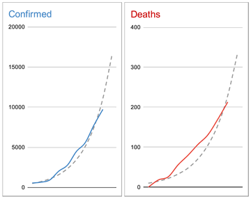
This sort of chart forecasting confirmed cases is using essentially the same techniques you will be learning in the middle section of this course:
Image

I noted the other day that it is a short move from restrictions on travel to restrictions on trade. While it is a minor border, Kazakhstan has closed its border with China to both.

There are estimates out that the epidemic may shave 1% of China’s real GDP growth for 2020. That is roughly $150B.

This image is confirmed authentic:

China is attempting to build a new hospital in Wuhan in 10 days (the video of this showing different colored vehicles is mesmerizing). China is building a physical steel and concrete hospital because this is what they can do; in the U.S., both the CDC and the military have pre-fabricated mobile hospitals for this.

The U.S. has gone to Level 4 travel advisement. This isn’t a restriction, but rather a position that you should not travel to China at all.

Many Chinese are in self-imposed quarantine. They are healthy but getting bored and low on food.
Italy has quarantined a cruise ship due to a suspected case on board.

**************************************************

Videos below here are best viewed as unconfirmed:

Believe this video from Tuesday is of a deserted shopping district is in Wuhan.

Apartment doors barred shut from the outside in Jiangsu, to keep infections in quarantine.

Charitable distribution of face masks in Hong Kong.

Monkeys at Mount Emei that are normally fed by tourists looking confused.

I am not going to link to epidemic porn, but there are also multiple videos available of people collapsed in public places going unaided.

COVID-19 #02: WHO Declares (Required Part Is Higlighted)

The World Health Organization has declared the coronavirus epidemic to be a public health emergency. The only other ones are for polio and Ebola.

Helen Branswell, who is providing some of the best coverage on this relays that WHO have just under 8K confirmed cases (a little below what SARS did in total). But they also have 12K suspected cases (Chinese sources also report that heavily hit hospitals ran out of test kits several days ago). China reported almost 2K positive test results yesterday alone.

The CDC has also reported the first human to human transmission in the U.S. There are now cases in 18 countries.

FWIW: If you’re not on Twitter, this is what Twitter is for.

Tuesday, January 28, 2020

COVID-19 #01: This Year’s Coronavirus Epidemic (Required Part Is Highlighted)

Macroeconomists do watch this sort of thing: it is definitely macro, and it might be economic if it gets bad enough. I have done posts like this, or covered topics like this, in this class before.
Here’s how many of the details fit together this time:
  • An epidemic started in China in December, and was reported to the World Health Organization on 19-12-31.
  • It is not a big epidemic yet (several thousand confirmed ill) so far, but it is widespread. Here’s the current map.
  • It is not particularly dangerous: death rates are about 3%. But they don’t really know how many people are ill or how many have died, so that number could be off. Keep in mind that plain old influenza, when it is bad enough to require hospitalization, has a death rate of about 10%. In both cases, most deaths are in the old, the young, or the previously ill. Neither appears to kill through the primary infection, but through opportunistic secondary infections.
  • It is contagious, but not terribly so. The measure for this is pronounced R-nought, and it’s the typical number of new people infected by one sick person. Estimates are that this is in the 2 to 5 range, comparable to the common cold, and more contagious than influenza (1.2), but nowhere near as contagious as measles (15).
  • Coronaviruses are fairly common, and not usually too horrible. The common cold is a coronavirus. But so are SARS and MERS. We don’t know what the new one is like just yet.
  • Why China? In short, pigs, ducks, and people. Viruses tend to be fairly species-specific. A problem is if they can infect a species without making it sick, forming a reservoir of animals than can affect others without it being easy to spot the source (this is the problem with Ebola, although they’ve kind of narrowed that down to bats as the carriers). Pigs are a problem because they can be carriers of both avian and human viruses. Both get into the pigs, mix their genetic material a bit, and pop out as new viruses against which we have no immunity until we catch it and get sick. And the largest, densest, concentration of pigs, ducks, and humans is in central China.
  • There is a strong suspicion that the current virus first infected humans at a “wet market”: one in which live animals are sold near meat for human consumption. They’re wet because ice is used, and waste often must be hosed away. Americans tend to take a dim view of this practice, but that’s mostly just prejudice: a restaurant like Red Lobster that carries live lobsters in tanks is a form of wet market too. It’s probably best to just note that these are more common in China.
  • China has restricted travel for about 50 million people: essentially, a stay inside your home quarantine. This is largely because they don’t know what they’re dealing with, or how else to contain it. Again, keep in mind how Americans would be likely to behave if the government cut off all travel in, say, Illinois, Indiana, and Ohio. It wouldn’t go over well.
  • A fear in China currently is that medical facilities inside that quarantine zone may not have enough supplies, In part, this is because these events are unfolding around the New Year’s holiday period in China: 10% of the population is engaged in long-distance travel to visit family and friends, and many businesses and vendors are closed or not making deliveries.
  • There is general agreement that China’s response to this outbreak has been better than their response to SARS, but still not that great. Outside of China it is common to imagine that the central government in Beijing is all powerful, but the reality on the ground is often that it’s a distant overseer without much ability to manage local problems evenly or well.
  • A fear is that this will turn out like SARS: not well. Even so, SARS only infected about 8,000 people with a 10% death rate. In the U.S., influenza alone kills roughly 100 times that many people each year. Having said that, initial projections were that SARS might kill 250 million people worldwide.
  • Where did SARS go? No one knows. It probably mutated into something that isn’t harmful that we no longer notice. If you like science fiction, Michael Crichton’s first bestseller, The Andromeda Strain, was about an infection that did just that. (If you like movies, I prefer the 1971 version to the 2008 one).
  • Beware of people who say this is like the 2011 movie Contagion, or the Steven King book The Stand. Could it be? Of course, anything is possible. Is it? Almost certainly not.
  • Having said all that, do recall that the Spanish Flu epidemic of 1918-20 killed 3-5% of the population on the planet. And the latest research is that it too may have started in China. On the other hand, that is by far the deadliest flu outbreak in history, and has yet to be repeated.
Currently we just have travel restrictions. Trade is travel in goods rather than people, so it’s a short step to trade restrictions. These things have macroeconomic effects. And if one of these epidemics gets bad enough, we’re pretty sure there were severe macroeconomic consequences to the Spanish Flu and the Black Death.

Monday, January 27, 2020

That Image from Class About Surveys About Whether Poverty Is Getting Worse or Better

In class I showed an image from BeautifulNewsDaily about survey evidence about what people think about poverty:

There’s a new text from MIT Press targeted at Macro I in graduate programs.† These charts from Chapter 1 are a good addition to what we’ve been covering so far:


Do note that both of these are showing the log of real GDP per capita, rather than real GDP, as I have been doing in class. When trying to get a sense of the ups and downs, and the trend, this probably doesn’t make too much difference. Since the economy grows with some volatility, but population does not, these are probably tracking the log of real GDP fairly well. I am thinking that they look less smooth than the charts in Barro due merely to the fineness of the lines in this text.
† Alogoskoufis, G. S., Dynamic Macroeconomics, MIT Press, 2020.

Test Post: Number in Absolute Poverty vs. Proportion in Absolute Poverty

I believe this will finally show as intended. I do not expect this to last. I fully blame short-sighted bureaucrats in the European Union, and their enforcers the large internet companies. If the images posted here disappear, or the post itself does, blame them, not Dr. Tufte. Everything I've done here has always been covered by the doctrine of fair use.

******************************
 
The World Bank defines poverty on an absolute scale.† Here’s some snapshots (sorry about the quality, it was tough to get these out of a protected format):

The above shows the improvement in number of people living in absolute poverty. Below is a repeat from what we looked at in class on Friday (so that we have them on the same page). It shows the proportion of people in absolute poverty.

And here is an image from another source that shows that the number of people in absolute poverty got worse for a while (as people lived longer and population went up), but that has been overcome by reducing the proportion in poverty over the last few decades.

This is a phenomenon taking place in most countries around the globe. But the numbers will be dominated by changes in China (bigger improvements over more people) and India (pretty good improvements over a lot of people, but not as pervasive as in China), due to their large populations.
† If you don’t know the difference between absolute and relative poverty, you should get this down cold (economists have to know this because there are lots of non-economists that don’t and could probably use our help).
Absolute poverty means you define a level of stuff or some real currency threshold that is fixed or constant. (Keep in mind that if you’re using a real currency threshold, that may change when you change base years). Anyway, if you exceed that threshold you’re no longer poor. The World Bank, since 1990, has been using a real currency threshold to assess absolute poverty globally. As of 2015, this was set to $1.90/day, or about $700/year in PPP real GDP per capita. I believe those PPP dollars are calculated using the Geary-Khamis method, using a base year of 2011 (that sentence isn’t stuff you have to know, but if you see those words now you do).
Relative poverty means you define a proportion of what most people have as the the threshold. For this, it doesn’t matter whether you choose a real or nominal value to start with. It may matter whether you choose a mean, median, or some percentile value to start with (because the income distribution isn’t a nicely behaved bell curve anywhere). For example, you might say that the poverty threshold is 50% of median income. In the U.S., the poverty threshold is set by the Census Bureau. The calculation is more finely grained than that, but that’s the basics.
The advantage of using absolute poverty as a measure is we know if people’s basic needs are likely to be met. The disadvantage is we don’t know how far poor people are away from typical people. The advantage of relative poverty is we know roughly how many people are disadvantaged relative to those around them. The disadvantage is that this is a sliding scale: as a country gets richer, the threshold for poverty goes up, and can be difficult to compare across regions and times.
More practically, absolute poverty can be eliminated, but it doesn’t mean that there won’t still be people who are worse off. Alternatively, one might be able to eliminate relative poverty, but since the threshold generally increases with the passage of time this almost never happens.

Friday, January 24, 2020

Suggestion from AH (Optional)

Current student AH sent along a link to this article from The Economist. It’s a pretty cool dynamic infographic that allows you to see lists of countries ranked by various measures of macroeconomic performance. Fun to play with …

Wednesday, January 22, 2020

Cute Graphic

I liked this:

This came from the article entitled “Receding Risks, Stronger Growth” that appeared in the January 20th issue of The Wall Street Journal. The article is not required.

Wednesday, January 15, 2020

New Research Appropriate for Class This Week

Most of the time, the new research discussed in this blog is not timed to match what we’re doing in class. I got lucky this time.

Also, while there is a paper behind this post, I’ve been unable to find a free copy of it. So I’m going mostly on the basis of the discussion of this in this Marginal Revolution post.

******************************************************

In class we’ve been talking about geographic correlation. This is the fact that we all live near each other to improve our level of well-being, and it seems to work.

I’m not a big fan of cities, but the message there is that urbanization is telling us something really important. I emphasized in class that countries collect data, and tell us how important they are, but the critical macroeconomic action seems like it might be at a lower level.

In contrast, we have a problem in the U.S. and in many other countries: people in cities know they have a good thing going, and don’t want any more people moving into their city and ruining it. The acronym often used for this is NIMBY: short for Not In My Back Yard. In the U.S. NIMBY-ism often takes the form of real estate zoning, which restricts the density of new construction, and the uses to which it can be put. For example, it’s very difficult to build a new home in coastal California due to zoning restrictions, and this places constant upward pressure on the prices of existing homes in that region.

In this new research, they build a theoretical model, and use it to explore counterfactuals. That’s a good college level word: it means they look at “what if” scenarios.† In particular, they look at what would happen if people could just move to, say, New York City, without current residents of New York putting up legal/cultural/social/political barriers to keep newcomers out.

Here’s how Tyler Cowen summarizes some of this:

1. If you restricted New York City and Los Angeles to the size of Chicago, 18.9 million people would be displaced and per capita rural income would fall by 3.6%, due to diminishing returns to labor in less heavily populated areas.

2. The average reduction in real income per person, from this thought experiment, would be 3.4%.  You will note that NIMBY policies are in fact running a version of this policy, albeit at different margins and with a different default status quo point.

3. If you were to force America’s 11 largest cities to be no larger than Miami, real income per American would fall by 7.9%.

4. If planning regulations were lifted entirely, NYC would reach about 40 million people, Philadelphia 38 million (that’s a lot of objectionable sports fans!), and Boston just shy of 30 million (ditto).

5. Output per person, under that scenario, would rise in NYC by 5.7% and by 13.3% in Boston.  That said, under this same scenario incumbent New Yorkers would see net real consumption losses of 13%, whereas for Boston the incumbent losses are only about 1.1%.

6. The big winners are the new entrants.  On average, real income would rise by 25.7%.

7. Alternatively, in their model, rather than laissez-faire, if America’s three most productive cities relaxed their planning regulations to the same level as the median U.S. city, real per capita income would rise by about 8.2%.

[emphasis is mine, not original]

As a closer, let me note that this problem is worse in most other countries (what makes America so rich is the large number of pretty big cities, not the few huge ones). For example, consider Seoul, where the population of the metropolitan area is half of the whole country … how many of you can even name another South Korean city.

† As students advance to higher levels, where modeling is pushed out to them more often, the common complaint is — Why do we have to do all this math? The answer is to make better counterfactuals.
Sunday, January 12, 2020

Thinking Like an Economist: Income and Wealth Inequality Edition

It’s a given that a lot of people are concerned about inequality. Income inequality has historically been a more popular topic, but wealth inequality is also big this political season.

Let’s leave aside whether inequality is harmful or not, or has its positives too.

Instead, let’s focus on something completely different: are there 2 things to be worried about here, or something less than that? This is a perspective you won’t hear from anyone who isn’t an economist, and you won’t hear it from most of them either.

The trick to seeing this is to use finance to think in terms of present value. A stream of income going into the future has a present value today. Alternatively, a pile of wealth today can be turned into a stream of income of any length going into the future.

Going a bit further, it’s not that unusual to have young people with high income but not much wealth, and old people with low income but a lot of wealth. It’s not a big stretch to notice that we could come up with 2 different looking financial situations with the same present value. While we might prefer one or the other personally, on average those are interchangeable.

**************************************************

So here’s the thing. Does, say, Bill Gates high wealth also earn him a high income? Of course it does. But, if we have some list from highest to lowest wealth, and another list from highest to lowest income, and we’re worried about the inequality in those lists … Bill Gates shows up on both even though he’s not working for income in a conventional sense.

It’s not as obvious going the other way, but are there young people with expectations of a lifetime of high income who buy a house (a form of wealth) that their older, lower income, siblings can’t? (I’ll let you in on a secret: that describes both sides of our family fairly well, but it doesn’t feel that great when we’re the ones making the bigger mortgage payments).

My point is not that income inequality isn’t important to understand, or that wealth inequality isn’t important to understand, but that there’s not really 2 distinct problems here, and economists ought to be telling people this.

Friday, January 10, 2020

Taxing Wealth

A lot of Democratic presidential candidates are in favor of a wealth tax.

This sounds better than it can ever be. Why is that so?

First off, while Congress can definitely pass such a thing, but it would very likely be ruled unconstitutional. In fact, it would probably require passage of a new Amendment to the Constitution.

How can that be? It’s because the Constitution doesn’t permit direct taxes (direct are those directed at an entity). Income was not initially taxable, and it required the 16th Amendment to make an exemption for income so that it could be directly taxed. An exemption for wealth would require an amendment too.

Do note that direct taxes are permissible on real property.† But much wealth, and the part that seems to bug many progressives, is financial property. So the Democrats are scoring political points by proposing to tax something that isn’t yet taxable. Uh oh. Also note that most real estate taxes, and personal property taxes (on stuff like cars) are levied at the state and local level. It probably would be hard to introduce a new and additional federal layer of tax on to those things.‡

Now, you may say that there are inheritance taxes on wealth, and this is true. But those are levied on the transfer of wealth. And taxes on transfers of stuff (called excise taxes) are permitted by the Constitution at the federal level. So any wealth tax done this way would be … occasional for any particular asset, rather than a regular income stream for Congress to spend.

In sum, we have presidential candidates proposing policies that they aren’t capable of enacting. That’s not unusual, just significantly harder if an Amendment is required.

Secondly, there’s an issue with counting and valuing wealth. The value of anything is unknown until it is actually bought and sold. This makes the value of Big Mac’s easy to observe, but the value of, say, fine art much harder to observe. This is why homes are taxed based on “assessed value”, rather than (actual) value. Assessed value is set below an estimate of value to reduce complaints, and is often reset to the sale price when a sale happens (because that’s the time when value is established most firmly).

Now, wealth is composed of a wide variety of assets of value, but where would you draw the cutoff of which ones to value (and tax)? Stocks? Common, or preferred, or both? Equity? Net worth at book value or marked to market? What about options? Warrants? Derivatives? How about bonds? Registered or bearer? If the latter, that means you could tax cash in peoples’ pockets too (can you imagine)? Convertible debt? How about goodwill? How about brand equity (if we didn’t tax brand equity, could Coca-Cola Inc. avoid a lot of wealth taxation that a weaker brand’s owner — like Dr Pepper Snapple Group’s RC cola — could not)?

There’s nothing in this point that’s impossible to work through. But no one should have illusions that a wealth tax will be as simple as an income tax … and no one thinks those are easy.

† The usage of the word “real” here is as in “real estate”, and is not the same as its usage as an adjective indicating corrected for inflation, as in real GDP.

‡ I generally have some international students who don’t understand the American system of government very well, and some American students who could understand it better. In a federal system, like the U.S., the top layer of government is weaker, and the second level is stronger. The word federal is related to the word federation. In the U.S. this means the states often have more latitude to do things differently from one another than they may in other countries. In this case of this post, states can institute wealth taxes if it’s consistent with their state constitution. The federal government in Washington is a different entity, and its governing document doesn’t permit direct taxes on wealth that isn’t real.

Thursday, January 9, 2020

An Interactive Chart of Per Capita Real GDP Growth

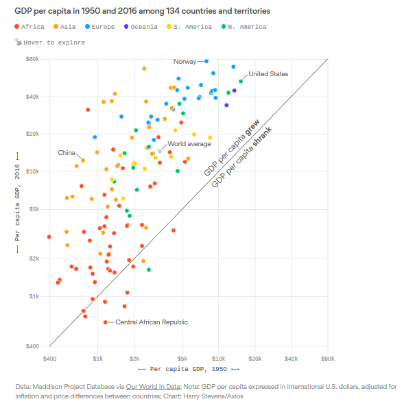
Here’s what’s happen to real GDP over the last 2/3 of a century:

Do note that this chart was produced by serious people/economists, not journalists or graphic artists. So, you should note immediately that the axes are on a log scale (note that the base of those logs shifts between 2.0 or 2.5, rather than some constant value like e, this is an odd thing to do, but it's done correctly here.).
Going to the right is richer in 1950. Going up is richer in 2016. Hugely successful (mostly East Asian) countries are towards the top left.
An important takeaway is that China is doing very well to be at the top left, but it is not unusually successful … a lot of other countries have done the same thing.
Growth models, starting with Solow’s, suggest (as one of their most basic implications) that growth rates should be higher when a region is poorer. On here, growth is upward slope, so the arc from the lower left corner to the upper right corner is consistent with theory.
This is a screen capture of an interactive chart. Go to the source to see the actual countries, and the multiplier for improvement (for example, the average person in the U.S. is 3.5 times better in 2016 than in 1950).
P.S. One more thought: if you're trying to assess whether one country has gotten relatively richer or poorer than another, the trick is to use a 45 degree line, but one which passes through the dot of one of the country's: if the other country is above that line it got relatively richer, below it got relatively poorer. For example, China got relatively richer compared to the U.S., but held its relatively status  compared to Norway. And, if we're going to do this, then it make sense to note that the original 45 degree line in the chart is showing which countries got absolutely richer, or absolutely poorer.
Note to self: something in this image would crash the uploading of this post. It had to be copied and pasted into Blogger.com before it would upload. That's why the paragraph spacing is weird and the image hangs over into the sidebar.