Friday, May 31, 2024

"Trading Places"

The (very unwoke) 1983 movie Trading Places comes up occasionally in finance and macroeconomics discussions. It features a pair of rich and crooked brothers. 

The finance aspect is that they attempt to use a futures market to make a killing on frozen orange juice concentrate.

The macroeconomics aspect is the simultaneous and timed announcement of important data about the real economy.

Knowing that data in advance could inform an unscrupulous trader of what positions to take in a futures market to make the most profit.

But ... it's a comedy: the brothers are foiled by the ragtag group of Dan Ackroyd, Eddie Murphy, Jamie Lee Curtis and Denholm Elliott. Several years later, the brothers made a cameo in the Eddie Murphy star vehicle Coming to America.

***

Parts of this is loosely based on the true story of the Hunt brothers attempt to corner the market for silver in 1980. The screenplay developed from that story, and then evolved. Frozen orange juice concentrate was chosen because it seemed funnier.

At least temporarily, the brothers were eventually bankrupted by the scheme and fines.

All of the above is a prelude. In a little bit of history, the last of those brothers, known as Herbert, passed away last month. Like a lot of people, risky decisions lead to bankruptcy, but more risky decisions allow them to rebuild their wealth after bankruptcy.

***

P.S. Oddly, this movie has turned into a Christmas tradition ... in Italy ... where families often watch (a dubbed versions of) it as a family tradition (think A Christmas Story).

P.P.S. A younger (and somewhat less-involved in the scam) brother, Lamar, is better remembered these days as one of the founders of the AFL (the AFC championship trophy is named after him), and the initial owner of the Kansas City Chiefs.

P.P.P.S Interestingly, it used to only be a crime to get the advance info. Profiting from that was not illegal. That was changed in 2010, and the new law is known (seriously) as the "Eddie Murphy Rule". Nevermind that Murphy's character in the movie was one of the good guys.

Monday, May 20, 2024

Baltimore Harbor Update

The ship blocking the main channel for the last 2 months was refloated and moved today

Not sure to what extent the harbor is back up and running normally (it may have been even before this).

The major bridge bypassing downtown Baltimore is, of course, out for many years to come.

***

When we talk about (estimated) errors, or (estimated) residuals, or shock, or impulses in macroeconomics, we have a hard time narrowing in on what they are. This is mostly because a macroeconomy is a big thing that gets shocked by a lot of stuff. 

I'm not saying this was a large shock, or even an important one for the U.S., but it's a pretty obvious one.

Saturday, May 18, 2024

Uh oh (Monetary Policy Edition)

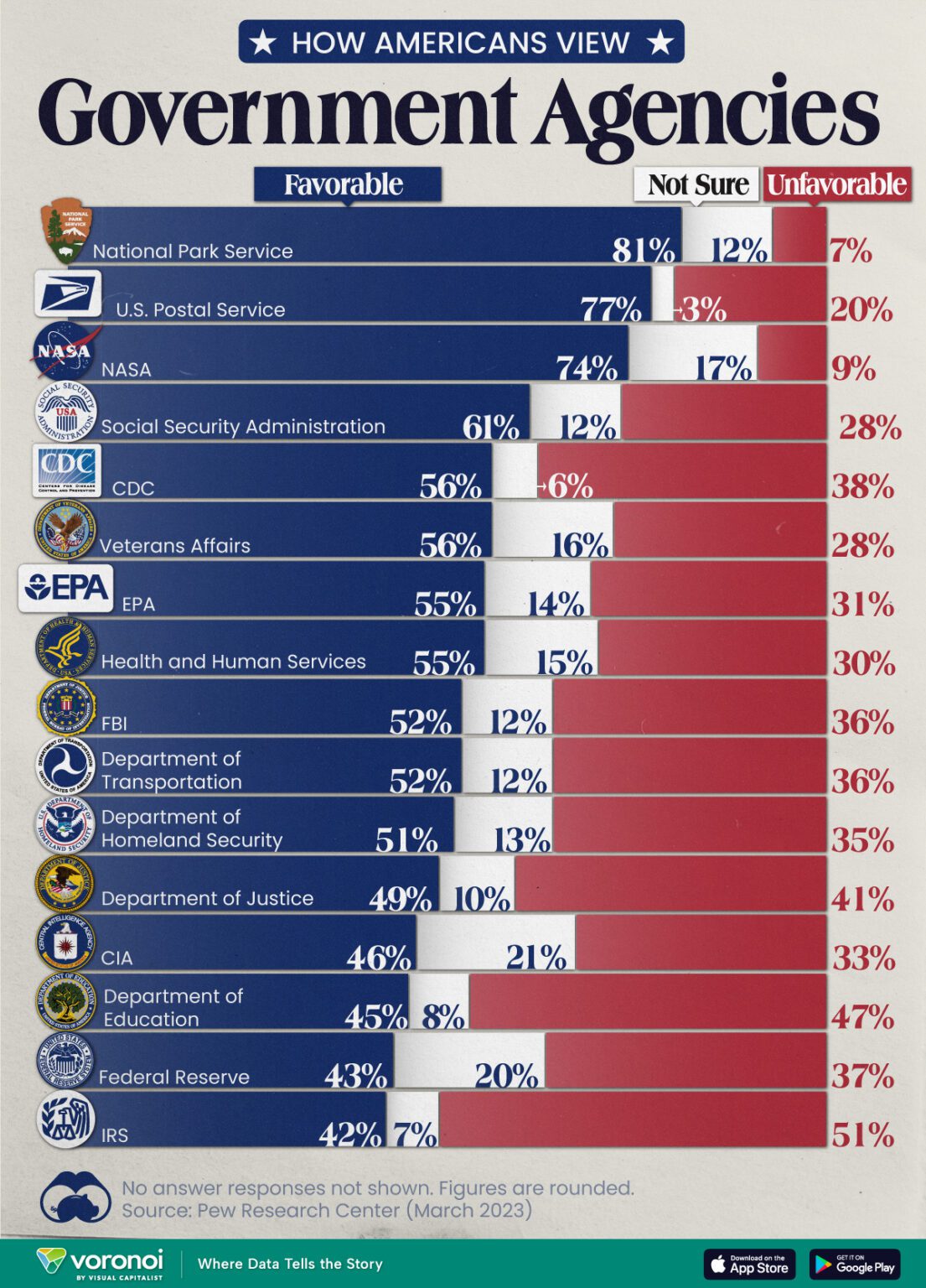
Visual Capitalist posted an infographic based on a Pew Research Center Poll from March 2023. It shows the level of trust that people had in various federal agencies.


What's scary to me is that 1) the Federal Reserve is near the bottom of the list, and 2) it's not even a government agency.

I have been teaching about the Federal Reserve every semester for almost 40 years. I have a lot of friends who work or worked there. Gosh ... I've applied for jobs there (or mostly with Federal Reserve Banks) perhaps 15 times.

Maybe I'm biased ... but I have a hard time thinking an entity that mostly employs macroeconomists is worth having an unfavorable impression of. Especially one that tries really hard to be transparent (literally hundreds of free publications available).

Having said all that, Americans have always viewed banking with suspicion, especially central banking. And the Federal Reserve does show up in a lot of conspiracy theories (no doubt because the spreaders read all the free literature). In addition, rural southern Utah is a hotbed of anti-Fed sentiment.

Inflation Under Presidents

We should not average a complex process like inflation by simply grouping dates under presidents.

Having said that, we do this with stuff like football team performance and their quarterback, so it's not like this sort of analysis is going to go away.

So here's the chart:

Now, this is useful because it's hard to get across to students how long it's been since we've had an inflation problem: Biden's average exceeds all presidents since Reagan. That's 1988, 36 years ago ... it's very likely a lot of your parents weren't even teenagers yet in 1988. 

It's also 2-3 presidents from each party, and 16 years from each party, so it's pretty fair to say this is not about Democrats vs. Republicans, but rather Biden being worse than everyone else.

In addition, the number from Reagan is deceptive. Carter lost his reelection bid to Reagan, in part, due to high inflation. And there was a hangover of high inflation going a couple of years into the Reagan administration, so the average for his second term would be much lower.

***

It's currently May and Biden is making speaking appearances where he claims that he inherited high inflation from Trump. This has been shot down as false, even by media that generally supports him. The inflation actually started ramping up a few months after Biden took over with a Democratically-controlled Congress. Inflation is driven in part by expectations, and this is consistent with expectations forming that new policies that were inflationary were being put in place.

***

Lastly, I'm of two minds about the note in the text box on the right. The point is correct. BUT, the shading does not correspond to the point (and I feel it is pretty obviously manipulative to put them so close together).

Anyway, it is true that the CPI used to include data on sales prices of new homes. And it is true that it now includes an imputed rent for owner-occupied housing (basically, not what your mortgage payment is, but rather a comparable of what you'd have to pay if you were renting instead of owning). The latter series is both smoother, and has shown less inflation that the former. Like most economists, I tend to think it's a better measure. But it does make for difficult comparisons.

The manipulative part though, is that they made the change over in 1985 — halfway through the Reagan administration. So imagine dividing Reagan in two, so there's one more bar. The top two (Carter and Reagan I) would behave differently than the bottom six. The effect of having all eight measured the same way is that it would be bring the top two and bottom six bars closer together (either by bumping the top two downward, or the bottom six upward).

The upshot is that Biden's numbers are a lot closer to Carter and Reagan I than they are to the other presidential terms in the middle. It turns out there's a paper that looks into this. First off, the BLS does maintain a CPI series that uses the pre-1985 method. But, 1) it's not as detailed as current series, 2) it isn't available before 1978, 3) it comes out with several months delay, and 4) it's not available publicly, and you have to ask for it specifically. But, in the paper they reconstruct CPI measurements going back to 1949, and forward to the date of publication (March 2022) that can be used for comparison.

So here's the data I got from the paper's linked spreadsheet. Keep in mind this shows Biden in a worse light than we would today, since it only goes through the 14th month of his term ... thus accentuating the high inflation period without showing the reduction in inflation. Having said that, it gives you a sense that the numbers we were seeing in 2022 were a lot closer to Carter era than to Trump's:

President
(Term and/or Initials As Needed)

CPI Inflation Rate
(Announced)
CPI Inflation Rate
(Post-1985 Method)
Carter 9.9% 8.4%
Reagan I 5.8% 6.2%
Reagan II 3.3% 4.0%
Bush, G.H.W. 4.3% 4.8%
Clinton I 2.8% 3.2%
Clinton II 2.4% 2.6%
Bush, G.W. I 2.3% 2.5%
Bush, G.W. II 3.3% 3.2%
Ohama I 1.7% 1.7%
Obama II 1.1% 1.3%
Trump 1.9% 1.9%
Biden (first 14 months) 5.6% 5.6%

If interested, the paper is Bollhuis, Cramer, and Summers, and is entitled "Comparing Past and Present Inflation". It has been published in a (gated) journal (Review of Finance, 2022), but a PDF of the working paper is readily available online. It also contains a link to their alternative data series.


Thursday, May 9, 2024

Austin Is So 2023

A little bit of macroeconomics here, noting that the lustre has faded for Austin. But Nashville is still on the rise

Interestingly, the author knows about FRED! The link to the data for the GDP of the Nashville metropolitan area, which is still somewhat smaller than that of Austin

FWIW: Salt Lake shows smaller than both in FRED, but this is misleading. I was not able to find GDP for what we call "up north" and others might call the Wastatch Front in FRED. Instead, what's in FRED is just Salt Lake County, which is fine, if you know there's a difference. But for us, "up north" is pretty much one continuous city from Santaquin to Tremonton, with tendrils going out to Logan, Park City, and Tooele. To get the GDP for that you have to look for Combined Metropolitan Statistical Area data (CMSA). This accounts for the fact that sometimes we want to count Provo or Ogden as part of Salt Lake, and sometimes we don't. When you get that data, Salt Lake shows as bigger than Nashville (which has a CMSA), or Austin (which only has a metropolitan statistical area, or MSA, because there are not other metro areas contiguous with it).

FWIW 2: Even these statistics are imperfect. I grew up in the suburbs of Buffalo, and the data show Buffalo to be a lot smaller than it actually is. Buffalo is smaller than Salt Lake these days.  But it's CMSA only includes Niagara Falls. Even though Rochester, with its own MSA, and nearly the size of Buffalo ... is actually closer than Provo is to Salt Lake's downtown. In fact, Santaquin to Tremonton is a longer drive than it is to get from Buffalo to Syracuse ... another large MSA. And nothing counts the adjacent parts of Canada to places like Buffalo, Detroit, and Bellingham. On the Canadian side from Buffalo, it's pretty much one continuous city from Fort Erie (across from Buffalo) through Niagara Falls (Canada), St. Catherines, Hamilton, and in to Toronto and out the other side. Anyway, this is another reason that the "lights at night" images are so important macroeconomically ... it's politics that keeps Buffalo separate from Rochester separate from Syracuse ... separate from Canadian cities ... even though Highmark stadium is full of people from those places on game day.

Tuesday, May 7, 2024

Before the Rust Belt was Rusty

Students in Utah in the 2020's sometimes have a hard time understanding why anyone ever wanted to live in the rust belt.

But ... check out this list of metropolitan areas with the highest incomes from 1949.

Only one city west of the Mississippi. None in the old South (especially, nothing in Texas or Florida). Heck ... only one on the east coast.

The phenomenon of the coasts being richer and the flyover states being poorer, is definitely one of the last 2 generations or so.

***

FWIW: think about the stories told by most of your relatives ... Utah was a place people moved away from until about 1990.


Sunday, May 5, 2024

Measuring Media Accuracy

There is an organization that measures the quality of media across countries. It's called Reporters Without Borders.

This is important for macroeconomics as the politicians and bureaucrats in many countries lie about performance. And then they're pronouncements are often taken at face value due to Westphalian Sovereignty.

N.B. As always, when looking at a "ranking" of entities, keep in mind that someone determined how to to weight things together. And you might not agree with those weights. So some digging is probably not a bad idea.

I decided to post about this because they publish a "heat map" every year of press freedom. But it's a biased one.

You actually need to click through to their website to see it. Sorry about that, but some sites don't like their stuff copied and reposted.

The problem is with their shading. Their index goes from 0 to 100. Scores from 40 to 100 are divided into 4 groups of equal width. That's OK as long as you do it across the entire range. But they don't. So their darkest (poorly rated) countries should be divided into at least 2 more groups (and that wouldn't be even, which is another no-no).

Most of you are probably interested in how the U.S. rates. And this problematic shading puts the U.S. in the middle of 5 groups, instead of in the third highest out of seven. This has the effect of making the U.S. seem much closer to say, China, than it really is.

Having said all that, this information was reposted at Statista in an even worse format:

So what's wrong with this one? Note that 3 of the shades are variations on reddish, and are quite distinct from the yellowish-tan, and turquoise-ish of the other 2 shades. This serves to visually group those three more closely together.

***

I would pay attention to their discussion of how the U.S. was rated. Most of their markdowns are pretty reasonable. Despite our first amendment, we probably should not be in the top groups.