I am mostly posting about this article for the graphs (that I’ve pasted below). The source article itself is not required, but it may interest some of you.†
This is a useful chart (although it’s not really saying too much):
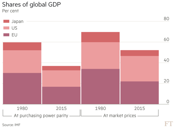
In the U.S., where we think we’re the center of the world, we sense that the rest of the world is catching up to us … and because we think we’re the center of the world we tend to infer that means we’ve done something wrong or someone else has cheated. This chart shows that, if anything, the U.S. has maintained its share of the world economy over the last 35 years. It’s the EU and Japan that have faltered. Obviously, that’s not what Trump would say. But interestingly, it’s not what Obama would have said either (recall that he readily admitted that he wanted the U.S. to be more like Europe).
This chart is not that useful:

This is an example of a bad chart because the scale is not logged. GDP per capita is one of those series that grows through compounding, so if it’s not logged … beware. The reader will have problems with any comparison made from this chart, but I’ll focus on the U.S. versus Japan. Towards the right, it looks like Japan is close to the U.S., but not that close. So then there’s a tendency to follow the lines to the left and think … oh … Japan is just as far behind as they ever were. But that’s not the case if you think of it terms of multiples: on the left the U.S. GDP per capita is perhaps 5 times Japan’s, but on the right it’s more like 1.3 times as big. That means Japan has improved a ton over the 65 years shown.
It’s worse if you’re focused on China. How accurate is your estimate of how much bigger America’s GDP per capita is than China’s on the left of the graph: that could be 10 to 1, or even 20 to 1. Who knows, right? That innaccuracy arises because this data isn’t logged.
It’s also very trendy to focus on income inequality. In the U.S., we think about this through the filter of Democrats and Republicans, and just having had 8 years of Obama, and a recession and financial crisis that has been largely blamed on “the rich”. Fair enough. But at this level, we need to go look at data, and here’s a chart of the primary measure of income inequality:
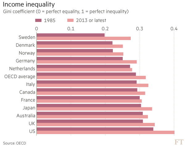
The most striking feature of this is that inequality has gone up in every single one of the developed countries shown here. So any explanation of that must focus on something global rather than national. This means that this Democratic/Republican thing that we have going on in this country — that mean Republicans are taking all the money — just can’t be right. One might argue that this is due to increasing political conservatism around the globe. I’m not going to go into the details, but I’ll warn you not to go there: the data doesn’t support that either.
More broadly, in social sciences, we call explanations like that political one “just-so stories” after the Kipling children’s book. They’re too easy to explain, and not thoughtful enough. Macroeconomists have to deal with a lot of those.
So, for income inequality, we need a story that works in all the richer countries without referencing which party is in power at a particular time. Macroeconomists don’t have great answers for this question yet, but we’re looking at whether the sort of technological advances we’ve seen over the last few decades lead to uneven gains in income. For example, if having Facebook is a good thing, we might have to put up with Mark Zuckerberg getting rich from it.
Stretching further, another possibility that I’ll consider in more posts later in the semester, is that increasing inequality in richer countries is related to decreasing inequality across all countries. One of the weird things about these debates is that while we’re all concered about local inequality within our country, globally, the inequality between countries is much larger. But now we run into a moral issue: global inequality is a bigger problem but it’s improved drastically, yet we’re focused on local inequality (which has gotten worse) even though it’s a smaller problem. That’s twisted. An explanation that ties the economics together is that perhaps the trade that’s making the poor richer globally is more tightly linked to the rich rather than the poor in developed countries. There’s some evidence to support that; but this bugs people because it means that policies to beat up the rich in developed countries to help the local poor are hurting the more numerous and worse off global poor.
These are drawn from an article from Financial Times entitled “Martin Wolf: The long and painful journey to world disorder”. Martin Wolf writes a regular column about economics; his stuff is generally well-informed, so if you see his name outside of class consider paying more attention.
† The source article is from Financial Times, a British newspaper similar to The Wall Street Journal. Typically, Financial Times requires a registration to view articles. I recommend that you go ahead and do that. Of all the publications I read/view, the Financial Times is the one that seems to have never, ever, done something I don’t like with my personal information, or sent me spam.
No comments:
Post a Comment