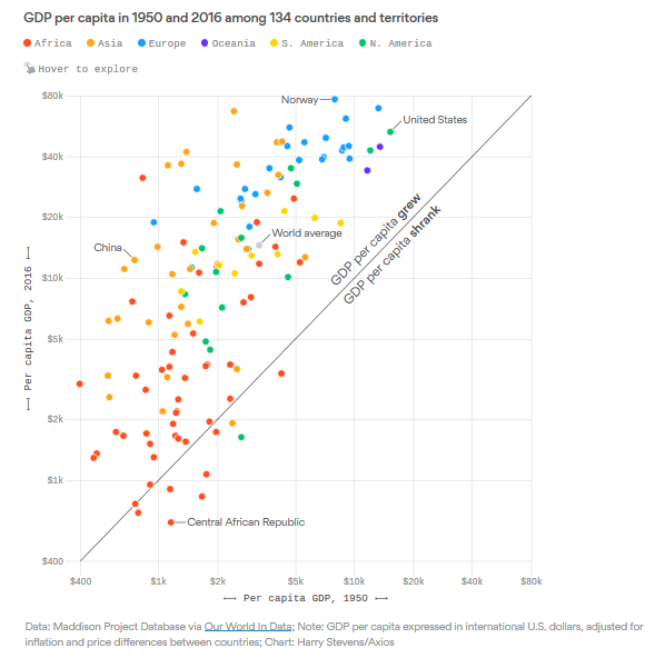
Do note that this chart was produced by serious people/economists, not journalists or graphic artists. So, you should note immediately that the axes are on a log scale (note that the base of those logs shifts between 2.0 or 2.5, rather than some constant value like e, this is an odd thing to do, but it's done correctly here.).
Going to the right is richer in 1950. Going up is richer in 2016. Hugely successful (mostly East Asian) countries are towards the top left.
An important takeaway is that China is doing very well to be at the top left, but it is not unusually successful … a lot of other countries have done the same thing.
Growth models, starting with Solow’s, suggest (as one of their most basic implications) that growth rates should be higher when a region is poorer. On here, growth is upward slope, so the arc from the lower left corner to the upper right corner is consistent with theory.
This is a screen capture of an interactive chart. Go to the source to see the actual countries, and the multiplier for improvement (for example, the average person in the U.S. is 3.5 times better in 2016 than in 1950).
P.S. One more thought: if you're trying to assess whether one country has gotten relatively richer or poorer than another, the trick is to use a 45 degree line, but one which passes through the dot of one of the country's: if the other country is above that line it got relatively richer, below it got relatively poorer. For example, China got relatively richer compared to the U.S., but held its relatively status compared to Norway. And, if we're going to do this, then it make sense to note that the original 45 degree line in the chart is showing which countries got absolutely richer, or absolutely poorer.
Note to self: something in this image would crash the uploading of this post. It had to be copied and pasted into Blogger.com before it would upload. That's why the paragraph spacing is weird and the image hangs over into the sidebar.
No comments:
Post a Comment