Lots of people say COVID-19 is just like the flu. There's a lot of evidence that it isn't. Here's a new one I came across today.
When people say something like "COVID-19 isn't that bad because the flu kills 60K Americans each year" they're missing a huge point: the 60K is an estimate based on excess deaths. Most of those 60K cases are not confirmed, they're suspected, and there may be comorbidities involved (like being old).
The story is almost the same for COVID-19. Almost. Here we have 100K deaths with comorbidities too. Except that a much higher fraction of COVID-19 deaths are confirmed with tests.
It turns out that if we compare confirmed deaths, then we have information from the worst week of COVID-19 vs. the worst week in each of the last 7 years of the flu. And what do we find? COVID-19 is ten times worse than the worst flu year, and 44 times as bad as the least bad flu year.
So, those naysayers are comparing apples to oranges. A better comparison would be estimated excess deaths this year (due to COVID-19 and the flu) with previous years (which are mostly flu, and already counted as excesses).
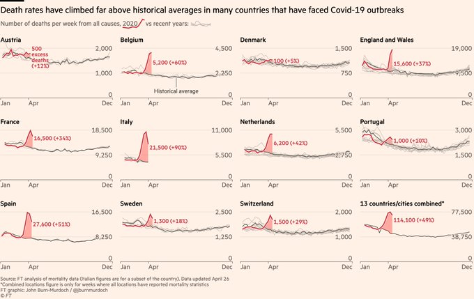
This is where it gets ugly. Here's a graph of deaths per week, by country:
The vertical scale is not logged (since these are not growing series), and may differ from panel to panel (reflecting different country sizes). The implication of the linked article above is that the figure of 60K annual flu deaths for the U.S. is calculated by measuring the distance of the gray curve above its minimum, and attributing some fraction of the difference to the flu. Then if COVID-19 were "just like the flu" the height of the pink peaks would be comparable to the distance between the top and bottom of the gray arcs. It isn't ... not by a long shot.
The New York Times has been making excess death data available for a variety of places. It's scary.

No comments:
Post a Comment