It's been 2 weeks since the crisis. Here's a chart of power generation at that time:
This is actually from Texas. Two weeks ago, it was hard to find this because people didn't know where to look. Now it's easy.
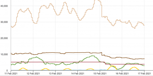
To refresh, green is wind, yellow is solar, tan is gas, brown is coal, and dark orange-ish is nuclear.
The real problems started early in the morning of the 15th. Those steps down in coal and nuclear are plants being shut down because they need water for cooling, and the gas system wasn't able to keep up with both providing power, and heating homes, and keeping the wells and pumping stations running ... and yeah I chose the word "both" on purpose to emphasize the problem.
Also note in this that the windmills are peaking out below 9,000 MW.
What is not shown on this chart, and a lot of others you can find on the internet is that a lot of the windmills were already shut down before the 11th because they knew they were not winterized.
Fun Fact: windmills spin in one direction, and you actually have to use a lot of electricity to run the motors that stop them from spinning so that you can lock them down.

You have to be very careful here. Not that the vertical axis is not the same between the two charts. Now we see that with normal weather, and the windmills turned on, that they peak at about 21,000 MW.
So you can definitely see that over half of the wind power was shut down during the crisis: so people are correct to blame green priorities for that.
And you can also see that gas is now peaking between 15,000 and 20,000 MW. So they are able to crank that up by 100% during the crisis (even though that was not enough).
And I was making an informed speculation, but I've been proved right: in the crisis, coal and nuclear were providing 10,000 and 5,000, and now in more normal times you can see that 1) the peak generation for coal never exceeds 10,000, and nuclear is set on autopilot at 5,000. Thus, they were completely relying on gas to save the day because they were already maxing out limited coal and nuclear capabilities. Given what we know about the public perceptions towards those two, it's reasonable to conclude that they have no excess capacity because it was intentionally taken away.
As far as I can tell these charts tend to confirm the view that excessive reliance on renewables was baked into the system. Whether or not you are in favor of more renewables, I think the takeaway is that in Texas the strategy was to "burn the bridges behind them", and that this shifted most of the cost for dealing with a disaster onto household consumers.
No comments:
Post a Comment