
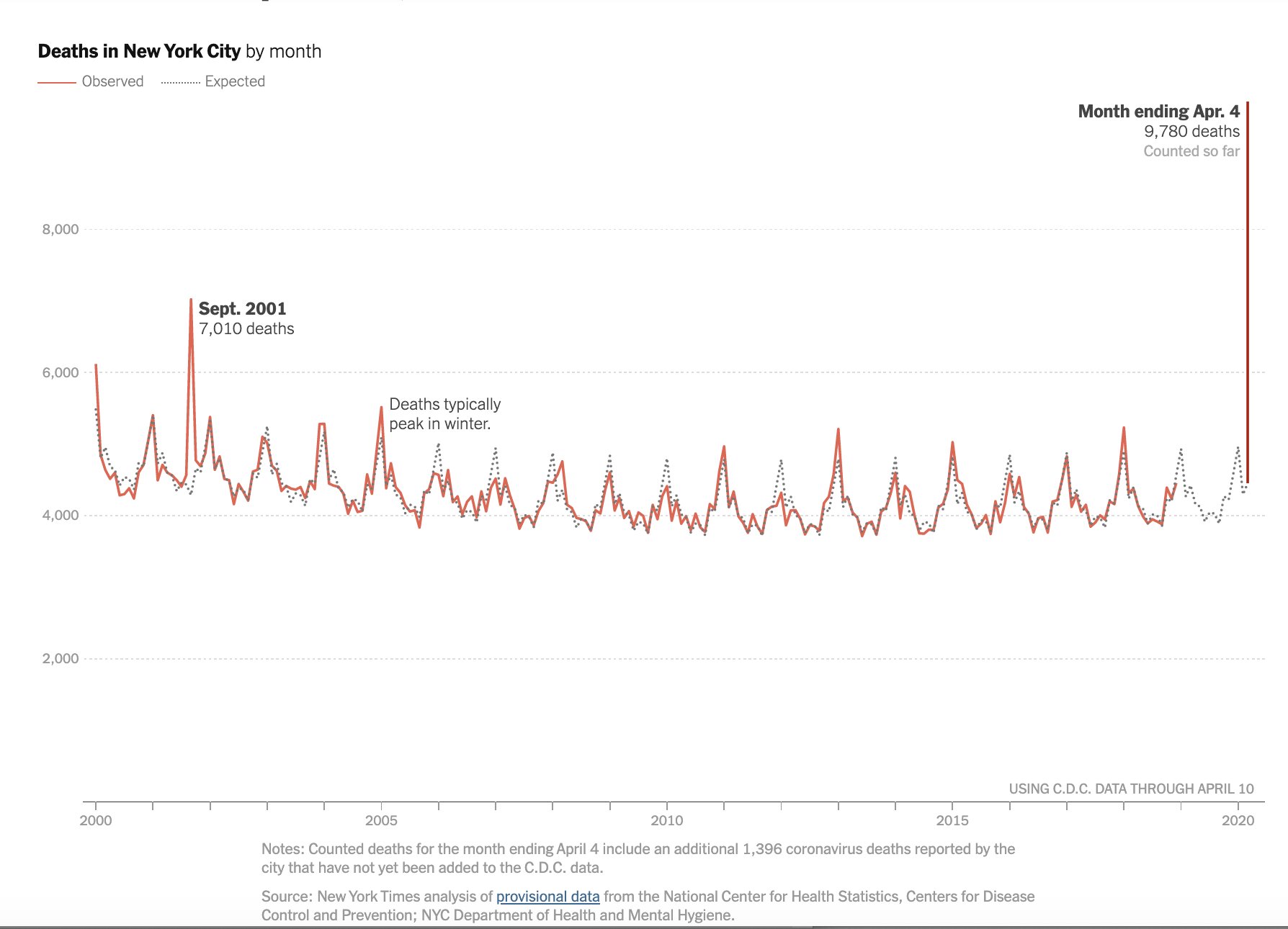
Here's a time series graph to help you digest what is going on in New York City:
That cool chart that TL brought to me from Flouish has been updated. I could not get it to repost properly, so you'll just have to click through, but COVID-19 has now moved up to be the #1 cause of death in the U.S. The other day it was # 3.
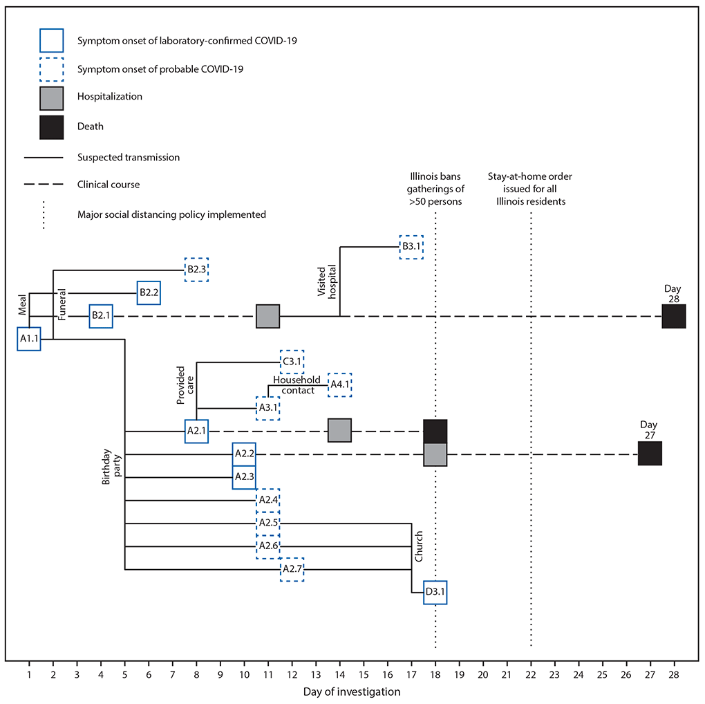
Contact tracing is how South Korea did so well. In it, you figure out everyone a person came in contact with, and you find them and get them quarantined. Here's what happens when you don't:
New research from the CDC estimates that the R0 of SARS-CoV-2 is much higher than previously thought. Their 95% confidence interval for R0 is 3.8 to 8.9.
Remember federalism? Ian Bremmer makes an excellent point:
This is the flip side of some governors (like Herbert in Utah) not shutting down their states. Do note that Utah is now requiring travelers from outside the state to divulge their travel plans once arriving in our state.Trump isn’t going to re-open the country.— ian bremmer (@ianbremmer) April 10, 2020
He’ll say the country should open. And most governors—who actually wield the authority—will keep it locked down.
Similar to what’s already been playing out in Brazil.
Numbers continue to go up in our region: 52 positives in southwestern Utah and 4 people in the hospital. The much smaller Central Utah Public Health Department (which is likely to send some cases to the hospital in Cedar City) now has a COVID-19 page up and running. They are up to 6 cases and 1 hospitalization. The worst hit is Millard County, which is in the area that probably will send people to Cedar City.This is a personal opinion.— Brian Resnick (@B_resnick) April 10, 2020
But it's okay to take a moment and just fully realize, this is one of the worst things to have ever happened. And there's no sugar to coat it.https://t.co/LTelcTbOEM
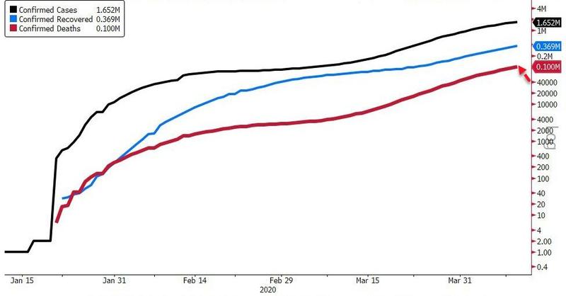
And here's an example of how not to use a log scale.
No comments:
Post a Comment