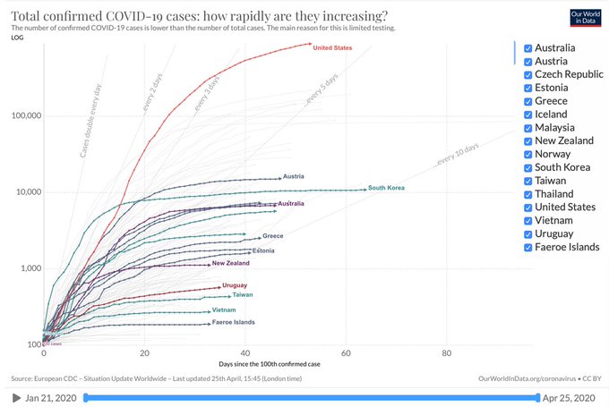
But charts like this are also rather stupid. The reason is lack of basic understanding of logs (something beyond ... well ... everyone else is using OurWorldInData and they chose the scale).
Consider this equation:
2a = 10
Is there an exponent x for which this is true? Of course.
Now, take logs of both sides to get:
alog(2) = log(10)
What this tells us is that any log in base 10 is a times the log of that number in base 2.
Looking above, the vertical axis is not labeled with the logs, but the values 1,000 then 10,000, then 100,000, then 1,000,000 are evenly spaced because in base 10 they are 3, 4, 5, and 6. But in base 2, they'd be multiples of those: a is about 3.32, so they'd be 6.64, 9.97, 13.29, 16.61, and 19.93.
In and of itself, this is not a big deal. What stupid about the chart is the faint lines showing doubling. These have to be added because they can't be read directly off the screen. But if you put everything in base 2 logs, that problem solves itself.
What's worse, those faint lines tell you zero about the situation right now. Take the U.S. for example. We are very close to the line for doubling every 5 days. The thing is, we used to double faster than that, and now we double slower than that, and neither one can be read off the chart.
Here's what I came up with instead:

- We most recently doubled in about 18 days (we're almost at 20 on day 56, and we were almost at 19 on day 38). That's a big difference from that doubling 5 days line we're close to in the top chart.
- But, before that it was doubling 8 days. We really are flattening the curve.
- The doubling before that was in 5 days.
- The time before that it was 4 days.
† Do note that I chose this chart because it happened to be the first one like it that I found when I went looking. I note this because it is rather biased: it compares the U.S. to countries that have "flattened their curves" to show that we're not doing very well. Point taken. But, it does not compare the U.S. to some random selection of countries, so it is missing that there are many countries, that like the U.S., have not had a good outcome with the outbreak. Also, it does not scale by population, which is a form of bias, since the U.S. is much larger than all the countries shown: in particular, the Faroe Islands at the very bottom are actually doing worse on a per capita basis than the U.S. is.
No comments:
Post a Comment